
This post was originally published in 2009
The tips and techniques explained may be outdated.
The Blackberry Loves U2 TV promo features some awesome, bright and vibrant lighting effects. Let’s take a look at recreating the style to produce a Blackberry inspired design of our own.
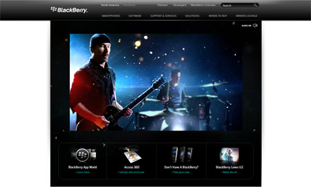
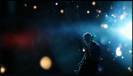
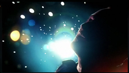
Much like the old Apple/Coldplay advertisement, the new Blackberry Loves U2 promo features some stunning visual effects. Check out the video, showing the range of light particles and colours flaring from the background.
Looks pretty cool huh?! Let’s take a look at recreating the style in Photoshop, starting with a couple of stock photographs and spicing them up with some Photoshop touches.
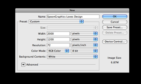
Open up Photoshop and create a new document. Enter dimensions of your own preference. Here I’m using 2000x1200px. Set the mode to RGB to allow for vibrant colours, and fill the background with pure black.
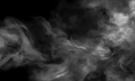
Find a stock photo of a smoke texture, desaturate (CMD+U) to remove any colour. Paste the smoke into the background of the document to give a subtle texture. Reduce the opacity right down to 13%.
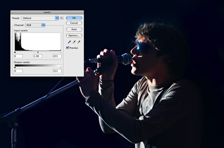
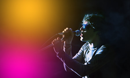
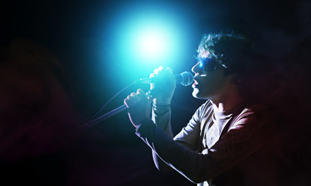
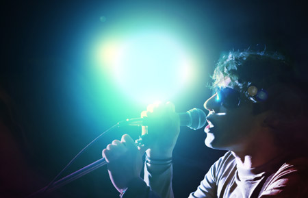
Next, find a stock photo of a singer. This particular image is courtesy of ShutterStock. Open up the image and adjust the Levels, this image has a dark blue cast, so adjusting the black point helps correct this.
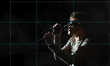
Paste and position the singer into the document. Using a simple rule of thirds approach gives a nice, structured composition.
Select a large, soft brush, then dab a few spots of bright colours on three individual layers.
Change each layer to Overlay. Adjusting this blending mode adds a coloured cast that reacts with the underlying tones of the singer and smoke texture layers.
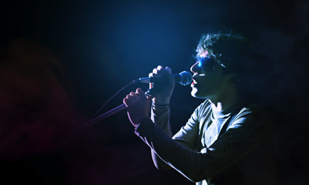
With all three colour spots changed to Overlay, it adds various hints of colour to the image. Next, dab a slightly darker spot of blue as the base of the light source.
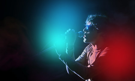
Continue adding a couple more spots of colour. Referring to the original ad, there are hints of turquoise and red. Mimic these in your Photoshop design. Change the blending modes to Overlay to give the casts of colour.
Dab a smaller spot of white to the centre of the light source. The colour should blend from a large dark blue, through to a medium sized turquoise, followed by the smaller spot of pure white.
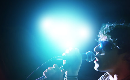
Place a couple more spots of white to disguise the circular shape of the brush marks.
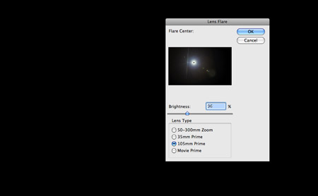
No lighting effect is complete without a good old lens flare. Fill a new layer with black, then go to Filter > Render > Lens Flare.
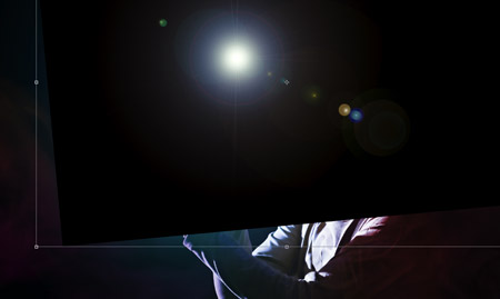
Scale and position the lens flare so that it radiates out from the light source. Change the blending mode to Screen to hide the black background and reduce the opacity to suit.
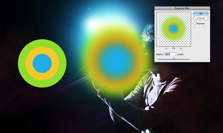
Draw a few concentric circles, each filled with a vibrant colour. Add a large Gaussian Blur of around 30px.
Change the blending mode of the circles to Pin Light, then position them over the light source to give a hint of green and orange against the blues. Reduce the opacity to tone down the effect.
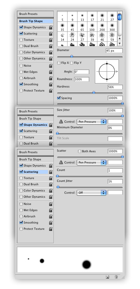
Next, generate a particles brush by adjusting various settings in the Brushes palette. Turn the Hardness to around 50% and Spacing right up to 1000% in the first section. Under Shape Dynamics, enter 100% Size Jitter and 0% Minimum Diameter. Under Scattering, enter 1000% Scatter with a Control of Pen Pressure (which is super handy if you have a Pen Tablet).
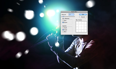
Draw a range of large white particles onto the document, letting Photoshop take care of the slight size variations. Add a Radial Blur in Zoom mode to give the impression of movement. Change the blending mode to Overlay.

Reduce the brush size slightly and continue to paint in another collection of light particles. This time change the blending mode to Soft Light and reduce to 50%.

Draw in a third and final collection of particles, this time smaller in size. Leave these as pure white. Go through and add a layer mask to the three particle layers, then with a brush at 50% opacity, dab over the particles to reduce their prominence and to give variation in strength.

On a new layer, paint over some of the particles with yellow. Change the blending mode to Overlay and reduce the opacity to give a coloured tint to selected spots, much like the original ad.

The design is looking good so far! We’re just about done, but let’s take a look at a couple of finishing touches.
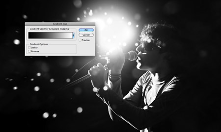
Select the whole document (CMD+A), then Copy Merged (CMD+Shift+C). Paste the duplicate on top of the layer stack, then add a Gradient Map (Image > Adjustments > Gradient Map) to convert to black and white.

Change this black and white layer to Luminosity, then reduce the opacity to suit. This simply adds a little contrast to the colours, darkening the darks and lightening the lights.
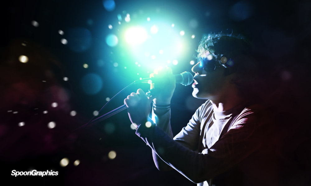
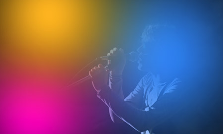
Add in your logo or tagline and you’re done! The final graphic boasts plenty of the effects that made the Blackberry Loves U2 advert so awesome, the colour casts, vibrant light source and flying light particles all add to make a cool design.

Great tutorial Chris!!
WOW! very nice turorial, thanks Chris!
Really nice work and great outcome! a really fine job :)
I like the tutorial, really great result!!!
thanks Chris
Very Nice Tut Chris! Just added on Web Design Updates – http://www.pvmgarage.com/wdu
Cool tut with some really neat skills involved, as always, thank you for the hard work.
I have to say, I’m not too focus by the style (including the vid) but I suppose that’s all down to personal taste.
Still worth trying to tidy up the Photoshop skills tho =D
Another amazing tutorial!
I can’t wait to give it a try myself!
AMAZING. Thanks Chris, for sharing!!
Very cool! Great job on the lighting effects.
wow nice tut bro
Great tutorial, Chris. Simple and effective.
hot day-m! it’s an understatement that your site is cool and informative ;) thanks bro
Amazing effect! I’ve always loved this effect. :)
Great post Chris, impress every time!
great tutorial! thanks chris!
Superb tutorial – love it!
Great tut. I’m going to use this one…
Sweet tut Chris.
Schweet tutorial, thanks a ton.
It makes it all the more impressive that the BB ad is in full motion when you think about the recreation of it in a single shot.
I just shot a series of concerts and have a few that will def be enchanced a bit by a similar process!
Thanks!
Great tutorial Chris. Thanks for sharing :)
Unlike many other sites that assume designers know EVERY SINGLE LAYER of programs such as Photoshop and Illustrator (I’m certified in each and STILL learn something new every day), your tutorials are step-by-step in the best sense of the phrase.
I love reading to see what you’ll post next! I love to borrow ideas for my blog, http://rockstarcarlene.com, which gives me a little more freedom to experiment than my normal website does.
You make it look so simple =]P
Excellent results with “simple” technique. Top notch tutorial, once again.
very thanks, nice effect.
Great work in photoshop on this!
Lovely tutorial. Thanks so much for posting it!
I really love the end result AND the black and white image (before the last 2 steps).
Amazing… It’s Chris…
Wow, your Photoshop tutorials are great! I have always used Corel software and just recently forced myself to start using photoshop since it seems to be the software of choice and because of all of the available resources as opposed to Corel. So I really appreciate this, I am a total photoshop newbie. Thanks.
nice tutorial..thx for sharing.
it’s very nice , i love this one
…cool
This is indeed very good tutorial – simple, well explained, I learned lens flares different usage :)
Only I don’t know or that bright light must be main focus? I mean from two accents – face goest to second place, but maybe it’s right I guess :)
Totally fantastic. great tutorial as always
Good tutorial! I think It would of looked better with smoke
wow~! it’s very nice ~!
Very great Chris, thanks for sharing….
Very stylish work Chris! As usual. Will certainly be working through this one myself when I get the chance.
Great tutorial Chris, was very easy to follow throughout and the effect looks fantastic.
perfect work! although it’s too hard to me ~
What a sick tutorial… well explained!
c00L.great tuts.
this is freaking awesome, thanks :D
Outstanding tutorial.
Thx for sharing
its exultant… work..
v cool worlk Chris!
hi, very good friend
I hope you prosperous for always :D