
This post was originally published in 2007
The tips and techniques explained may be outdated.
This first tutorial at Spoon Graphics covers the process of designing a logotype, this particular logo created in the tutorial is for a fictional business named Purple Lemon, which immediately suggests a modern, trendy, possibly web/internet or design related company.
The tutorial covers the complete design process from conception to completion, creating a practical logotype that will work in the real world.
For a commissioned project more details on what the business specializes in, and their desired image and values would be researched, but for this tutorial the rather vague description allows us to create a more generic logo.
When designing a logo it is important that the final creation is practical, in that it can be used in everyday business life as intended. Here are some general rules that should apply to your logo designs:
1) Always design your logos in a vector application such as Adobe Illustrator, and not a raster application such as Photoshop, reason being the logo must be scalable without losing quality and needs to appear crisp when printed on anything from business cards to 20ft vinyl banners.
2) Ensure that the logo can be reproduced in a single colour, such as black and still be recognisable. Think how the logo will look on a press advert or fax letter, or reversed out of a black background.
3) Bear in mind that the logo may need to be reproduced as small as a postage stamp, so ensure that any fine lines or text will still be legible when scaled down.
4) Limit your colour palette and specify your corporate colours with Pantone or CMYK references to certify correct colour reproduction when printed.
5) Finally bear in mind your use of typeface, colour and form to give your logo the desired appearance of it's business.
The logo that will be created in this tutorial can be seen below. Following the above rules this logo can be implemented on anything from a pen to full van livery, by designing it to work well in black and white, it can then be produced in flat colours, and then maybe even be given some trendy gradient and reflection treatment for use on screen.
![]()
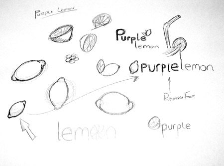
Before starting your computer based designs it is always useful to sketch out your ideas with a good old pencil and notepad.
It may also help to browse the internet for relevant images and photographs, for example in this project it helped to study the shape of a lemon.
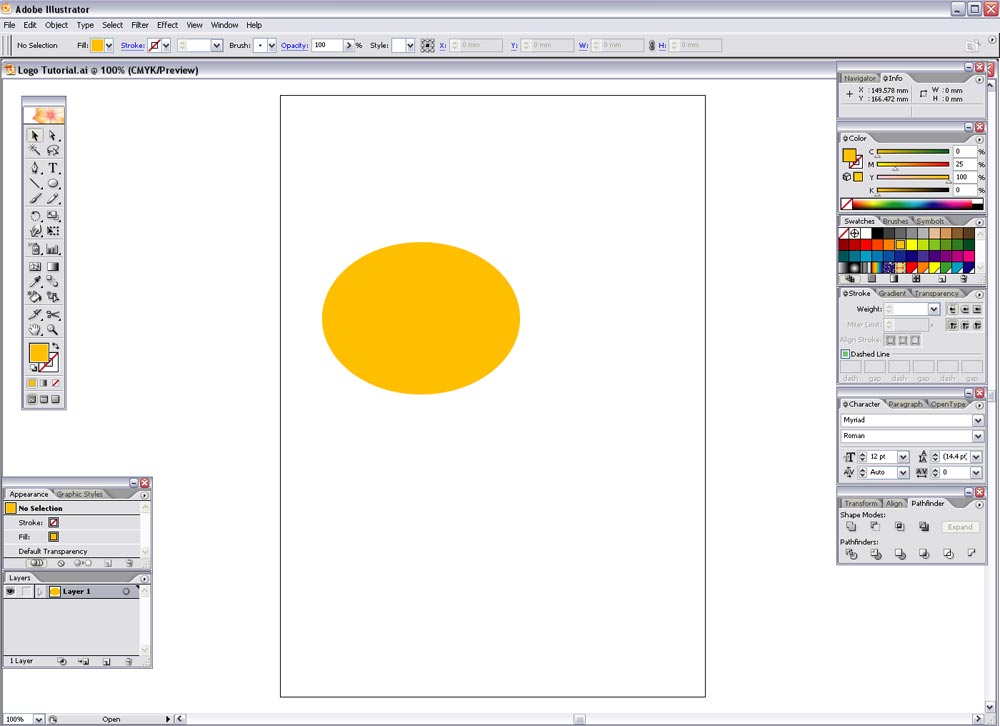
Once you have your chosen design(s) in mind open up Adobe Illustrator, and create a canvas in CMYK mode.
Use the Ellipse Tool to draw an oval shape and fill with a random colour.
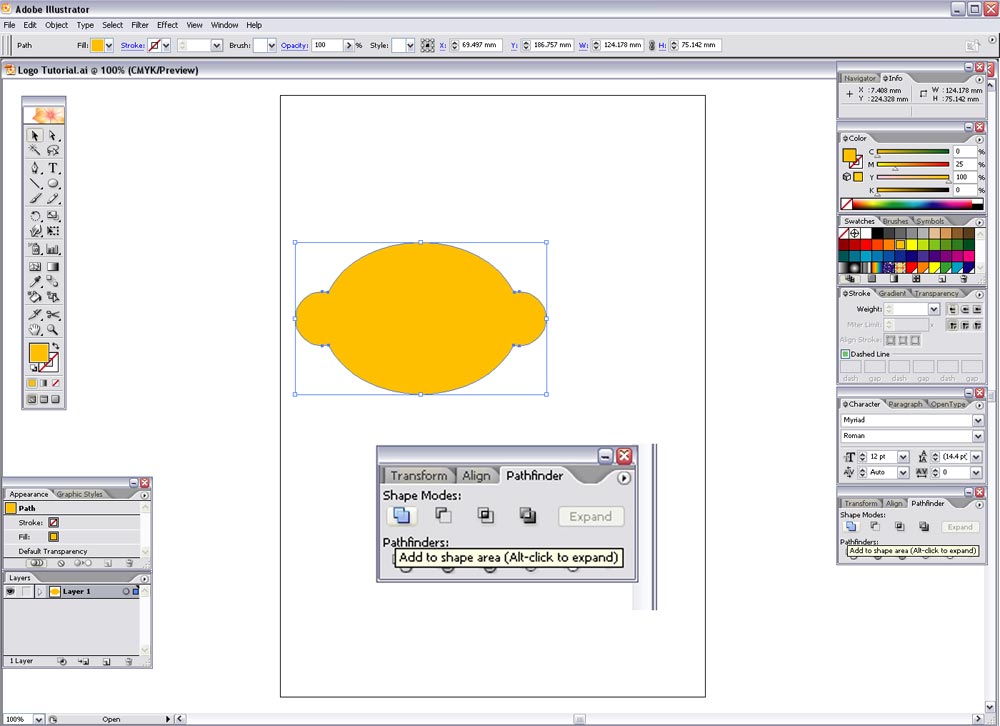
Draw a smaller circle while holding shift, then duplicate it and place them at either side of the larger oval.
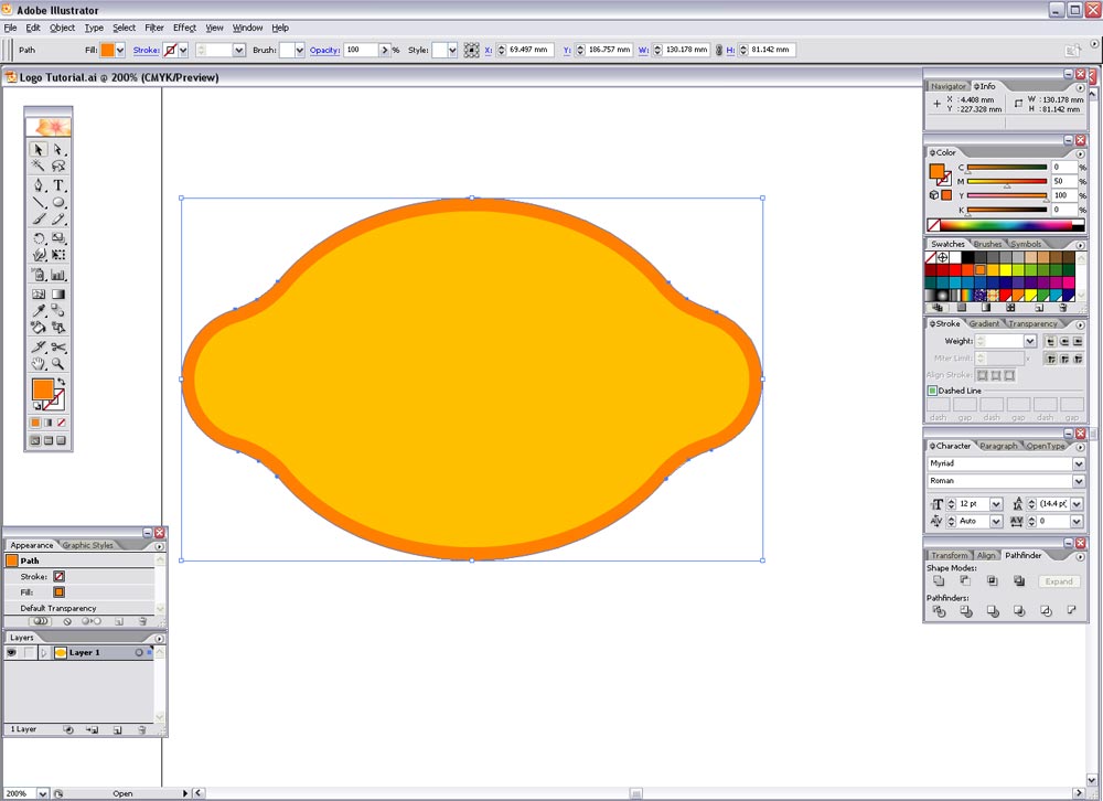
Select all three objects and select 'Add to Shape Area' with the Pathfinder tool and click Expand, this merges all the shapes into one path.

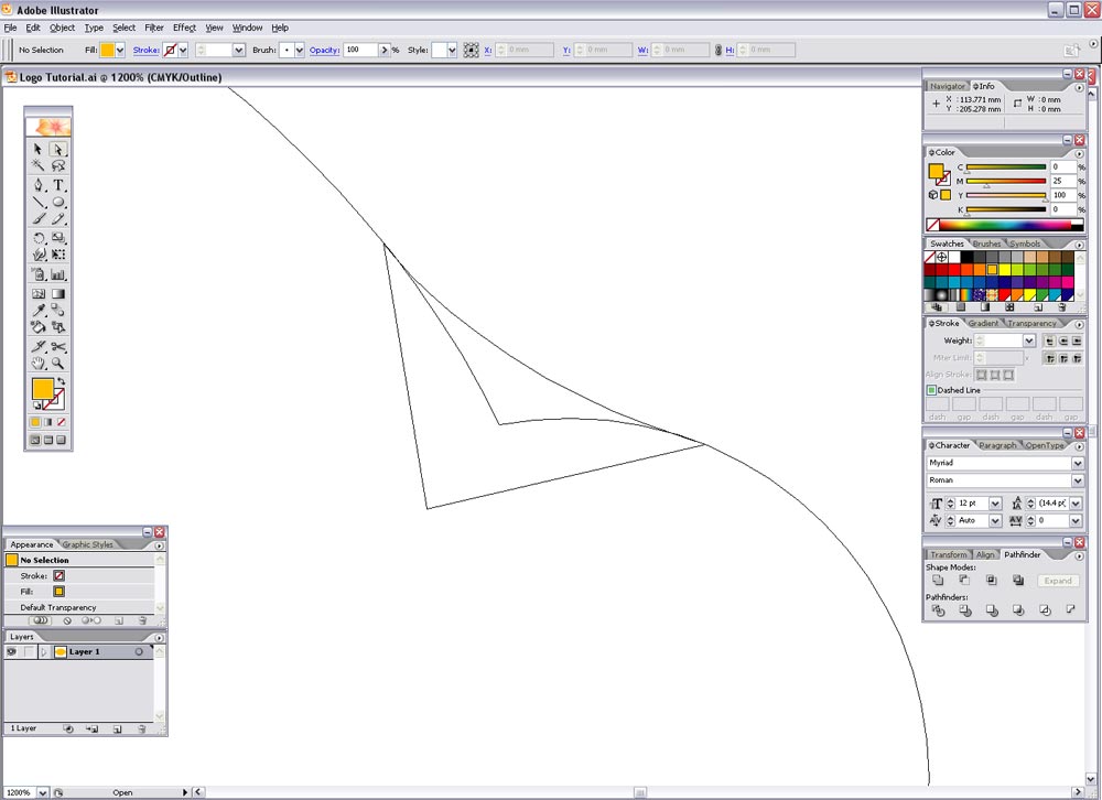
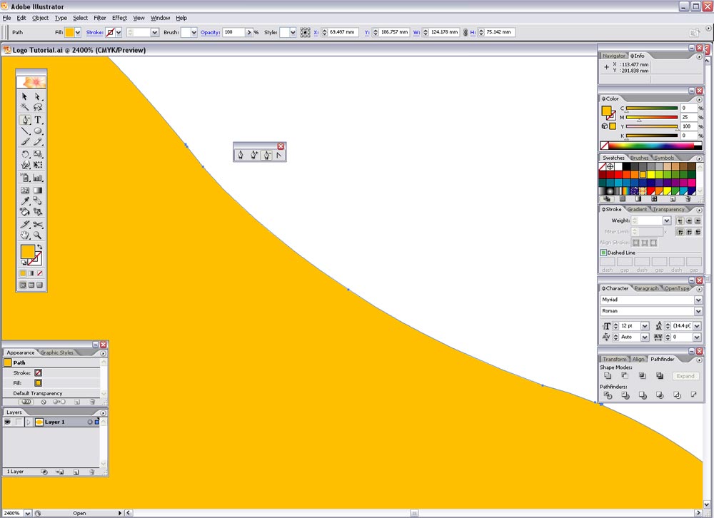
To create a smoother, lemon-style shape, draw a curved line with the Pen tool that follows the form of the graphic, and complete the path to form a shape. Repeat this on the remaining corners. It may help to toggle to outline mode by pressing CTRL-Y.
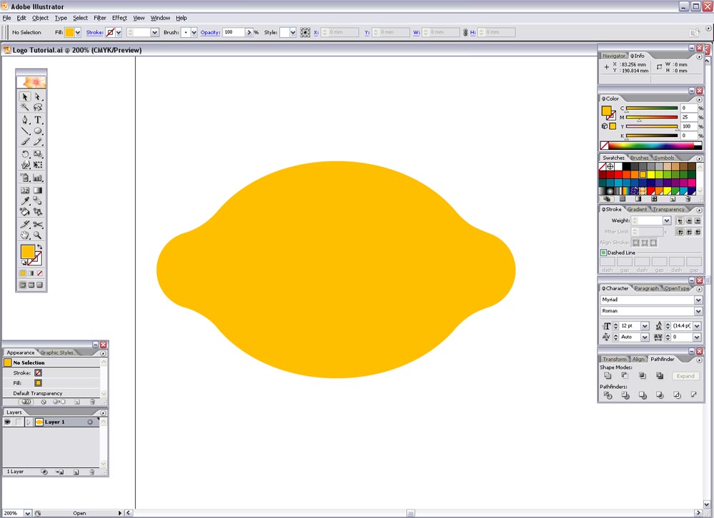
Select all the shapes and select 'Add to Shape Area' again in the Pathfinder window and Expand, this shape now looks more like a lemon!
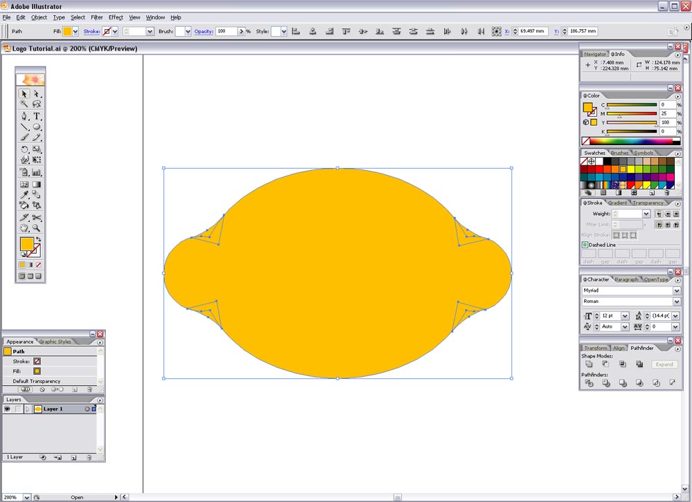
Zoom in on this shape's path and you will find a few unnecessary points, it is good practice to remove these using Delete Anchor Point under the Pen tool to give a smoother shape.
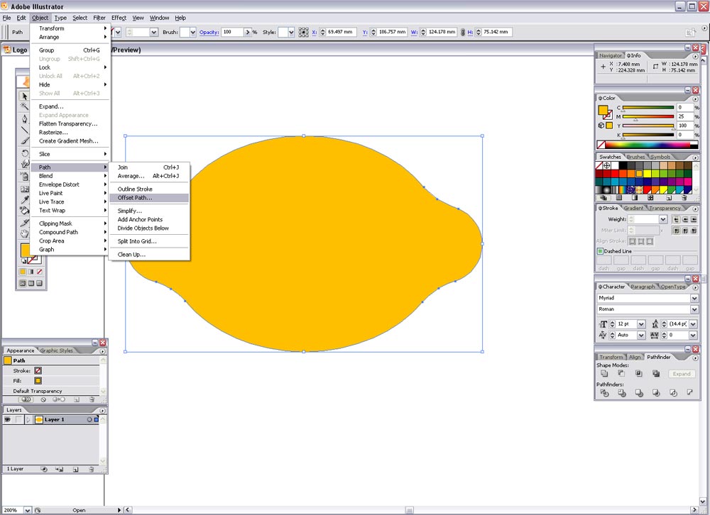
Next, select the shape and go to Object > Path > Offset Path…
Enter 3mm in the option box. Fill this new shape with another random colour.
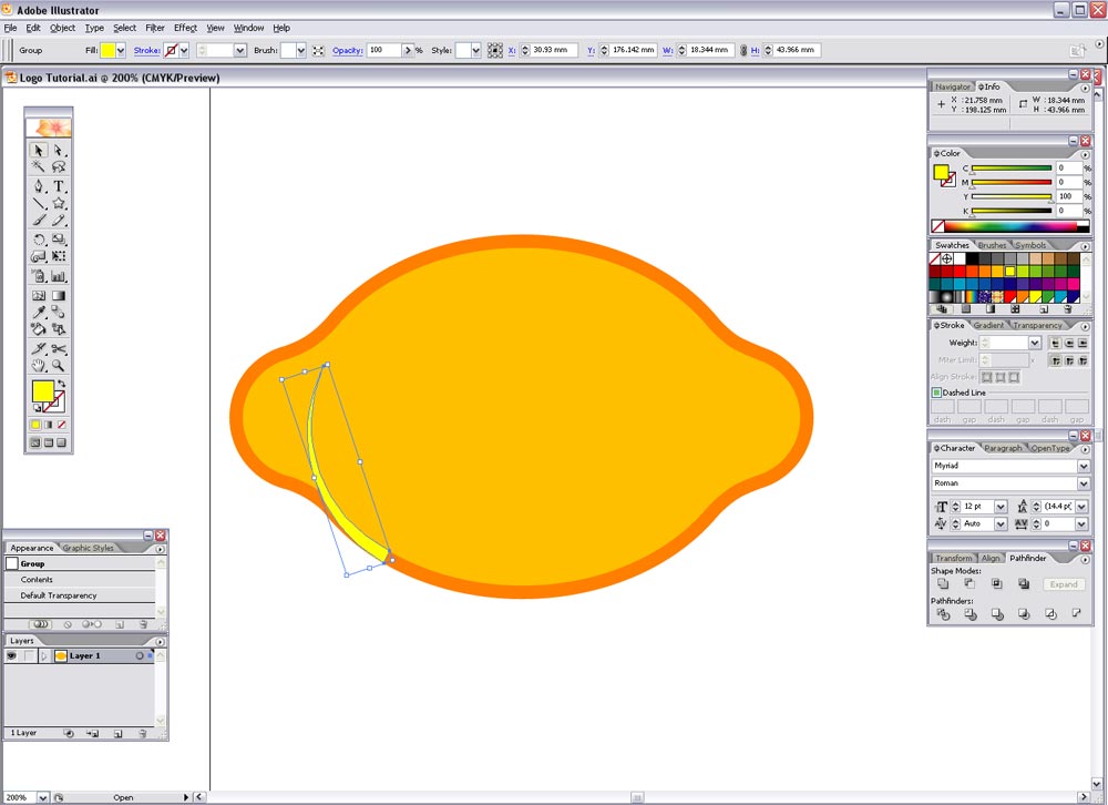
To give the impression of a bulge in the centre of the shape, two curved lines will be added, to create these select the Star tool.
While clicking and dragging press the down arrow key to reduce the number of points until you have a triangle.
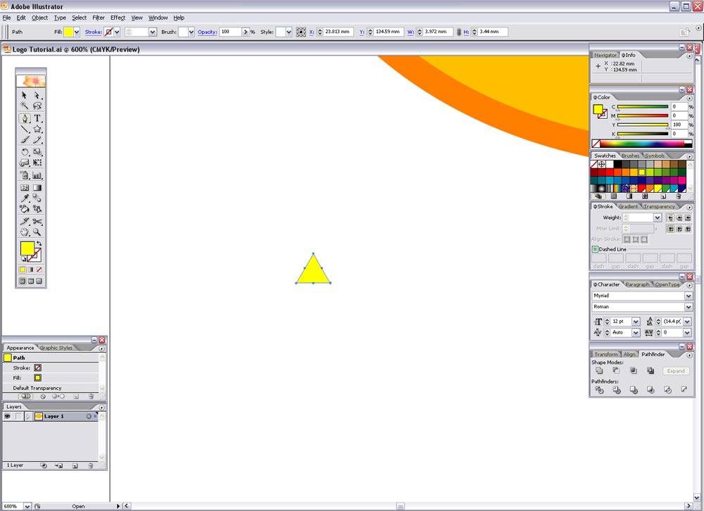
This triangle has some unnecessary points so remove them as before with the Pen tool. Then select the upper most point and drag vertically while holding shift to constrain the axis.
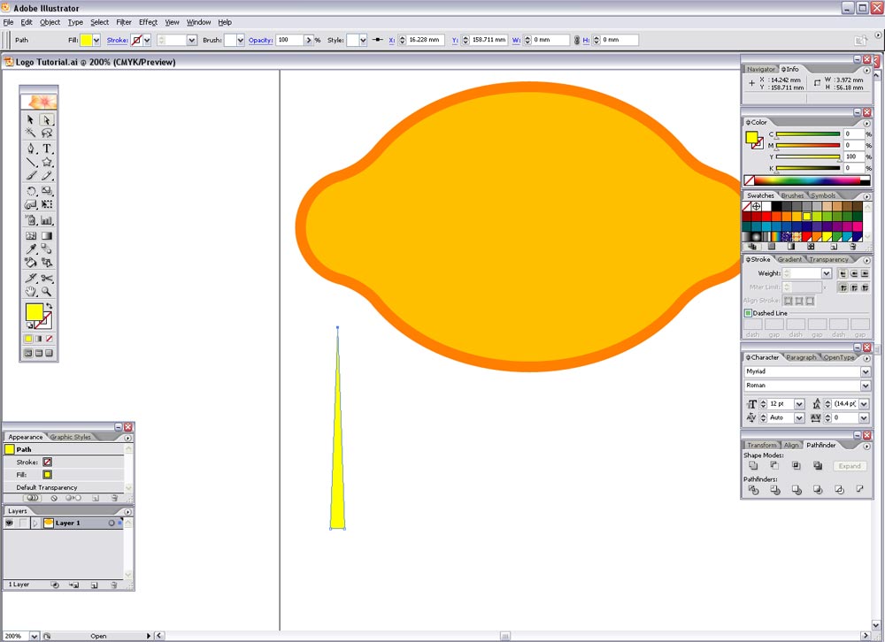
To bend this triangle go to Object > Envelope Distort > Make with Warp…
Select the Arc style and enter 50% on the Vertical axis.

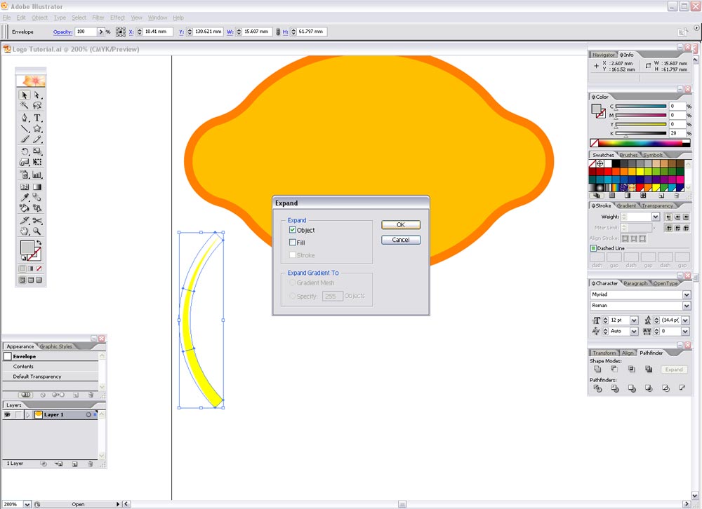
Make this new shape editable by going to Object > Expand, and select just the Object box.
Scale, reflect and rotate this shape as necessary to fit within the outer shape as shown. Duplicate and repeat on the opposite side. Then fill these shapes in the same colour as the outer shape.
Select the inner shape and press CTRL-C to copy, then select just the outer and inner lemon shapes and press use the Subtract From Shape Area tool from the Pathfinder window and expand. This has now removed the centre of the outer shape. Press CTRL-F to replace the inner shape.
This will now allow us to merge the curved lines with the outer shape by using the Add to Shape Area from the Pathfinder window, press CTRL-SHIFT-] to bring this shape to the top.

Zoom in and check for any unnecessary points that can be removed.
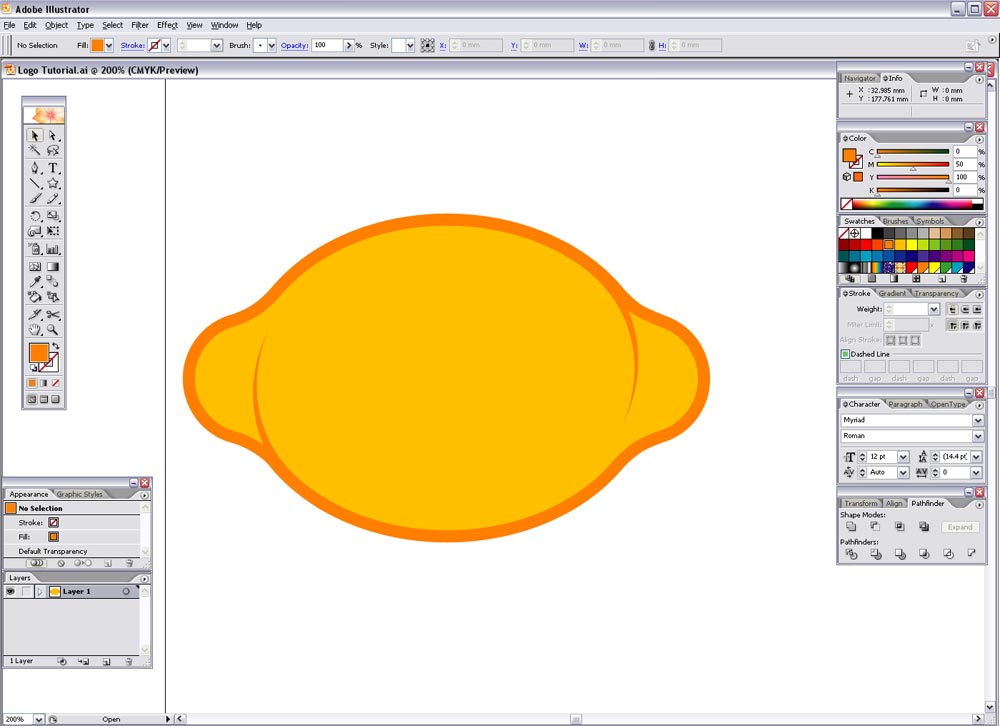
Next the lemon can be given it's corporate colours, in this example I have used a dark purple of 70C, 80M, 0Y, 0K and a lighter purple of 45C, 70M, 0Y, 0K.
Rotate the lemon to roughly 45degrees to give it a little dynamism.
Despite adding the curved lines to give the appearance of a bulge the shape still looks rather flat, a reflection may help give more of a three dimensional impression..
Draw a circle whilst holding Shift, then drag a guide along the vertical centre of the shape.
Use this guide along with the pen tool and create a triangle as shown in the screenshot.
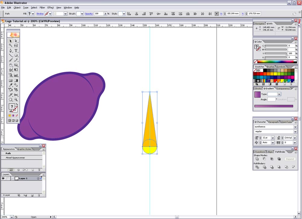
Use the Add to Shape Area tool from the Pathfinder to merge these shapes.
Give the shape a bend by using the Envelope Distort tool again (Object > Envelope Distort > Make with Warp), using the same options of Arc, 50%, Vertical.
Object > Expand > Object to make the shape editable.

Rotate, reflect and scale and bring into position on the lemon graphic, give it a light shade of purple such as 35C, 45M, 0Y, 0K.
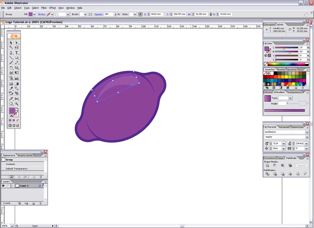
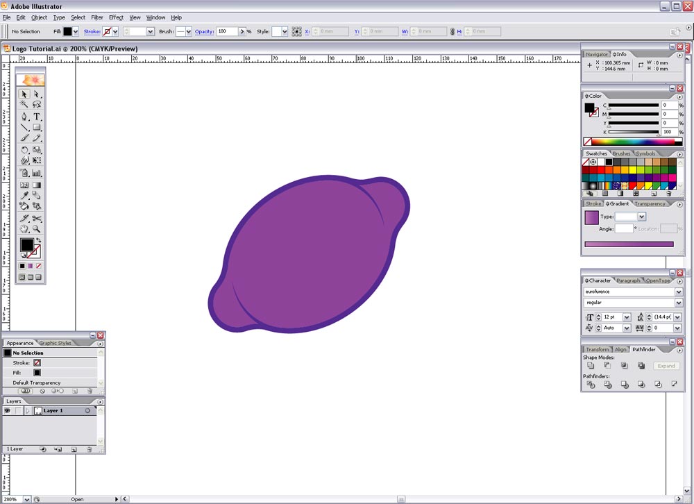
This leaves our lemon icon/graphic complete, now onto the typographic element…
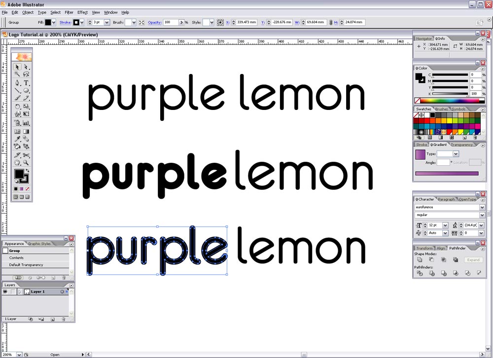
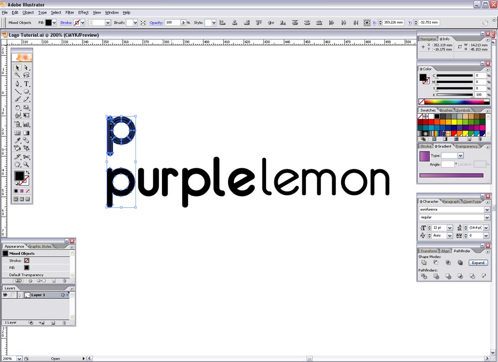
Type out the words 'purple' and 'lemon' and set in your desired font. In this case I have used a free font from www.dafont.com called Eurofurence. It's rounded appearance is similar to the popular VAG Rundschrift typeface used in many 'Web 2.0' logos and gives a friendly, modern, trendy image.
At first I used the bold weight for the word 'purple', but it looked too overweight so I set them both to regular, and used a stroke to give a slightly stronger appearance to 'purple'.
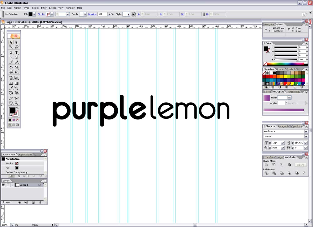
Convert the text to outlines (CTRL-SHIFT-O) and align the two words to the baseline, zoom right in and use guides or a temporary square shape to adjust the kerning of the characters by eye. Also adjust the word spacing as desired.
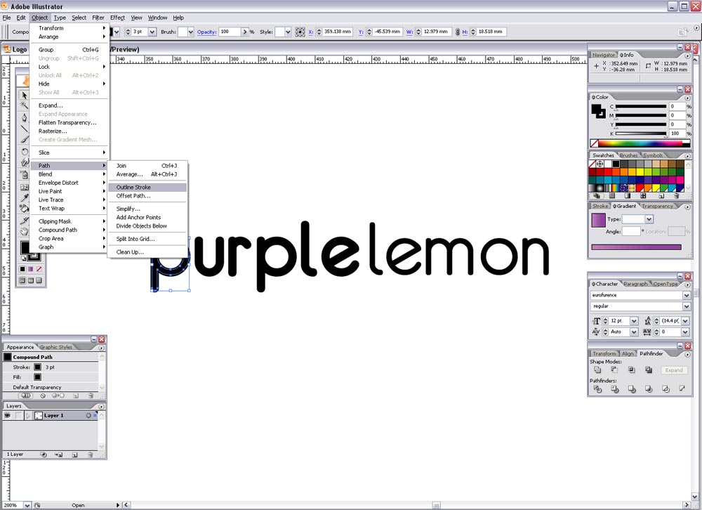
Select the word 'purple' and go to Object > Path > Outline Stroke, draw a selection across each letter individually and Add to Shape Area from the Pathfinder window. This removes the duplicate paths from the stroke we added earlier and creates a nice simple letter outline.
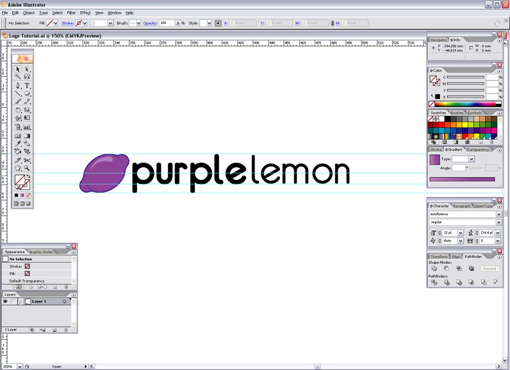
Use guides again to balance the lemon graphic with the text, scaling the lemon to fit within the Ascender and Descender lines.
Finally add the corporate colours to the text to link the design together. Then variations can be produced such as a single colour version, flat colour version and full blown glossy reflected super trendy Web 2.0 version!
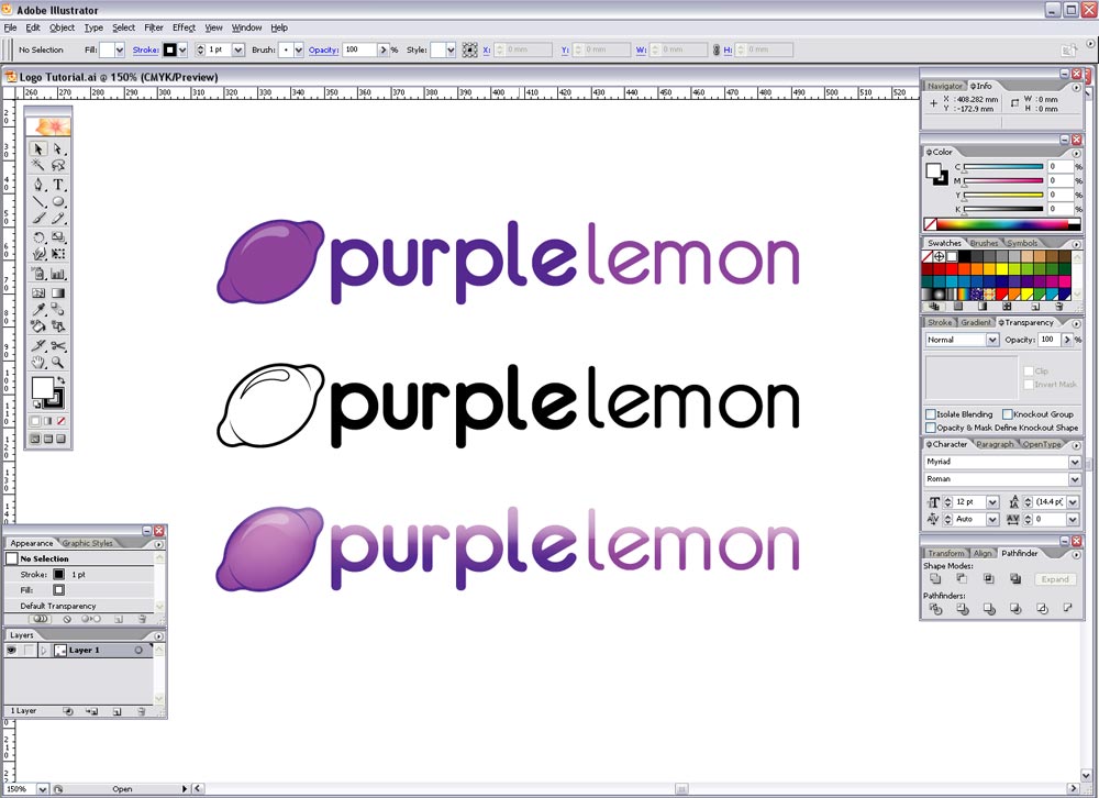
This logo now sets the theme for the whole corporate identity, where the colours, lemon graphic and typeface will be implemented into the design of the stationery, brochures, advertisements and website.
Great tutorial!
thans for this great lesson!
it ‘s great !thanks a lot
This is a very good tutorial.. Excellent quality & very informative.. Thanks a lot.
the tutorials in here are handsOn and effective…much respect
Thanks for the lesson! Very well written and easy to follow.
Can you please explain how to do this part?
To create a smoother, lemon-style shape, draw a curved line with the Pen tool that follows the form of the graphic, and complete the path to form a shape.
I can’t figure it out.
thx
DJTrex,
Hopefully this will clear things up.. take a look at this screen shot:
http://www.spoongraphics.co.uk/blog/wp-content/uploads/2007/04/4.jpg
Where the smaller circles on each side of the large oval were combined, it left sharp angles. Basically you’re using the pen tool to create the triangle shape to follow the contour of the large oval and smooth out the angles. Do this on all four corners then Add to Shape Area with the Pathfinder then you are left with a curvaceous overall shape.
Good tutorial for a beginner like me, very straightforward!
This is a really cool tutorial, can’t believe i’v only just found it!!!
respect, great tutorials, great site
nice guide
thx very much
really helped me
You help me a lot
thank you very much
This is the same process I’ve always used :) You gotta start out with sketches, it helps tremendously. Otherwise sometimes you get lost if you go straight into illustrator. Excellent TooT!
Awesome tutorial man.
This will give me some good inspiration in the future!
I stumbled across your website while building my own portfolio. You help me A LOT!!!!!!!!!!!!! Your site looks fantastic and tutorials AWESOME. Many thanks x x x
Good job.
PS I added this site into memori.ru
Hey, like your website and respect your work! Very informative articles and a joy to read.
Great site. Question: If I want to design a logotype for my business that I will eventually register as a trademark, are there potential copyright infringement issues with using existing typefaces in my design?
Thanx 4 sharing a great tutorial!
great tutorial!
i don’t think that’s a good logo. what about a reproduction in b&w. even a “web/internet or design related company” sometimes has to print its logo.
the tutorial shows a nice graphics design work but not the right way to make a logotype.
cheers, tobias
This is very informative tutorial
First of all: Great Website and great Tutorial
Now, Could you explain how to make the whole Logo look aqua (first picture)
Thank You Very Much