This post was originally published in 2010
The tips and techniques explained may be outdated.
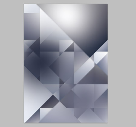
To celebrate the third birthday of Blog.SpoonGraphics, I took the time to work on a special personal design project to create a limited edition poster design to mark the occasion. Here’s a detailed walkthrough of the design process, showing how the design of “3” was conceptualised as a sketch, constructed in Illustrator and given some digital polishing with a range of final touches in Photoshop.

The whole theme of the poster is the number 3. Being the blog’s third birthday, it made sense to develop some kind of abstract design around the number three. The idea I came up with was to build the whole design out of triangles (…being three sided), and to include the number three subtly in the design (…up there in the top right corner, split into three pieces). The poster itself I planned to get printed up in a limited number and give three away to you guys and girls, the readers of my blog.
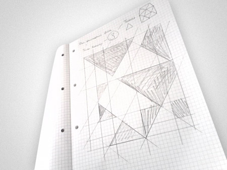
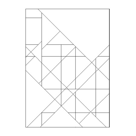
The whole idea of a tessellating pattern soon emerged out of my sketchbook after drawing a bunch of lines across the page in various angles. I noticed that these could either be left as the tiny individual pieces from the intersecting lines, or merged together to form larger triangles. It looked like a winner, so the sketchbook was tossed aside and Illustrator booted up.
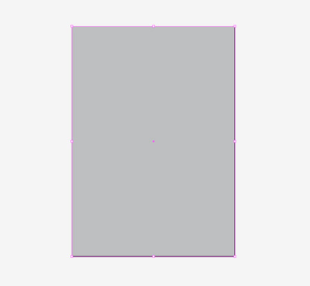
The A2 sized artboard was created and a rectangle used as a base for the graphics.
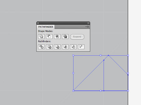
I actually tried using Photoshop during my first attempt, but soon realised Illustrator would be the tool for the job with its handy Pathfinder palette.
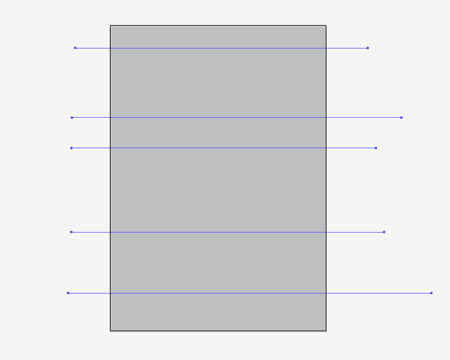
Next I grabbed the Line Tool and drew a bunch of randomly placed horizontal lines across the artboard. Holding Shift ensured everything was straight.
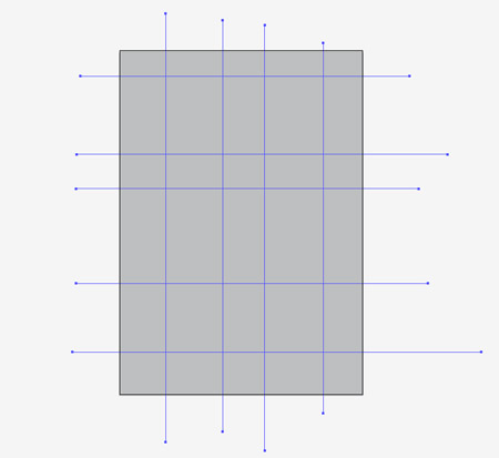
I continued drawing lines, but this time drawing them vertically across the design.
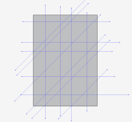
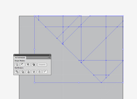
A range of triangles soon started to take shape when diagonal lines were added to the design…
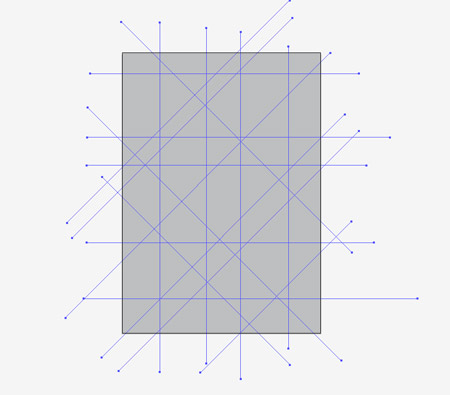
…and after some more lines in the opposite direction, I had a good number of triangle shapes to work with.
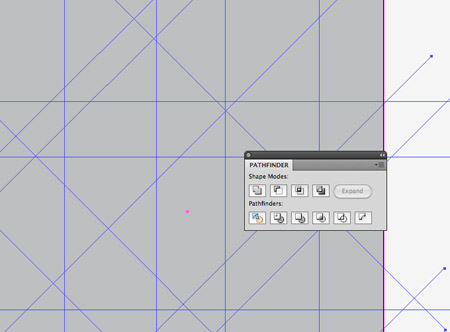
The next step was to use these lines to intersect the grey rectangle and create a bunch of solid shapes. Once everything was selected, a click of the Divide option from the Pathfinder palette did the job nicely.
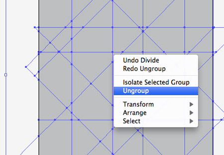
The pathfinder palette tends to group items together once they’ve been manipulated, so ungrouping them would allow access to each individual shape.
The pathfinder also divided the overlapping lines, so to clean up the design anything outside the document artboard was deleted.
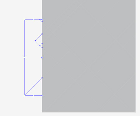
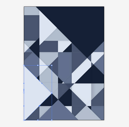
The design so far is made up of lots of small shapes, but larger triangles could be created by merging multiple items together.
Some section of the design were created by merging together lots of pieces, the biggest being the top right corner where the number three would later appear.
Once the design had a good mix of large and small items, it was time to remove the grey and prepare a colour scheme.
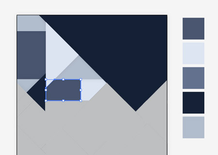
I had in mind that I wanted to use a blue/grey colour scheme that had a steel feeling to it. A quick search on ColourLovers.com soon brought up this cool palette. Each shape of the design was selected in turn and given a swatch from the colour scheme.
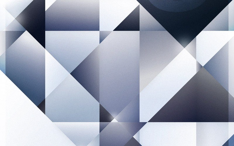
Once every shape had a colour fill, it started to develop a kind of stained glass/kaleidoscope/diamond pattern… which was pretty cool!
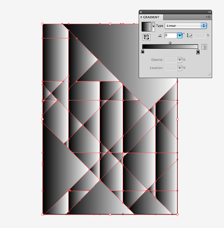
So far the design looks pretty boring with a bunch of flat colours, so the whole lot was copied onto a new layer and a black-white gradient fill added.
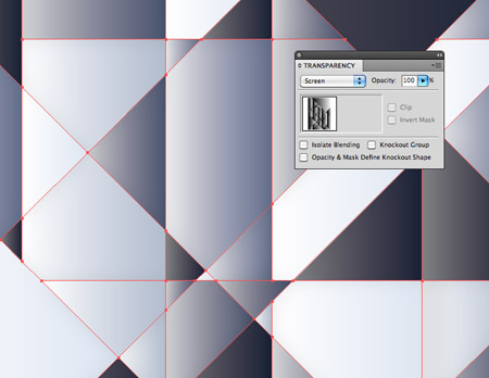
Changing this layer’s blending mode to Screen allowed the gradients to interact with the colours, adding changes in tone and a touch of depth to the shapes.
Ever shape had the same gradient direction, which looked a little too uniform, so every shape was manipulated with the gradient tool and the angle randomly changed.
Some gradients flow vertically, whereas others flow horizontally. The randomness adds to the depth, allowing some shapes to stand out more than others.
This was as far as the design could go in Illustrator, so it was time to export it as a high-res Jpeg, wait for the file to save then upon it up in Photoshop for some extra polishing.
One of the first touches I added in Photoshop was to add a few dabs of colour over the design. Once these were changed to Overlay, it gave extra levels of light and shade that aren’t noticeable on the design, but the design lacks their addition if the layer is turned off.

A few dabs of white with the brush tool created a few highlights, giving the design a bit of sparkle. Everybody loves a bit of bling.
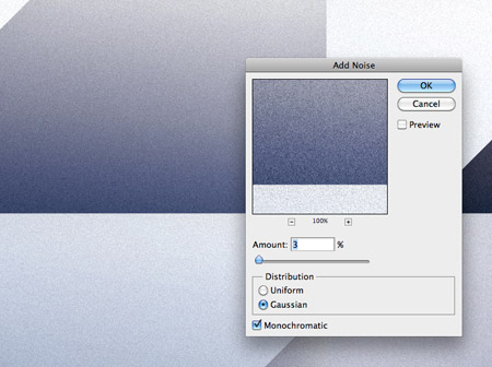
Vector shapes are always nice, crisp and smooth. But I always like to add some subtle textures to rough things up a little, giving that tactile feel of something life-like.
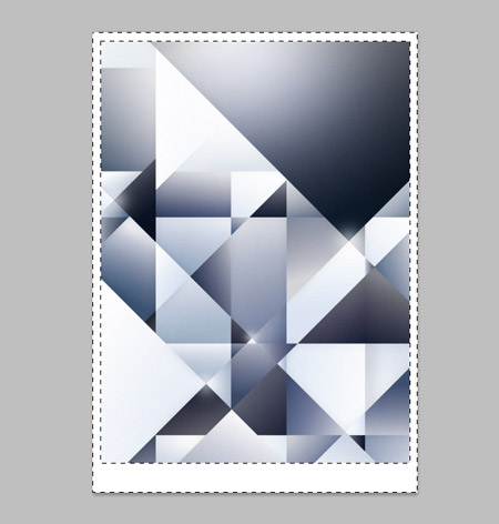
A simple border was added to the outsides, both to frame the design and to give somewhere to place the title and textual information about the poster. Changing this to Overlay also helped it interact with the colours and textures, helping it blend in as part of the design.
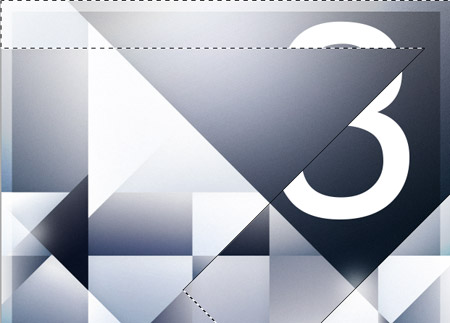
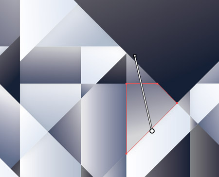
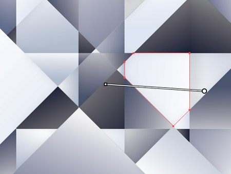
A large number three was added to the top corner, then was cut up by following the lines from the artwork with the mask tool.

Changing the layer to Overlay and dropping the opacity helped create the subtle appearance I was after, and a few dabs with the brush tool on a layer mask further helped disguise the number.

A few highlights on the corners of the number added some sparkle and changes in tone. These were then set to Overlay and the opacity reduced to allow them to blend in subtly.
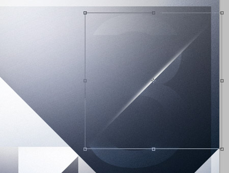
The main diagonal line was then emphasised with a shard of light, which was squashed and stretched into place. Once again the layer was set to Overlay and the opacity reduced.
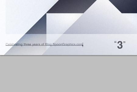
The finishing touches were them added to the bottom frame. A short description, the title and a small logo is all it needs.
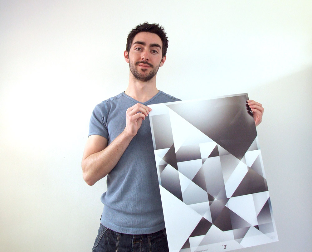
The whole design was then flattened and saved as a TIFF file. Being a low number of prints it was printed digitally at A2 in size. Now who would like a free poster?!

Great article Chris, I will be trying out some of those techniques later
Chris love your artwork its really awesome i will use this trick maybe in my coming poster design
Thanks for the breakdown Chris. Great result. I love the subtle touches … really makes a big difference.
Hey Chris,
Have you given away your posters yet? or what? when? how?
Anyway, interesting piece of art. And sorry… but I won’t use this technique in my coming poster or anything… because I respect you and “uniqueness is part of beauty” (ooh! i feel smart now).
Cheers!
Original idea! is a really nice project, congratulations!
A great, simple process with a really effective outcome. I enjoyed this post immensely.
Really nice insight into the process behind the poster Chris. Definitely gives a few new ideas for future projects.
rlly rlly great work <3 i love your blog!
thnx for really breaking it down …
Wow. I love it!
Nice tutorial is great chris
Yet again some great inspiration, Chris!
Cheers
Yet again some great inspiration, Chris. Congrats on three years of blog.spoon graphics!
Cheers
really cool design
something between classic and modern poster !
thx
really cool design …
something between classic and modern poster !
thx
Great Poster Chris! I love your blog!
Happy Birthday Blog.SpoonGraphics
A great tutorial Chris. Gave me some ideas for designing my own poster artwork for home decor ;]
Could you recommend a good printer for A2 size posters?
Love the thought process behind this design- very insightful. This poster is definitely futuristic, yet amazingly retro. Thanks for showing all the tricks! There are so many ways to express an idea (as well as something concrete) without designing it in such a literal sense. Lovely work.
Thanks for the kind comments everyone. The winners of the poster were drawn the other day. Congratulations to Roland Van Paridon, Jodie Richelle, and Sergio Filipe!
I love it, THANK YOU FOR SHARING!
Nice Poster, what Camera did you use to shot the image of your self with the poster?