This post was originally published in 2010
The tips and techniques explained may be outdated.
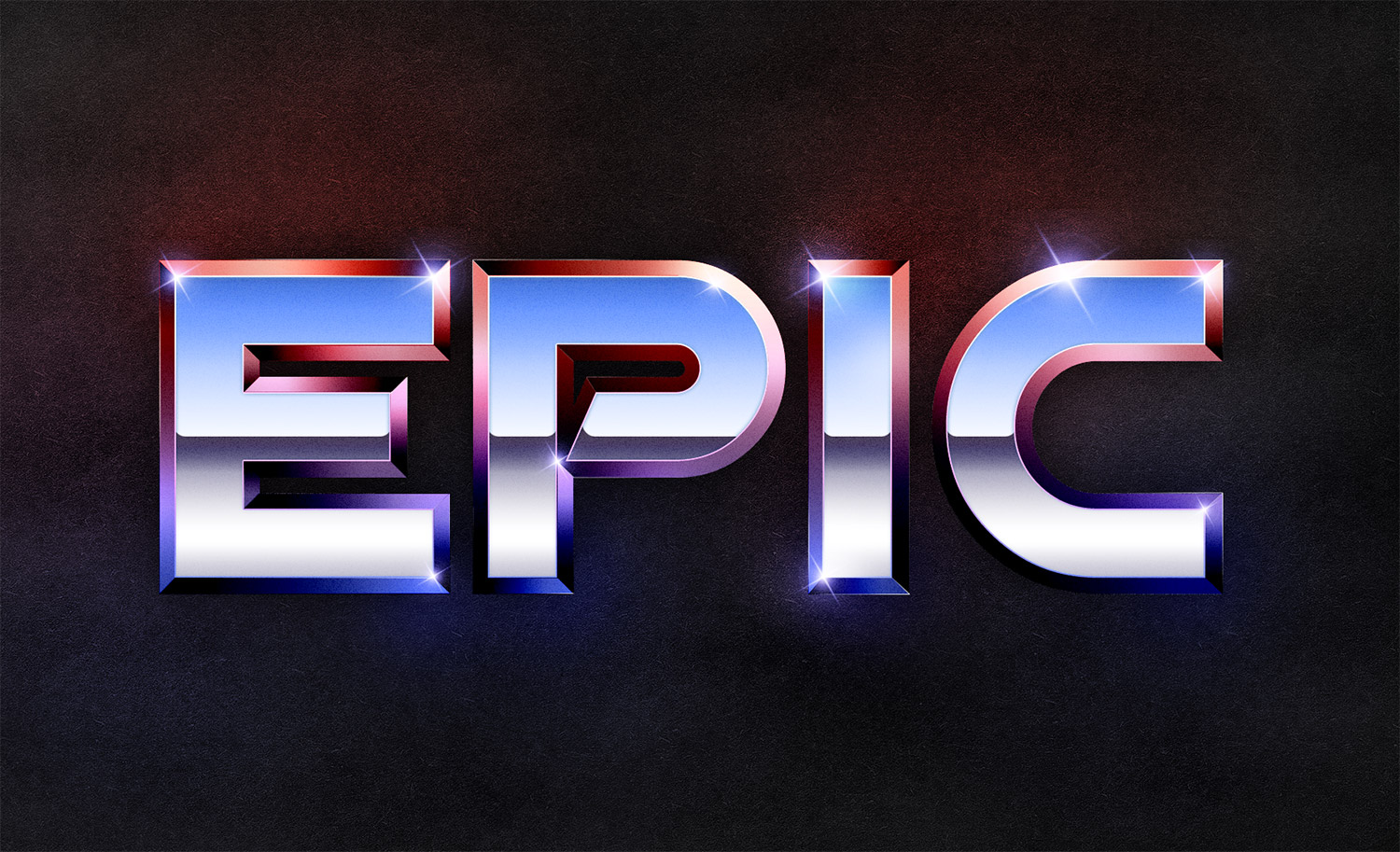
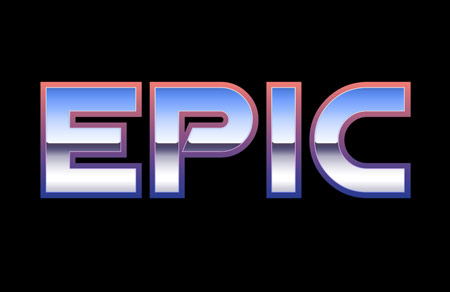
It’s funny how trends reappear through the years. The bright and shiny chrome text effect could be found everywhere in the 80s, then it disappeared altogether when people realised how hideous and gaudy it was. Recently though, this text styling seems to be making a comeback in the world of digital art as the 80s generation are implementing inspirations from their childhood into their designs and artworks. Follow this tutorial to recreate the epic metal text effect for yourself, making use of modern day digital design techniques in Photoshop.
Watch the video
Subscribe to the Spoon Graphics YouTube Channel
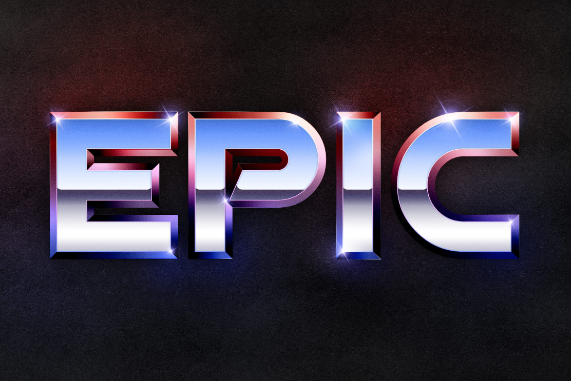
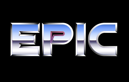
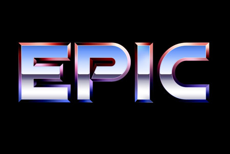
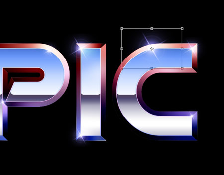
View full size artwork
1980’s Inspiration
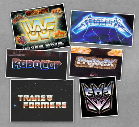
WWF Wrestling, Metallica’s Ride the Lightning album, Robocop, Amiga games and Transformers are all examples that I can relate to. As a little initial research, collect a few logos and graphics to refer to when creating your own text effect. Look closely at the colours used, the style of text and what seems like a desert landscape in the reflection of the text.
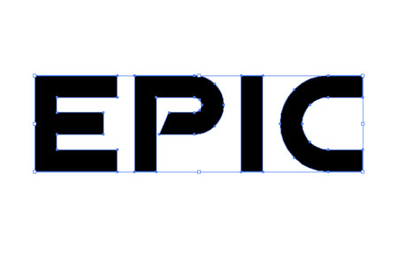
We’ll begin in Illustrator for the first couple of steps to lay out our type. Set out the wording of your choice in an appropriate font and convert the text to outlines (CMD+Shift+O). Here I’m using the font Viper Squadron, and the word ‘Epic’.
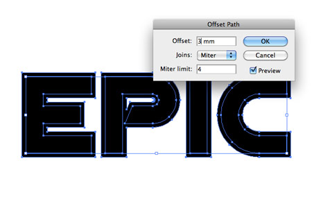
With the shapes selected, go to Object > Path > Offset Path. Enter 3mm in the options box. Right click on the objects and select Ungroup.
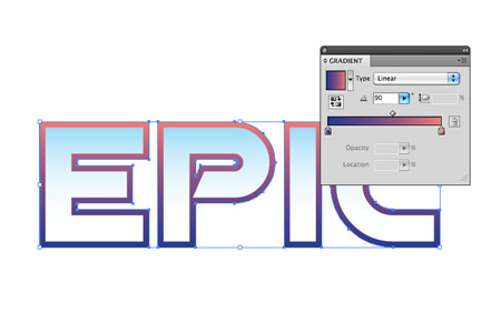
Add a couple of basic gradient fills to the two shapes to make it easy to identify them. A sky blue to white on the inner shape and a red to blue gradient on the outline will do the trick.
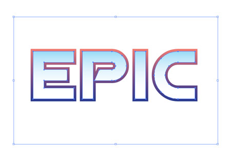
Draw a temporary rectangle around the text, then select this along with the outer shape. Paste the objects into Photoshop. Repeat the process but this time with the inner shape. The temporary rectangle will maintain the proportions between the two objects when copied through to Photoshop.
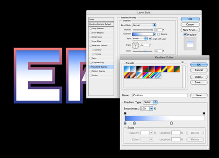
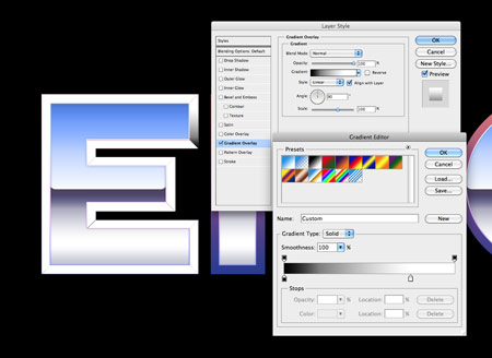
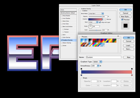
Double click the inner shape layer and begin adding some layer styles. Start by replacing the fill with a Gradient Overlay. Use dark blue (#426bc7), light blue (#719cff) and white (#ffffff) swatches and run the gradient vertically from the top.
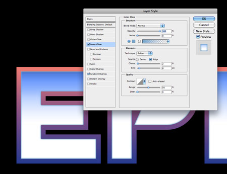
Next, add a soft Inner Glow using a mid-blue (#76a5cd), set the opacity to 100%, blending mode to Normal, size to around 8px and add a 2px stroke to accommodate the stroke in the next step.
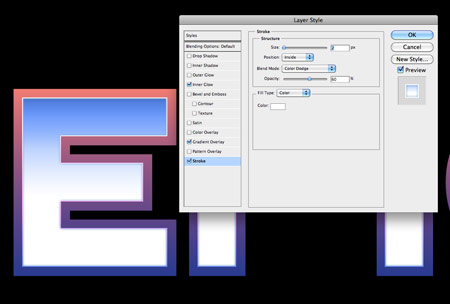
Add a 2px stroke in white, then set the alignment to the Inside and blending mode to Color Dodge. Adjust the opacity to around 60%.
Hold the CMD (Mac), or CTRL (Windows) key while clicking the thumbnail of the inner-text layer to load the selection. Grab the Rectangular Marquee tool and hold Alt while dragging a selection across the upper portion of the text, leaving just the lower half selected. Fill this with white on a new layer.
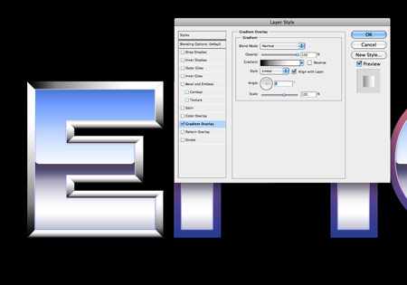
Double click the layer to open up the layer styles and add a vertical gradient running from dark indigo (#261528) to mid-indigo (#241e53) to white (#ffffff) to a very light indigo (#b6b4c7).
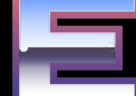
Zoom right in and draw a circular selection at each end of the reflection gradient layer on each letter.
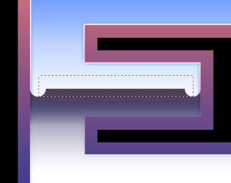
Use the rectangular marquee tool to remove the middle portion between each circle. Repeat the process on every other letter.
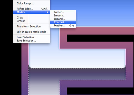
Load the selection of the reflection layer, then go to Select > Modify > Contract. Enter 2px to reduce the mask size to accommodate the stroke, then inverse the selection (CMD+Shift+I) and delete.
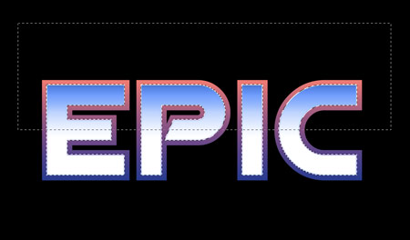
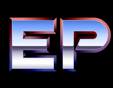
The text is beginning to develop some definition with the gradients and stroked outlines. Now let’s start work on the chamfered edge.
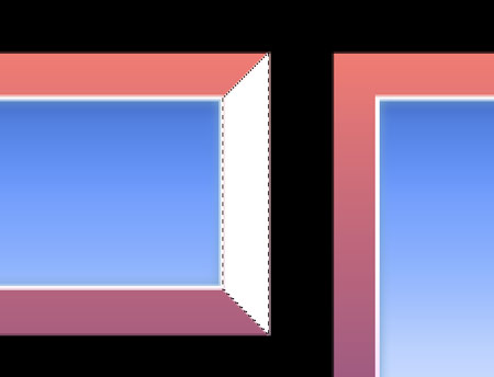
Zoom in and draw around each edge of the outer outline with the Polygonal Lasso tool. Close the path by cutting diagonally across the outline at each corner. Fill each edge with white on individual layers.
Add a simple black to white gradient on one of the shape layers. Right click the layer and select Paste Layer Style, then select all the other layers and paste the same layer style.
The gradient is running in the wrong direction on the horizontal shapes, so tweak each one by adjusting the angle of the gradient fill.
Repeat the process on every other letter. Aim to contrast black against white on each shape to highlight the diagonal edge lines.

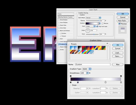
CMD-click the layer of the original outline shape and fill a new layer with white. Then CMD-click the original inner shape layer and delete this selection from the fill.
Replace this white fill with a blue (#283891) to red (#f07b71) gradient using the layer style options.
Change this layer’s blending mode to Linear Burn to allow the gradient overlay to replace the colour of the white to black gradients underneath.
Dab a few spots of white across the text to add a variety of highlights and tones. Load and inverse the selection of the text layer and delete out the excess from the highlights layer.

On a new layer, draw some 1px white lines across the straight edges of the text to act as highlights.
Add a layer mask to the highlighting lines layer and erase out the ends of the lines with a soft brush.
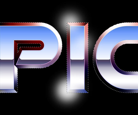
Find a stock lens flare and paste in multiple copies to highlight the edges and corners of the text.
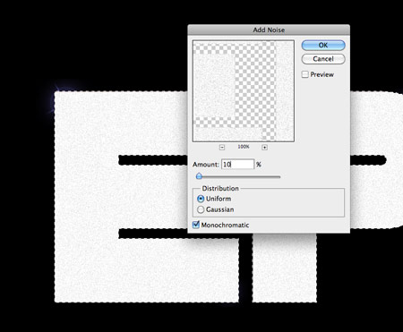
Load the outer text selection and fill a new layer with white. Add a Noise filter (Filter > Noise > Add Noise) with the settings 10%, Uniform & Monochromatic. Change this layer’s blending mode to Color Burn to allow the texture to interact with the text.
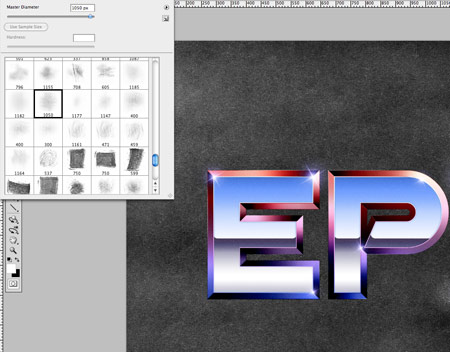
The text effect is just about complete, but let’s finish off the design with a subtle background. Use some Subtle Grunge Brushes to add some background texture to the design. Reduce the opacity down to around 30%.
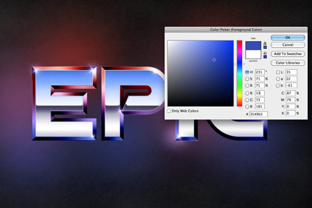
Dab some large spots of colour above the texture layer, but below the text. Use samples of blue, red and purple from the outer edges of the text.

Change the blending mode to Color Dodge at 80% to allow the colours to interact with the textured background.
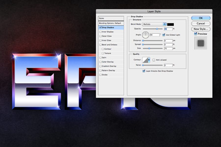
Finally add a soft Drop Shadow to the outer text outline layer to anchor the text with the background.

Wow. That takes me back a while. I had forgotten about those. Thanks man. Not the most fanciest thing these days but an epic read nevertheless
Classic! Thank you for this tutorial!
yea… nice retro stuff ;D
Nice work Mr. Spooner!!!
very good site…;)
Nice – I’ve got an invite for an 80’s fancy dress party to do soon – this will come in very handy…
nice, could have been better with a scrachted textured overlayed, and the it could be a little bit more.
:P
What a great talent you have presented here.. Thanks
oh yeah.. transformers! thanks for writing this tutorial!
wow all posts are awesome, :)
wow, nice tutorial! thx
nice tutorial, thanks
Man that’s awesome! I’m actually beginning to notice you’re quite 80’s driven these days, crazy tutorial man. :)
Great tutorial. It brings me back.
wow, futuristic
awesome tutorial man. i might try and replicate this for my next site.
Damn so Amazing as Ever! Thanks
Hawtness!!!
Very nice Tutorial, thanks for sharing !
Does look very cool in that fabulous 80’s way! thanks for sharing!
Great Job!! Many thanks for keep sharing free stuff!
Fantastic tutorial Chris, will be doing this one.
Thanks Chris! Reminds me the good old days =)
You always doing fantastic things!!! Keep posting!!!!!
Epic.
Owesome and simple. Thanks for this tut. Goold Luck!
Nice website and tutorial man. I’m gonna try this now =].
cool and simple. thanks.
NICE ,I WILL BOOKMARK
I was just starting, I thank you very useful help
awesome! love it! this gives me a great idea for a logo design …
Wow, this certainly is “EPIC.” I’m having childhood flashbacks. Nicely done!
Hi. Thanks for the great tutorial. I combined both this and the sci-fi composition to make a fake gaming magazine cover. http://fav.me/d2thno7
Made myself a TRON background using this technique.
http://uploads.mibbit.com/sSyDy1.jpg
I always have trouble with the gradient editor. Epic!
It’s amazing how much that little curve at the ends helps! Nice.
i’m probably the dumbest designer here, but there are a couple of things with this tutorial that have totally turned me upside down.
1) a 3mm offset path doesn’t look anything like the example – it’s much bigger. i would recommend a 1mm offset path, which is what the tutorial seems to use.
2) the first step after creating all the bevels (the example image is “epic” in all white with the inside paths selected) is confusing as hell. i tried following the directions as given, “CMD-click the layer of the original outline shape and fill a new layer with white. Then CMD-click the original inner shape layer and delete this selection from the fill.” but it didn’t work. so i’ve tried every logical thing i can think of, mind reading basically, to no avail. at this point i’ve spent 6 hours on one word (not “epic”), and appear to be hopelessly stuck.
can anyone offer me some guidance?
Im usin CS2 and theres a tick box with blend interior effects as a group.
make sure thats ticked.
worked for me
you don’t even really have to do this, just make sure the layer with the larger letters is below the layer with the smaller ones. here’s an explanation anyway.
basically you’ve got to take out the smaller letter shape from the larger one. make sure you’re on the smaller letter layer and use the magic wand to select the area around them (if you’ve got letters with holes make sure to select that negative space too). now inverse your selection (CMD + SHIFT + I). with this selected switch to the layer with the larger letters. now you can use the eraser or just hit delete to get rid of the area. what you should have is a letter outline.
hope that helps you.
brilliant thanks
This tutorial is simple enough for the most amateur user to comprehend. Thanks for sharing this.
Cool, just cool
Awesome! You make something that looks so incredible seem so easy to create!