This post was originally published in 2011
The tips and techniques explained may be outdated.
I recently updated my avatars and social profiles with some new photos of the 2011 Chris Spooner. I’m by no means a pro photographer, but the photos came out pretty well if I do say so myself! The key was all in the post processing and colour correction. Follow this step by step walkthrough of my editing process to see how I transformed my basic photos into bright and crisp profile shots.
I’ve already mentioned that I’m by no means a pro photographer. The equipment I have is very basic, and the shots themselves are to be used for nothing more than online avatars and social profiles. The pro techniques will most likely include RAW files that can be tweaked at a higher level before even being imported into Photoshop. This guide is aimed at the amateurs like me, who want to make do with what they have to hand and achieve the best results.
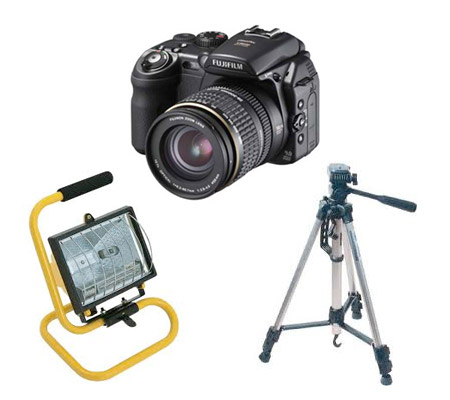
First up we actually need to take a photograph. There’s essentially three things you’ll need: 1) A camera (I use an old Fuji 9600 entry level camera). 2) A tripod (Unless you have a photography studio or a set of lamps it’s likely you’ll be shooting in low-light conditions. 3) Some kind of DIY work lamp. My photos were taken in my living room against a plain grey wall. I use the window for the majority of the lighting with the blinds altered to tone down any shadows. The DIY work lamp is positioned at the other side of the room to balance out the lighting from the window.
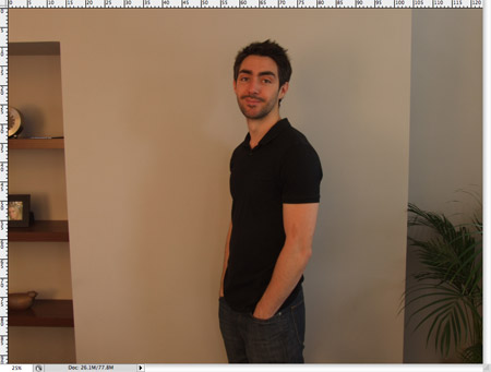
The raw photo file is nothing special at all. Being a basic camera the white balance is completely off and the photo is overall too underexposed. Not to mention that ugly guy in the middle ruining the whole thing!
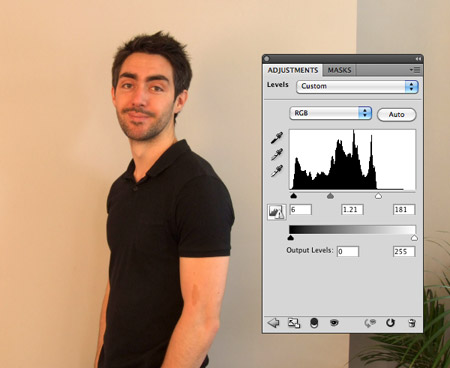
Create a Levels adjustment layer from the menu at the bottom of the Layers palette. Adjust the white coloured slider to clip the highlights to the end of the histogram. This will brighten up the overall image. Tweak the blacks to fit to the start of the histogram and adjust the greys to balance out the general tone.
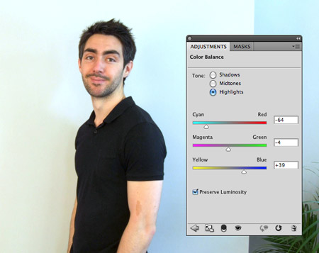
The step that completely transforms the image is the addition of a Color Balance adjustment layer. Begin with the Highlights and move the sliders to correct the tones of the image. My original had an orange tone, so really pumping up the cyan and blue helps bring back the correct hues. Go through the Midtones and Shadows and move the sliders while visually analysing the difference. Usually it’s only the highlights that require major adjustment.
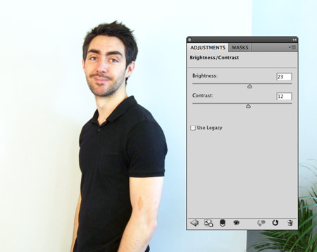
Next a Brightness/Contrast adjustment will help brighten up the image to reduce the background shadows, while the contrast will give more definition to the image.
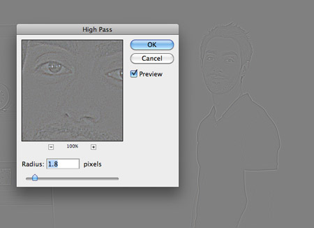
Once all the adjustment layers have been carefully tweaked, press CMD+A to select all, then CMD+Shift+C to copy. Paste this image on a new layer then go to Filter > Other > High Pass. Adjust the slider so the details are just visible from the grey.
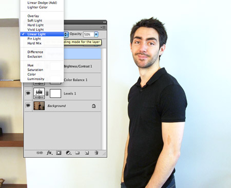
Change the blending mode to Linear Light and adjust the opacity to tone down the effect. The High Pass overlay really helps sharpen up the image and bring out the details.
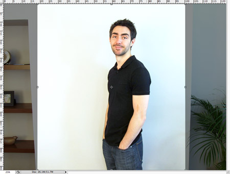
Use the Crop tool to remove any unwanted items from the background. Luckily the fairly large empty wall from my photo allows for a decent sized image.
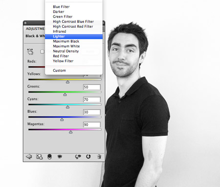
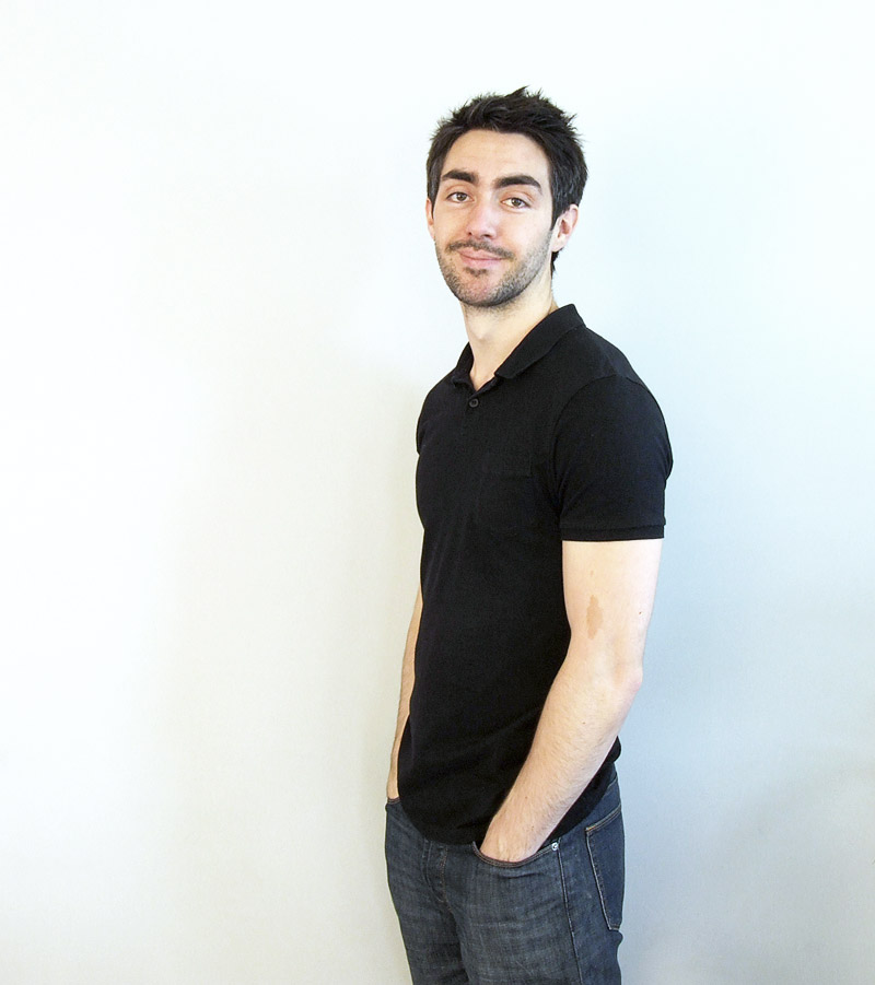
Your photo could be saved and exported right now, but there’s one extra step that can give that trendy fashion effect. Add a Black and White adjustment layer with the setting changed to Lighten.
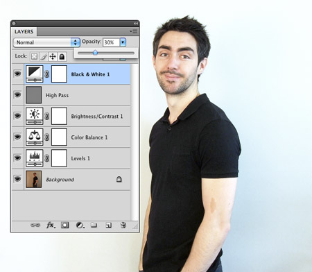
Reduce the opacity of this Black and White layer to around 30% to desaturate the underlying image, but retain a wash of colour. Don’t go too far though, or you’ll end up looking dead!
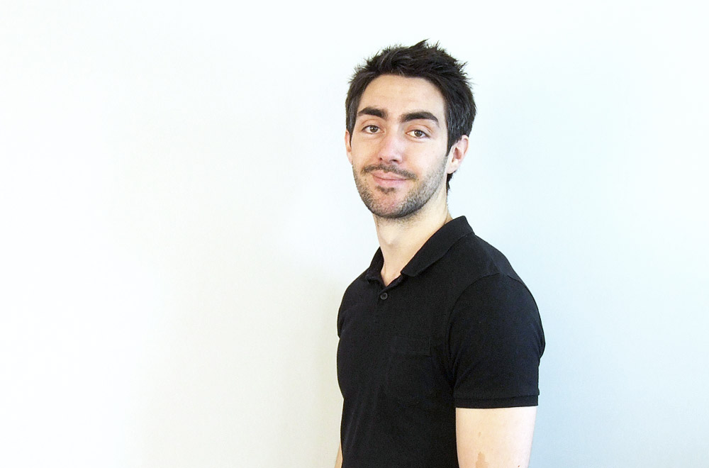
The final photo is a complete transformation from the orange/brown dark/underexposed raw photo, but a quick few tweaks in Photoshop soon brought it to life so it can be used for your various social profiles and websites.

Thank you for the post, I had the same problem with my photos, and always messed up with it while editing it, this one will relay help me out thank you once again.
The High Pass will be useful for me. Thank you.
I am loving this! I will be referring to this for the next 10 years I am sure of it ahah!
Thanks for sharing your process of editing.
I finally found another person who doesn’t use curves every time.
Great tutorial for beginners!
I needed a tutorial like this for the photos in my portfolio! Thanks for sharing it!
surprising to see the before and after a touch so simple but so effective. Congratulations
Great tutorial Chris, have really found your photography tuts very helpful in the past. This one really shows what sort of crisp result you can achieve in a few simple steps.
I’ll try this in a few days when i got my camera back =)
wow nice simple tutorial, didn’t know you knew how to photo edit :P
you are the best!!!thanks!!.
Amazing article! Very creative and very helpful! Thank you!
Where’s your hipster designer glasses? lol
Amazing article! Very creative and very helpful! Thank you!!!
Great post, very handy for getting good lighting!
Love your blog Chris. This has actually helped me a lot!
Nice Tutorial Chris.. Simple and direct… Thanks
Danke für die Infos !!! aber welches Programm benützen sie umd die Bilder zu bearbeiten ?
nice post! it is great pleasure to visit your site. thanks!!
The Black and White Adjustment layer really cool. Loving it.
Thank you from Argentina Chris!!!
Really great tutorial, short and very useful.
Added to my bookmark for the future :)
Very nice tutorial for beginners … love it! Thank you :)
WOW!! Cool Chris.. Thanks for the tuts..
This is a great blog! Everyone who works with photographs should have a go at this tutorial with a badly taken photo, they will definitely learn a thing or two!
Awesome tut thanks dude :)
great tutorial!! im definatately saving ur page to refer back to next time im editing! x
download free psd slider from deviant art
http://jayrajput.deviantart.com/art/Elegant-photo-slider-251303154?q=gallery%3Ajayrajput&qo=0
Great tutorial. Very helpful for me. I met such problems but I didn’t know how to figure it out wenger backpack. This post helped me out. Thanks for sharing.
Hi Chris! First time on your blog…I was searching this evening for some tuts on photo correction and found your post. I must say it was a good read. Great tutorial. Easy to follow along and a tutorial that actually made sense (and worked). Thanks!
The high pass and BW effects = brilliant.
Good tutorial. Thanks.
Wow… I am blown away by the transformation. I didn’t even know this was possible! A job well done of course. I’ve bookmarked this page. On my personal makeup blog I need to do a good amount of portrait editing, and these tips will definitely help. Thanks!!
I wanted to share that I just used this as a resource for some photo adjustments. Many thanks!
Really impressed how much you were able to change the photo. We tend to set the camera to be over-exposed when taking the photos which helps. Although we’ll add a couple of big lights to the surrounding walls for extra effect. Great to know so much can be fixed in post production, for these times when the camera does its own thing.
what a great tutorial, i like it so much
thanks
Nice picture, Chris! You look so laid back! Great tips, too! Thank you!
Su
Thank you for this tutorial.. which is very nice ..
nice tut.. thank you for sharing..
hi, i’m more nice now because this nice tutorial and now i add my pictures on my community to find friends and working nice thank you
improve the beautiful…i’m more nice now because this nice tutorial and now i add my pictures on my community to find friends and working nice thank you
Hmmm.. Too difficult for me.
I think I’d better try something like this but I don’t think I have that lamp that is featured in this post.
Thank’s for the useful tips!
The next time HDR tutorial?
:)
Chris, do you find that it works better to adjust the histograms for the R, G & B levels individually, or do you always just use the RGB layer for the single adjustment?
Thanks for share, it’s cool
Muy bakno este tutorial!!!!
this is what i call a great tutorial…
Excellent portfolio, I’ll get a lot of use out of this tutorial in the future!