
This post was originally published in 2007
The tips and techniques explained may be outdated.
As mentioned in the last quickfix, there are some options in Illustrator that can catch you out. This particular one could cost you dearly if a job goes to print after overlooking this crucial option, resulting is a fuzzy/compressed and pure ugly rendering on the effects you added to your design. What we're talking about here is Illustrator's Document Raster Effects setting.
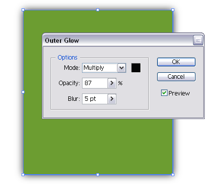
Let's say you have an object within Illustrator, and you add an Outer Glow, Drop Shadow, Inner Glow or basically anything from the Stylize menu.
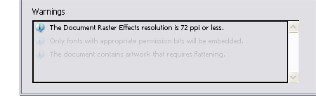
Now the problem comes when you export that file as either an AI or EPS, Illustrator will convert those effects into a raster format but the default setting for this raster conversion is set to 72ppi, which will look hideous on any litho or large format print. You do at least receive a warning message in the dialog box upon saving, but this could easily be overlooked or you may not know exactly what it means.
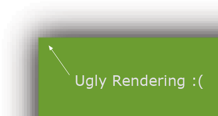
As an example, if you went ahead and saved your file regardless of the warning, check out the detail on that effect you added. Pure ugliness! Ok, this example has been zoomed in slightly on screen with Photoshop, but the final printed version would look just as bad.
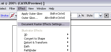
So, how do you fix this? Go to Effect > Document Raster Effects Settings…
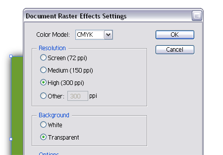
In the options box, select 300ppi. Alternatively 150ppi can be sufficient for large exhibition graphics.

Now, export your file and notice there is no longer a warning message. Take a closer look at your file and you will notice a nice smooth effect with no dirty compression.
What next? You should remember to always check this option before exporting your artwork for print. However, if you tend to work on many print projects you can actually alter the CMYK Template file within the Illustrator program files to select 300ppi as default. Afterall, if you’re creating a CMYK file, chances are it is destined for print rather than screen! – Why Adobe doesn’t make this default as standard I don’t know.

I had this effect a client once when they went to print their business cards. Needless to say it won’t happen again. Its good your pointing this out it might save someone some time and printing costs. Thanks.
This is nice, though this is simple I’ll try to use this later. Thanks for this tutorial.
I have wondered how to fix this! Thanks so much for bringing this to light.
Thanks, I’ve always wondered how to fix that! I knew basically that you needed to turn it up to 300ppi – but didn’t explore the how/where. Fantastic!
Great, helpful site.
When i place (i think its place and not drag and drop) an image (gif usually) AI seems to make the transparent part of the image cause whatever is under it to get lighter by a shade or 2. on top of that if I’m printing on a white background the “transparent” part makes the (white) background become a little bit darker/creamier whatever.
Have you had that problem/know of a fix. many of my amigos in architecture school have had this problem on different printers (large and small format) and on different computers. (it looks great on the screen though!)
oww thanx
very helpful
its so easy
Thanks for this tutorial
I think AI defaults to 72dpi to help the program run better. If all objects in the file were all at 300dpi during the creation process the project would get really large really quick. Thats just my guess.
how do you export to AI or EPS? Am I missing something? I only export to JPEG or TIFF usually.