This post was originally published in 2010
The tips and techniques explained may be outdated.
Back in the days of analog photography imperfections were part of the job. Colour washes, light leaks, vignettes and blurs were all common problems that appeared during the processing of your film, particularly from cheap cameras such as the Holga, or simply down to human error. While these problems don’t affect digital cameras, we can recreate the cool effects in Photoshop to give our shots that cool lo-fi retro effect.

Inspiration
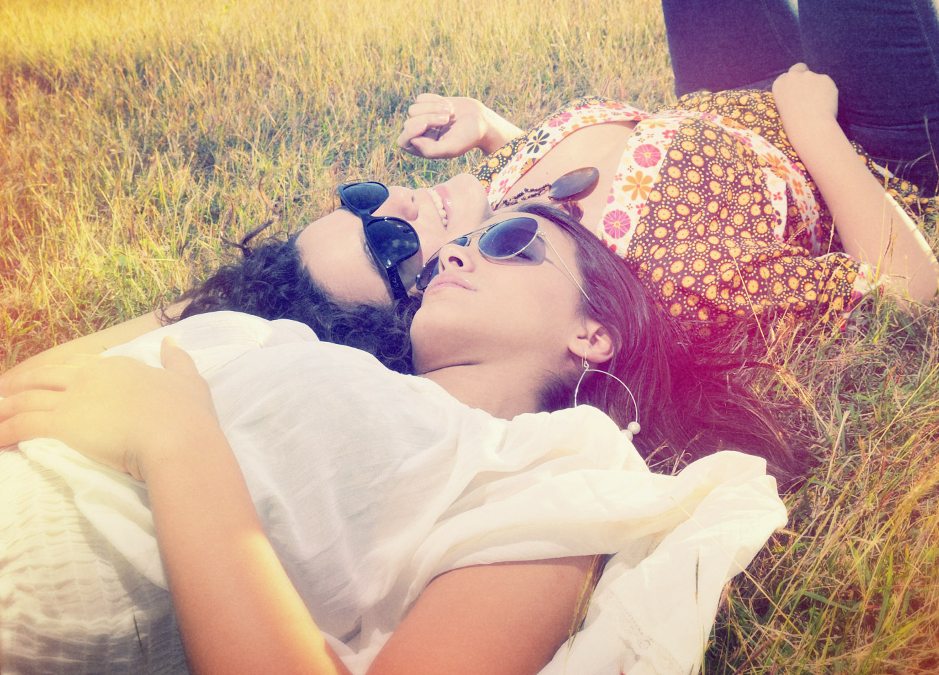
You don’t have to look far before finding quality examples of old style analog photography. Characteristics include inaccurate colour washes of warm tones, dark vignettes surrounding the shots, blurred focus and light leaks where the film has been excessively exposed.
Create your own retro analog effect
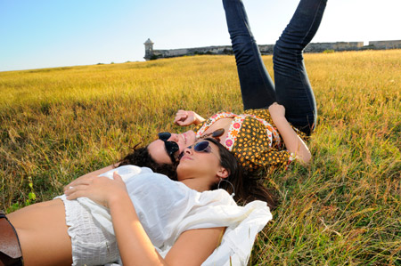
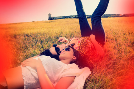
Once you have your photograph of choice, fire up Adobe Photoshop. This particular image I’ve sourced from ThinkStock.
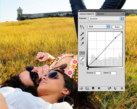
Add a Curves adjustment layer to begin altering the tones of the image. Using an adjustment layer as opposed to the menu command gives you the ability to go back and tweak the settings, or remove them altogether.
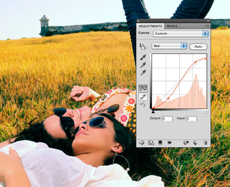
Change the drop down menu to the Red channel and begin manipulating the curves. Tweak the line into an S shaped bend.
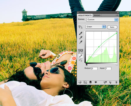
Move onto the Green channel, this time increase the green midtones by creating a large flowing bend in the line.
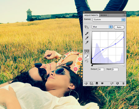
In the Blue channel, add both a slight S shaped bend and move the start and end points above and below the original curves line.
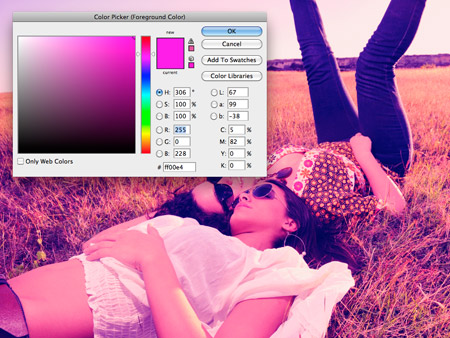
Fill a new layer with magenta, then change the blending mode to Soft Light. Reduce the opacity of the layer to around 20% to tone down the effect.
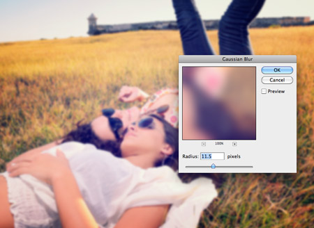
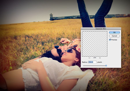
Press CMD+A to Select All, then go to Edit > Copy Merged (CMD+Shift+A). Paste this duplicate on a new layer, then add a Gaussian Blur. Add a Layer Mask to the blur layer and erase the blurring from the main subjects, leaving spots of blurring creeping in from the edges and in the background.
Dab spots of red using a large soft brush on a new layer. Change the blending mode of this layer to Linear Dodge to create a series of light leaks. Reduce the opacity to around 70%.
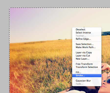
Select All, then right click the document and select Stroke. Add a 100px black stroke to the inside of the canvas.
Blur the stroke with maximum settings using the Filter > Blur > Gaussian Blur option to form a vignette. Set this layer to Soft Light at 70%.
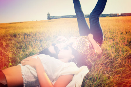
Dab a large spot of white in the centre of the canvas to highlight the main subjects. Change this to Soft Light at 100%.
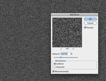
Fill a new layer with black and add some noise (Filter > Noise > Add Noise). Give the noise layer a slight Gaussian Blur to take the edge off the noise particles, then change the blending mode to Screen at 15%.

very nice… thanks.
thank you. It is the best retro effect tutorial i read
I saw a tutorial similar to this a couple weeks back, i was instantly amazed at how polaroid-ey it looked, and so i was definitely a fan, infact id been searching for a way to do this for a long time, and now you provide me a quick way to do it, thanks, its working perfect.
I have been looking into this for a couple of weeks and not really cracked the old style yet- thanks will have a play with this technique later- Grant
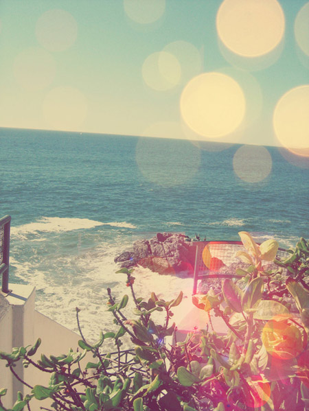
Is this what they call ‘Lomography’? … Great tutorial, Chris… and I love the bokeh photo.. its beautiful…
Lomography is similar, but with slightly different colours and much more contrast. Here’s a post from the archives that links to various ‘real life’ photo effects – http://is.gd/dxXEg
I was waiting for this , looks great ! … thank you for another useful tutorial
Wow Chris amazing. :)
This would go so perfect if used an a Polaroid.
Square cropping and a Polaroid style frame would finish it off nicely!
So easy and nice too!
Thanks a lot for sharing :-)
Lovely effect Chris.
Great tutorial, you make it look so easy, when it never actually is! Thanks Chris.
I attempted to do this but got stuck on the channels part. I know it’s not meant to be particularly difficult but I’ve never actually used channels before. I’m still learning. Good tutorial though, love the monsters!
It’s really just trial and error moving the lines and seeing how it looks in the preview. The advantage of the adjustment layer over the basic CMD+M curves is you can go back and edit the settings afterwards.
Excellent work Chris!
Thanks for the ideas man. I quite like adding a layer of dust and grime on the lens .. helps sell that retro look. Here is an example.
http://markos.co.nz/2010/05/compositing-two-photos-in-photoshop/
very nice! :)
Am not a web designer, but when i came out reading this message i feel like returning from photoshop tutorial.. As a internet marketer i can able to know what you really telling about, but that much am not a technical person to take the exact outcome of the messages as a technical person.. Nice one Keep Swaying..
Venkatesh – Gulwebstudio.com
Lovely effect – reminds me of when photos were square :)
I am going to have a go at this later, I really like the effect used :)
Sweet Article as always Chris!
Wow it’s sad all the people who are doing “SEO” by making their “Name” things like “Web Design Chester”, “Graphic Designer” or “Corporate photographer London”. I remember when people used to be genuine… that was nice.
The best part is that google bots don’t even follow the links. A-Class numpties.
5 SEO Tactics That Make You Look Like a Douche – http://is.gd/dxXT6 ;-)
Loved that article! ;D
i love it! Your tutorial is always simple and final result makes amazing!
Very nice work Chris, this could be saved as an action and used quickyl and easily too.
Great tut Chris, good work.
great tutorial chris ! :)
Very nice photo effect, thanks chris :)
Creative Photography – People under Water – http://www.cruzine.com/2010/07/19/underwater-people-photography/
Great tut Chris! Really nice effect! :)
I love this effect! Great tutorial
Great tutorial! Thanks so much!
This is awesome Chris. The post work on the photography really does make a difference. Extremely impressed. Cheers for sharing buddy.
http://hipstamaticapp.com/
Good one.
Love the old photo effects, the difference between before and after is just stunning.
lovely! thanks for the tutorial
Thank you for this effect tut! I’ve been looking for a simple explanation and now I’m edified. Mr. Spooner, you’ve done it, again!
Saw this on Dribbble, was waiting for the tutorial, great stuff!
Nice tutorial but I’d rather use an action to get the same or similar result. What do you think?
Actions are handy but sometimes it’s useful to have control over the individual tweaks.
I like this very much! Neat effect!
Thanks ! Thanks and….. THANKS !
VERY COOL EFECT
I really like the effect used :)
thanks for tutorial..
Man, You always do the best! ;)
wonderful article very helpful indeed.
Hi! Nice tutorial. Just wanted to add that from CS2 and forward you can make vignette in the filger menu
DISTORT -> LENS CORRECTION
But I guess you already know ;)
I haven’t come across Lens Correction – I’m off to play around with that now!
love it… great effect and perfect for summer!
Great tutorial, and the final effect looks great! And thanks for including the tips about stroking the entire document, and copy merged – I didn’t know those two functions existed!
Copy Merged is my favourite shortcut. So much my hand is permanently formed in the ‘CMD+Shift+A claw’…
I was actually thinking of doing a similar tutorial just recently. You have a slightly different process but the result is about the same. Awesome tutorial and some very useful steps in there. Thanks!
Nice effect.. and nice looking girl too! :-)
how to dab a large spot of white in the center?
Well done, Chris, well done. Though, I think the layers could’ve had a bit more comment such as “now, make a new layer and name it ‘xyz'”.
Cheers
Funny how we didn’t necessarily like these effects when they were part of reality, but now they give us a nostalgic feel. Thanks for the great tutorial. Good stuff…
Very nice tut, Chris…thinking about doing something similar with a revamp of my portfolio site…bring in some colors…nice job!
Nice effect. Thanks for the tutorial.
I love this effect! I am relatively new to photography and I have been wanting to try something like this. This is a fantastic tutorial – Thanks!
ini Bagus banget…
ada lagih gx tutorial yg lbih bagus lgih..???
TerimaKasih’
Wao — its a nice effect and nice tutorial too . Love this — Add more stuff like this — people will be very helpful
Wow!!! I recently discovered your website! Thank you do much for the AMAZING and helpful tutorials!! It has pretty much every topic I wanna learn about! Thanks a BUNCH!! :D
~Jamie
Very nice tut, love the final vintage render.
And thanks for the “copy-merged” tip! We learn every days.
How can i create an effect like on the last picture? Especially light bubbles? :) ( i dont know how to call them) Can you explain it too with an article? please i wonder how to create them too much
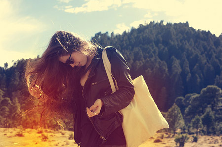
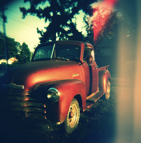
Actually all these effects are hard to do and they’re amazing .. Will you explain them too? Like last and third(with a van) pictures.. if you explain i will be very happy :))
Just tried this – great tute!! Love the effect! Thanks!
This is so cool!
Thanks for the tutorial, I think I will make all my photos like this, and feel in 1950 :)
nice tutorial. and very easy to follow. thanks. :)
Very different type of post.Good work Chris.
Nice one, Chris. It brings me right back to the seventies – reminds me of a wall of faded photographs at my grandmother’s house. Ahh – nostalgia!
Ben böyle bir film görmedim arkadaşlar süper ötesiydi.Hepinize tavsiye edeirm.
This is great – really innovative
Lovely Tutorial, Chris!!!
Hey,
I am a graphic designer myself and I loved the Retro Analog Effect you shared with us. Really Helpful… Great Work… Keep up !!!
Best,
Nick Jones
St. Augustine?!?
Nice! Been wondering how to do this for a while. Here is my attempt – http://forr.st/~uXc
Thanks for this, been looking how to do this effect for ages. You can see my attempt here – http://forr.st/~uXc
Always wanted to play around with with emotive colours but never found the right tutorial, tried this out in 10mins and it worked perfectly. Wish I could show you the before and after (should put it up on flickr later). Thanks man!!!
okay, I got off my lazy butt and uploaded the images: http://bit.ly/bWJqsd , thanks again!
Great , i like this post.
Copy it! hahaha,…
Hello! I didn’t know how to give photos this kind of retro analog effect. Now i know, thanks to you. Cheers.
このエフェクトぇしていただきありがとうございます!私は簡単な説明を探している、今私はびっくりしたのです。氏スプーナーは、あなたが、もう一度それをやった!
Yusuf Güney Dinle.Yusuf Güney Dinle blogumuzd bu gün Durham hakkında orjinal bilgiler vereceğim.
Wow, this tutorial is so nice and easy, I’m loving it.
I like the effect. I’ll give this effect to my new family photos. I’m sure it will be more interesting. thx for the tutor.
I miss a lot of details in the explanation
charming
search ends… veryy nice!
Good tutorial, i spend sometime looking for something likely…
http://www.vazto.com