This post was originally published in 2011
The tips and techniques explained may be outdated.
In case you haven’t noticed, today is Valentine’s Day, so I thought it would be fitting to base today’s tutorial on some kind of ‘lovey-dovey’ theme. Follow this step by step Illustrator guide to creating an intricate vector heart illustration. We’ll build the various patterns and shapes out of simple objects and modify their appearance with Illustrator’s handy distort tools in order to completely fill our heart graphic with detailed elements.
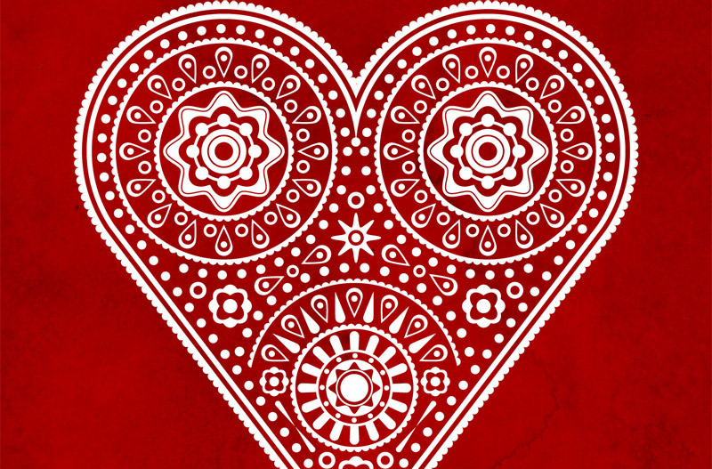
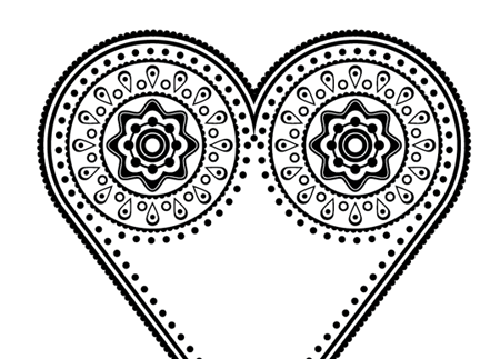
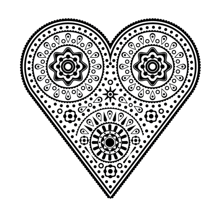
Here’s the illustration we’ll be creating today. It features a range of vector shapes and elements that combine to produce a super intricate and detailed pattern within the overall heart outline.
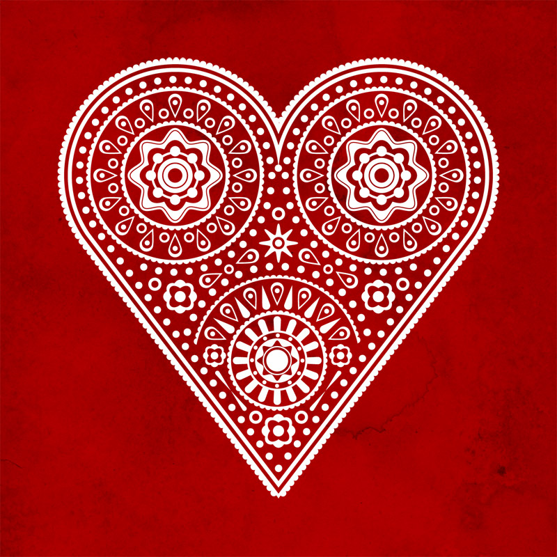
View the final heart illustration
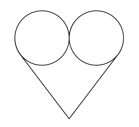
Open up Adobe Illustrator and create a new document. Draw and align two circles side by side, then draw a triangle using the Polygon tool to match the exact width of the two circles.
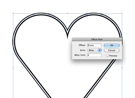
Use the Pathfinder tool to merge all the shapes together, then go to Object > Path > Offset Path. Enter 2mm in the options to create a duplicate of the outline running parellel to the original.
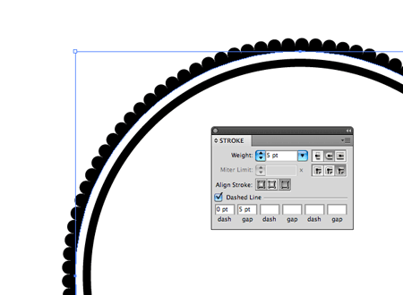
Copy (CMD+C) and Paste Behind (CMD+B) the outline, then switch the stroke to 5pt weight with round options checked, then select the Dashed Line options and enter 0pt dash and 5pt gap. This will create a cool dotted border.
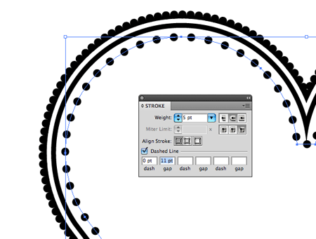
Make another offset path, this time with -2mm settings. Add a dotted stroke to this shape but with an 11pt gap in the dash settings. Play around with these figures to balance out the number of dots so they’re symmetrical on both sides.
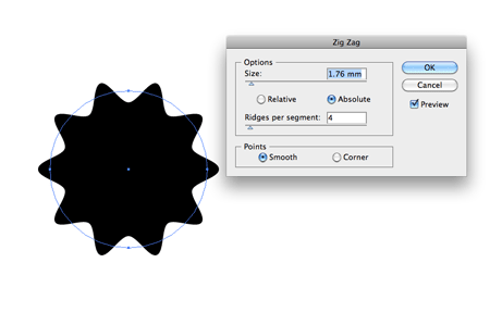
Elsewhere on the artboard draw a circle and give it a Zig Zag effect (Effect > Distort > Zig Zag). Select the Smooth option and adjust the sliders to create a cool shape.
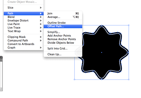
Create an offset path duplicate of this shape, then give the original a white stroke to differentiate between the two.
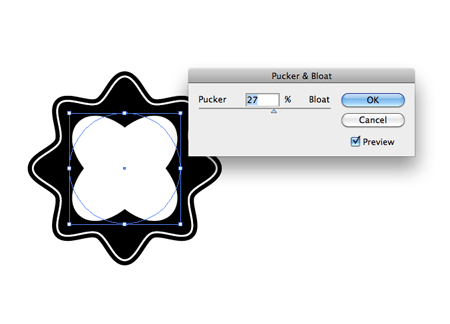
Draw and align a circle to the centre of the shapes then give it some tweaking with the Pucker & Bloat effect from the Distort menu.
Continue creating random shapes to build up the detail. Here I’ve duplicated and rotated the Pucker and Bloat shape and added a range of circles at various sizes.
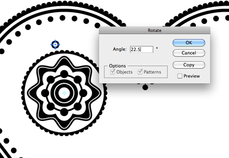
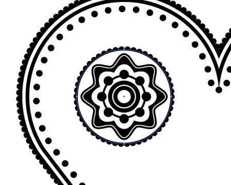
Draw a couple of concentric circles, group and align them above this collection of shapes. Select the Rotate tool and Alt-click the centre pivot point to open up the options box. Enter 22.5 as the angle and press Copy. Repeatedly press CMD+D to repeat this transformation until you have a full circle of shapes.
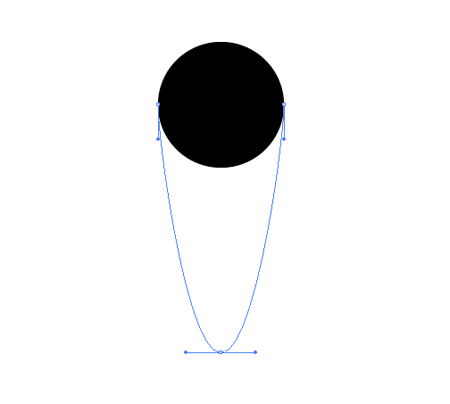
Draw a circle elsewhere on the artboard and drag to lower most point vertically downwards with the Direct Selection tool. Hold ALT and click it with the Pen tool to clear out the bezier handles from this point to form a sharp edge.
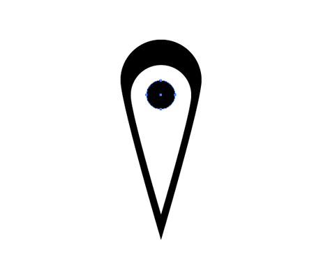
Duplicate and scale the shape to produce a white inner area then finish it off with a little black circle. Group all the elements together.

Position this shape between two of the recently created circles, then repeat the rotation transformation to create a series of teardrop shapes running around the circumference of the pattern.
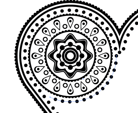
Continue adding various elements to build up the detail, keeping everything aligned and centered. Clip a circle to size with the Scissors tool then add the same dotted stroke setting to continue the lines around the patterned objects.
Select all the elements that make up the patterns in the top left corner and duplicate them onto the right hand side.
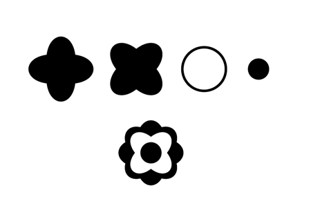
Continue making unique shapes by building up layers and layers of random objects. Here I’ve made a shape with the Pucker and Bloat tool, rotated it, then added a couple of simple circles with alternating fill and strokes.
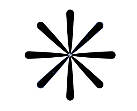
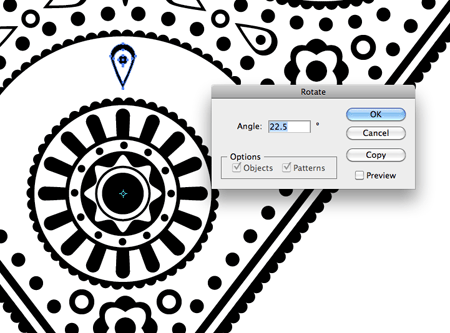
Create a teardrop, rotate it by 180 degrees and position it on the opposite side. Then select and duplicate both these shapes and rotate by 45 degrees until you have a basic flare.
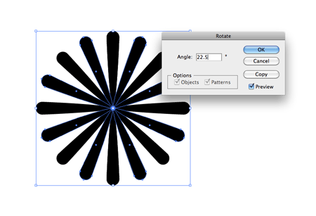
Select all the shapes that make up the flare and paste in front (CMD+F). Go to Object > Transform > Rotate and enter 22.5 to accurately position the new shapes exactly between the originals to create a much more detailed flare shape.
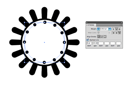
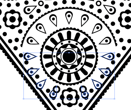
Draw and align a series of circles to the centre of the flares to build up the details. Use different dash settings to create dotted strokes with various sizes and gaps.

Keep alternating between black and white using both fills and strokes. Adding Zig Zag or Pucker and Bloat effects helps mix up the design with a variety of different shapes.
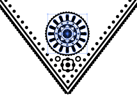
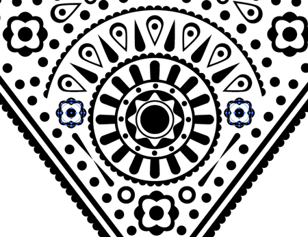
Position this new collection of patterns in the lower portion of the heart then continue filling the gaps with more simple shapes and objects.
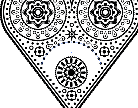
Use duplicates of shapes used elsewhere in the design to fill in the remaining gaps between the three main elements.
Position a copy of the teardrop shape in the lower portion of the design and select a centre pivot point for the rotate tool. Add a series of copies using the 22.5 angle.
Select all the objects that overlap or don’t fit into the design very well and delete them, leaving just a half-circle of elements.
Fill in the last few gaps with simple shapes to finish off the design. Take a step back and check for uneven gaps in the patterns and adjust if necessary.
The whole process is pretty simple, but repetitive. Simply building up layer upon layer of basic shapes can really help create some interesting patterns.
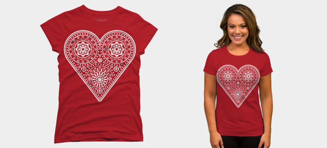
Love this design? Get the t-shirt!

I knew a valentine tut would appear sooner or later :)
Nice tut! =)
looks like a heart-shaped sugar skull… nice one!
happy valentine’s :)
excellent job chris.
Thanks Chris for this tut. Just learned something about strokes…
Thanks for this useful tutorial – lots of helpful tips on repeating shapes and strokes :)
Very helpful tutorial. Thanks.
Great article Chris, the small dot outline trick is a revelation! I was doing it a more long winded way, thanks!
Beautiful, Happy Valentines
Nice to see a simple tutorial for something that looks so complicated. Thanks Chris.
excellent job chris, and you picked the right day for it. I just hope it got indexed today..! would do wonders for visitors
This is cool. Very intuitive.
Great for the valentine’s day. Love it!
Great tut, great techniques!
love the simplicity and the possibilities!
the elements quite reminded me of a mehndi design (henna tattoos in the middle-east/south asia). as always, thank you for the tips!
that ROCKED!!!!!!! Excellent, and as always, thanks for allowing me the opportunity to recognize my total mediocrity. :)
Create an offset path duplicate of this shape, then give the original a white stroke to differentiate between the two. – I don’t get that bit :(
Wow. This really came out so beautiful. I think I am going to try this out today. Thanks for sharing your talent!
I’m so excited about this tutorial, thank you for posting it! – but I’m still new to Illustrator, and had difficulty just creating the heart shape. Once I got the triangle in place and sized correctly, and created the heart shape with the shape builder, I had all sorts of extra anchors and mini-strokes that I had to go in and clean up. Do you have any tips or suggestions for a newbie to help avoid these problems in the future?
Thank you for your time.
Oh, that’s a neat outcome of a tutorial! I’ll try this myself. Thanks a bunch!
Nice! like this a lot.
Thanks so much. I always enjoy your tutorials!
Great, Well done! Clean as a really designer can do. Bravo.
Love the intricacy of the design Chris, great job sir. As always you are very detailed in your tuts and easy to follow. Thanks!!! If you have a chance, please swing by my site. I would love to hear your feedback (orlydesign.com). Take care.
Nice intricacy Chris, reminds me of a day of the dead skull. Good work!
Love this! (how appropriate!). I’m in the midst of learning Illustrator and just love – and appreciate – tutorials like this that help me learn.
Wow, beautiful stuff, to bad I I didn’t see this a day earlier, it would have been a welcome addition to my valentines day present. This is wonderful practice for me because I am currently mired in attempting to learn illustrator and this step by step tut will certainly help me with my quest. I find the world of graphic design and illustrators absolutely amazing, after having worked with a great logo designer from Sydney, DPM Creative Group. It is very interesting what you can find and learn out there in the interwebz, thank you.
-Katherine.
love it – something like an indian fractal art – will try it out soon ;)
Nice Job, man. Awesome! I m giving it a try.. :D
Nice tuts ! Thx !
Nice ! & very beautyful !
A complex shape with some simple shape.
I get stucked a while with the rotate thing. Didn’t work the repeat without doing it manually. But I found a solution: Transform my shapes as a brush, and then spreading it on a path. Fascinating technique indeed. However, my questions: Is there a way to repeat a shape along a path, other than with a brush?
I’m in Mexico so this kind of design are very well known, and we know that complexity is no more than the sum of details… Thanks for the tut dude!
Great tutorial…Good shape but heart looks very sharp at the end..never mind..this is wonderful stuff..Thanks for sharing.