
This post was originally published in 2009
The tips and techniques explained may be outdated.
A great looking abstract design can be created from the simplest of shapes. Let’s take a look at compiling various geometric shapes and objects to form a dynamic composition in Illustrator, then polishing it all up with some transparency effects to create a trendy vector illustration.

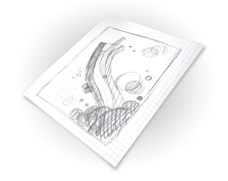
Start work sketching out a rough plan for the design, taking into consideration the composition and general style of the illustration.
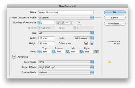
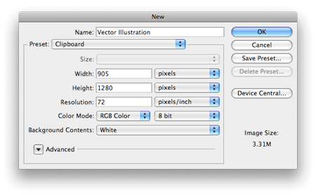
Open up Adobe Illustrator and create a new document. Choose a generic size such as A4, and set the Color Mode to RGB for a choice of nice, vibrant colours.
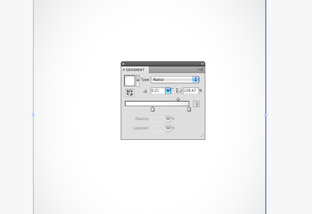
Draw a 210x297mm rectangle onto the Artboard, align it centrally then add a soft grey to white radial gradient. This subtle addition gives a little depth to the design, rather than a boring flat white background.
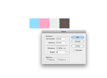
Pick out a colour scheme of your choice. Here I’ve used an ice-cream inspired mix of baby blues, pinks and a couple of complementing greys. Draw a square at 7x7mm, copy (CMD+C) and paste in place (CMD+F). Then, press the ENTER key to Move the square a set distance horizontally, enter 7mm into the options.
Tip: Use CMD+D after pasting a new object to repeat the last transform command.
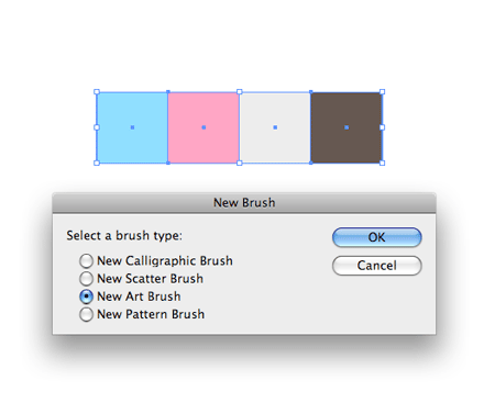
With all the coloured squares selected, click the New Brush icon in the Brushes palette. Select New Art Brush from the list.
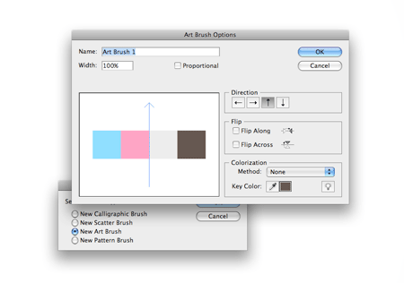
In the options panel, ensure the direction of the brush is correct. Click the small arrow buttons to alter the orientation of the brush flow.
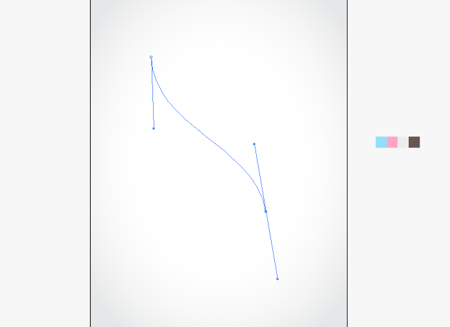
With the Pen Tool, draw a smooth flowing line spanning from the bottom left corner to the upper third of the document.
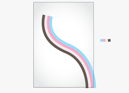
With the path selected, click the recently created brush in the Brushes Palette to give a cool stripe effect.
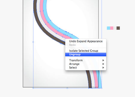
Go to Object > Expand Appearance to convert the path to a shape, then right click and Ungroup the objects.
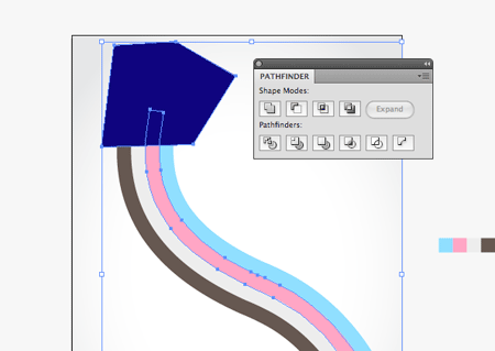
Rather than have all the coloured stripes end abruptly, we want to tweak them to different lengths. Draw a temporary shape that crops off one of the stripes. With the shape and stripe selected choose the Subtract from Shape Area option in the Pathfinder.
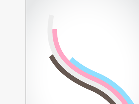
Repeat this process with the remaining stripes at different positions, giving varied lengths to the lines.
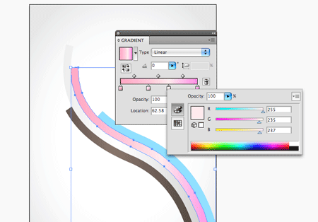
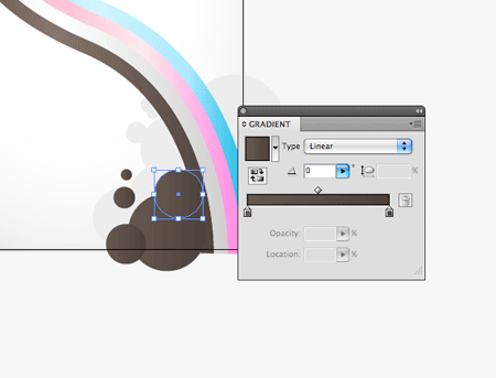
Add some depth to the stripes by changing the flat colour to a gradient. Add a couple of extra swatches that add lighter and darker tones. It’s handy to keep a copy of the original swatches to one side to allow quick and easy colour picking.
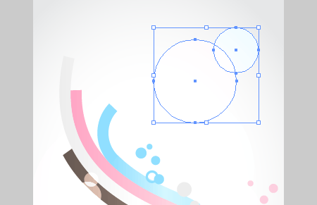
Begin to add some secondary elements to the design, such as a bunch of grey circles. Draw each shape at a different size to fill out the empty space.
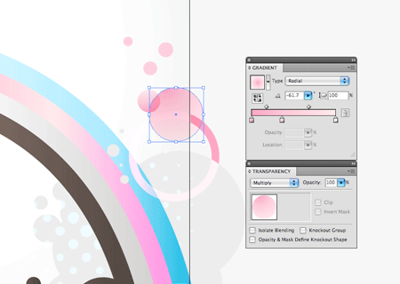
Overlap this area with another collection of circles, this time choose a different colour from the palette. Add a subtle gradient to give some depth to these new shapes.
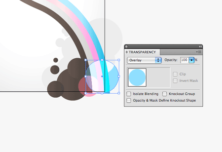
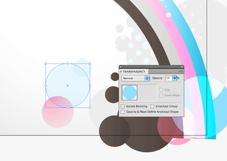
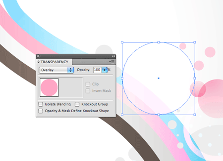
Spice up the design with a touch of transparency. Draw a couple of new circles using the pink and blue colours, then change their blending mode to Overlay to react with the colours underneath, giving a vibrant theme to the design.
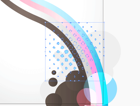
With circles being a prominent theme in the design, a set of halftone style elements would fit in well. Download a copy of the Vector Halftones from Think Design.
Add a few objects to fill out the space either side of the main flowing lines. Use the Overlay blending mode, or simply reduce the opacity to tone down the elements.
A variation of the circular shapes is a circle with a stroke, giving a ring shape that still fits in with the overall theme. Continue drawing lots of tiny shapes that give plenty of detail to the design.
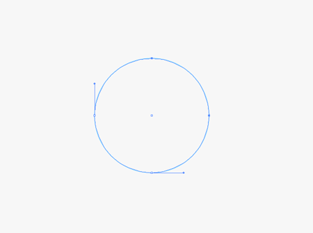
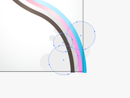
Draw a separate circle elsewhere on the Artboard. Use the Direct Selection Tool to select two of the points. Hit delete to crop the circle down to a quarter.
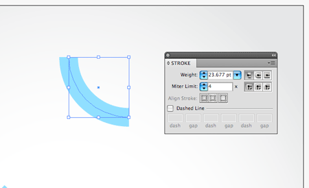
Add a thick stroke to the line, the idea is to match the width of the main flowing lines, so a little trial and error is in order to match them exactly.
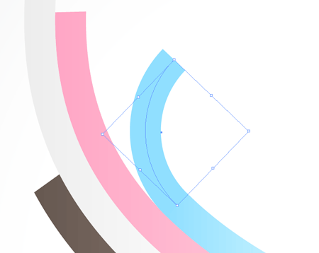
Position the new curved line accurately on the end of the blue stripe.
Overlap some large circle elements using the Overlay blending mode to break up the flow of the lines slightly.
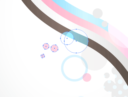
Continue adding lots of little elements to the design. The key is to place the objects so that they span outwards from the central flowing lines.

Also place objects so that they interact with each other, which helps give variety to the shapes.
Spice up the overall background with some very large, faint circles.

The vector design is just about complete. The clean lines of vector work always looks pretty cool, but I always enjoy roughing up my designs a little in Photoshop to add some interesting texture and detail.
Copy the whole illustration, then open up Adobe Photoshop. Create a new layer in proportion to the design.
Paste in the vector elements and scale to the document boundaries. Being vector graphics they can be scaled to any size until they are rendered as pixels.
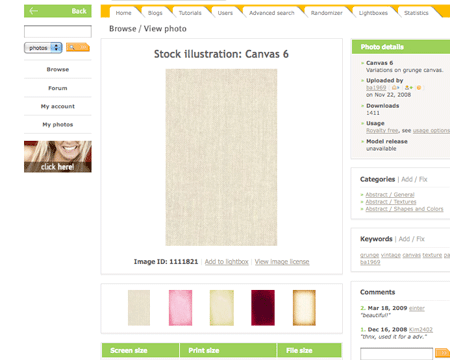
Head over to SXC to find a nice canvas texture. Copy the design into Photoshop and desaturate to remove the original colour cast.
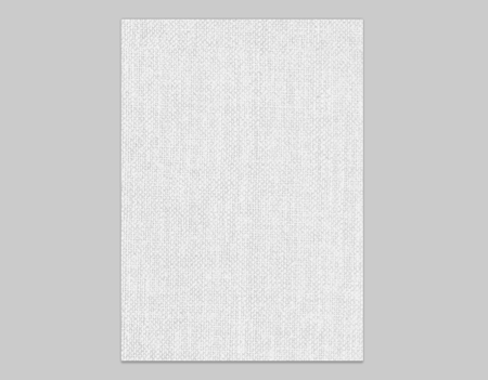
Paste and scale the texture into place in the main document. Set the blending mode to Multiply and drop the opacity down to suit.
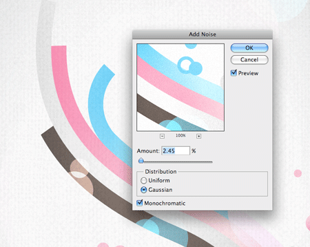
Duplicate the vector artwork layer then go to Filter > Noise > Add Noise. Choose a low setting that just adds some grainy detail to the colours. Change the blending mode to Multiply and drop the opacity right down.
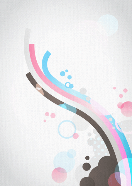
The illustration now has a nice grainy feel to it that contrasts against the clean and crisp line of the vector graphics.
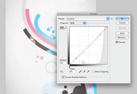
Make any last tweaks such as a touch of Curves adjustment to bring out the darks and lights for more contrast.
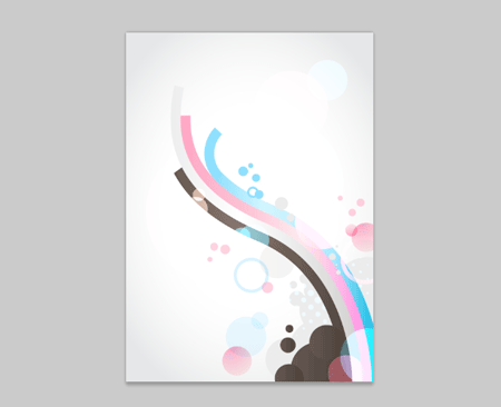
The abstract vector illustration is now complete. The great thing is this type of work fits right into any type of design for print and web, or could be left as a design showcased on its own.
wow, cool
texture that you link has been deleted :D
That’s a really detailed tutorial. Thanks Chris.
great design great tut Chris. Thanks
Chris, this is really tight. I will be giving this a try!
This is “typically Chris Spooner”: A simple, yet effective and stunning result from a great Illustrator tutorial.
Can’t say this enough: Keep up the great work mate :) .
Lovely tutorial, I love this style!
Once again you show how easy it is to create something wonderful in Illustrator with a little bit of the right know-how.
That technique you use, creating a brush with blocks of colour to create the big curving bands, is so effective. I’ve tired the technique from your skateboard illustration tutorial and I’m amazing at how much time it has saved me!
Thank you…something new for me to try this evening =D
niCe ..ThanKs ..
awesome job chris
Amazing tutorial Chris! It’s incredible how such a good result can be obtained using simple shapes.
COOL..
usually i work with corel draw..
by this tutorial i’ll try use illustrator to create vector design
Some very nice productivity tips in here. Thanks for sharing.
I love this tutorial, it’s simple, clean and effective.
Featured here: http://www.presidiacreative.com/web-picks-21/
Cool tutorial! Love the results. Thanks for mentioning/linking my halftones, I really appreciate it!
cool effect, great tutorial
loved it! great work. Cheers
huuu esta chido!!
Really cool design! I will try this at home.
Great tut Chris! nice job… your art is aw for inspiration.
Been looking for something like this to help redesign my portfolio, cheers Chris.
looking nice :)simple yet very effective;)thanks for the share
Very nice, Chris. Thanks, dude!
Very good tutorial. Plenty of diagrams and explanations and very easy to follow. Stunning end results too. Will definately have a play around with this.
Keep up the good work Chris! Certainly looking forward to more like this.
Thanks.
Another great tutorial!
Love the colors …
Mr Spooner … you rock!!! Really great, thanx for inspiration ;)
This is one hell of a tutorial Chris! Thanks for always sharing such wonderful stuff!
Thanks that was really helpful and informative. :)
Cool und very good tutorial.
Great work, especially for a nooblet like me. Thanks
Thanks for the detailed tutorial. I will let my visitors know about your blog.
Wow…
thnkx alot for post’n this tut..
keep it <3
Great tutorial! You should post the final product for sale at http://www.sxc.hu or somewhere.
Thank you for your great tutorial!
Great Tutorial, Thanks, very nice and simple vector.
I love this site! thanks for the tutorial, really cool.
WOW!! im new to designing, and i had jus sketchd a design and was wonderin how to make the same on illustrator…AND THEN I FOUND UR TUTORIAL… thanx alot…
Rất đẹp. Tôi thích phong cách thiết kế này.
Very nice..Thanks
Chris Spooner your the man !!!
thanks again … look forward to future tutorial keep up the great work …
thanks for this great tutorial!!!
mola
Hey great design!
Any ideas on Surfboard designs? Im racking my brain on shapes and somthing big enough to print on Rice Paper…
Cheers,
Linz
even i dont like that much the illustration… the technique with the brush i like a lot and it was a inspiration…
merci