This post was originally published in 2009
The tips and techniques explained may be outdated.
A great looking design can be easily created by combining various textures and brushes. In this tutorial we’ll look at creating a cool grungy design based around some abstract 3D type, then apply a few finishing touches to really bring the design to life.
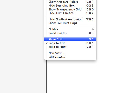
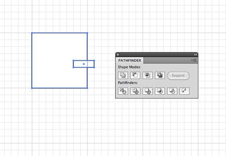
To start, we’ll create the type by hand using Illustrator. Create a new document, then turn on the Grid, and adjust the snap settings to snap to the grid.
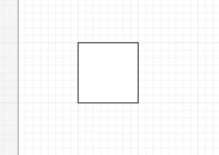
Draw a square onto the artboard. Notice how the points will automatically snap to each grid intersection. This will come in handy when creating our abstract geometric type style.
For this tutorial, we’ll base the design around the word ‘Create’, so manipulate this first shape into a letter C by chopping out a section using the Pathfinder tool. Use a temporary shape to overlap the appropriate area, then select both shapes and click the Subtract from Shape Area icon.
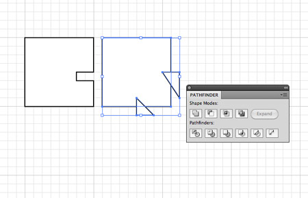
Continue onto the next letter, in this case an R. Use the Pen tool to create triangular shapes to sculpt the box into a vague R shape.
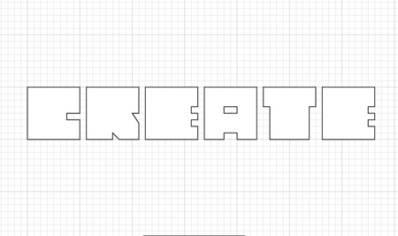
Once all the letters have been created, space them equally alongside each other. Basing each letter on the same rectangle gives a boxy, geometric and generally cool style.

Head over to SXC and download a background texture. This particular one is a paper texture from IB6364. Paste the texture into Photoshop.
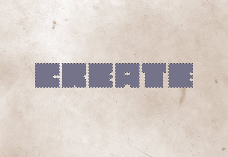
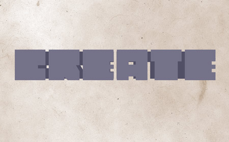
Copy and paste the wording from Illustrator into Photoshop. Fill the letters with a colour sample of a nice grey-blue.
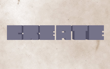
Duplicate the text layer, then press CMD+T to Transform. Hold Shift and Alt to scale down the letters proportionally. Dropping the opacity on the top layer can help visualise the transformation.
Fill the smaller text with a darker shade. This is the base of the three dimensional effect.

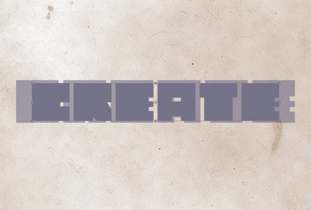
Zoom right in and use the Polygonal Lasso tool to connect the corners of each letter. Fill the selection to give the appearance of perspective.
Once all the connections have been made between the two text layers, the illusion of a third dimension is created.
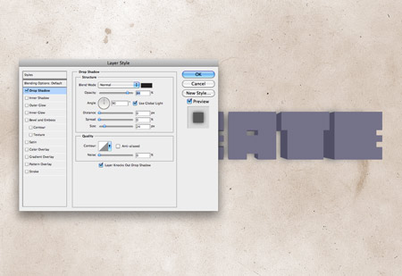
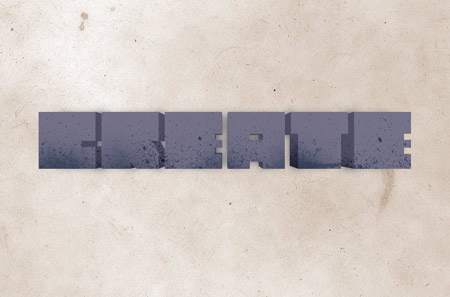
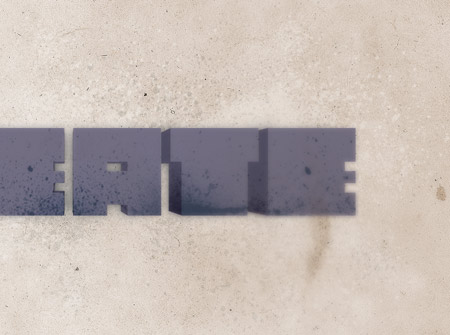
Add a Drop Shadow to the top text layer. Use a large value for the size and keep the opacity fairly high.
Source a collection of spray paint Photoshop brushes, such as these, or these. On a new layer dab a few spots of black over the text, paying attention to the fine splatters overlapping each letter.
CMD-Click the first text layer, then CMD+Shift-Click the second text layer to load the outline as a selection. Then, add a Layer Mask to the splatters layer to hide any excess spray paint. Change the Blending Mode to Vivid Light at 50%.
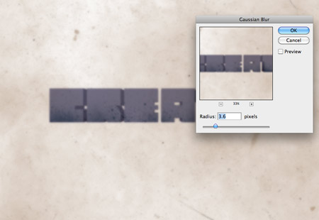
Press CMD+A to select all, then CMD+Shift+C to copy all layers. Paste the selection on a new layer then add a 3.6px Gaussian Blur.
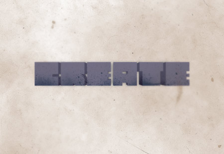
Add a layer mask to the layer and fill with black, then dab large spots of white with a soft round brush to bring back subtle touches of the blurred effect in select places. This little touch adds a cool lens blur kind of effect.
Create a new layer below the text layers, then use the spray paint brushes to draw in various splattered elements. Change this layer to Vivid Light.
Draw in more splatters on a new layer, but this time change the blending mode to Color Dodge and adjust the opacity to 55%.
Add a new layer to the top of the layers stack. Use a large soft brush to dab a bright purple and blue spots onto the design. Change the blending mode to Color Burn at 25% to add a subtle cast of colour and contrast to the design.
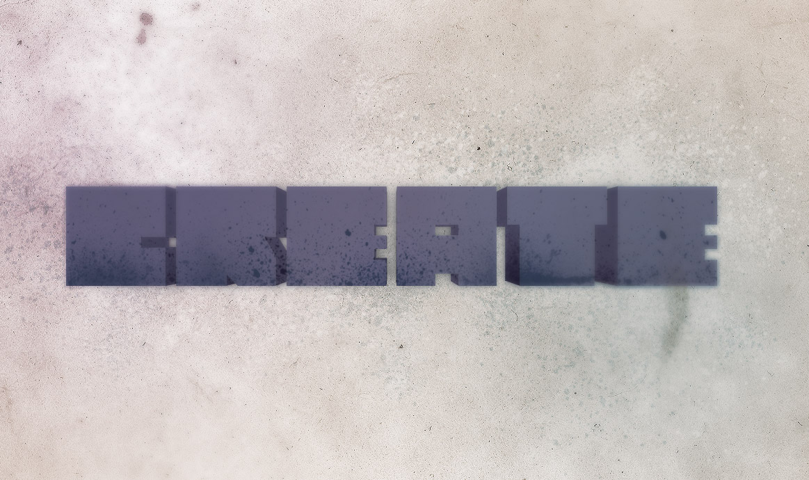
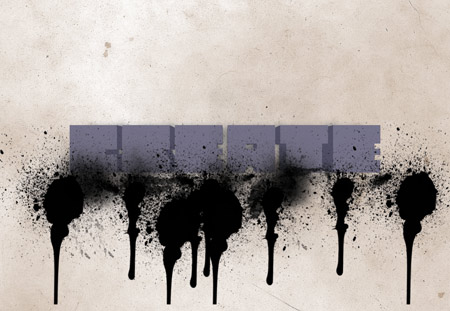
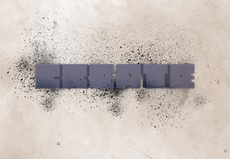
There we have the finished design, complete with 3D type, grungy splatters and detailed textures. The subtle colour casts and lens blurs really help add an extra finishing touch.

The 3d-Tool in illustrator would be easier
Agree. But If the desired font is not present I would go ahead and use cad or 3dsMax, Render & Bring it in.
i really like your short design with best tips.
Lovely! Can’t wait to give this a whirl.
how did you do your avatar, ive seen a bunch of them around?
Really cool end result. Thanks for this!
Love this effect.
Would it not be easier to create the 3d effect with the extrude feature in CS4?
Anyway, there’s a few nice little techniques that I’ve taken away from this and for that I thank you.
Thank you for this cool tutorial
I really enjoyed this tutorial.
Thanks everyone.
RE: Illustrator 3D tool. I started out with this technique but found Illustrator was forever splitting up the graphic into hundreds of pieces. Tried a bunch of different settings but couldn’t get a nice clean rendering :-)
Can’t you just do Expand Appearance twice?
For me in CS4, doing this keeps the text paths and the extrusion paths in two nice little groups; you can expand further to separate into the individual letters, and again to separate into the facets OF each extrusion OF each letter OF the whole word.
Great tutorial! I love it. I’ll can’t wait to try it out, although your choice of color doesn’t appeal to me – sorry. Question: Do you need CS4 for this? Thanks…
Awesome tutorial! But I think that if you are a newbie to photoshop there is not enough details. But otherwise it is awesome and very useful!
Thanx!
ur just simplyyyyyy professional !! i love ur work and ur tutorials =D
Great type tutorial I really like the background behind the text i think it ads a nice touch and really makes the 3d type pop.
i would like to know, how can i add a similar box as you have here at the end of the post?
“Written by Chris Spooner
Chris Spooner is a designer …. …….. ….”
i’ll try to use this effect
Ok I’m not sure if this is correct, I copied it out of Chris’ code:
HTML
Written by Chris Spooner
Chris Spooner is a designer who has a love for creativity and enjoys experimenting with various techniques in both print and web. Follow Chris’ daily design links on Twitter, and be sure to check out his second blog over at Line25.com.
CSS
#content .author-info {
background: #f9ebd2;
border-bottom: 3px solid #f2e6d1;
padding: 10px 10px 0 10px; margin: 0 0 20px 0;
}
#content .author-info h4 {
font-size:15px; line-height:20px; font-weight: normal; color:#666666; margin: 0 0 5px 0;
}
#content .author-info h4 a {
color:#B85B5A; text-decoration:none;
}
#content .author-info h4 a:hover { color:#8C3B3A; border-bottom:1px dotted #B85B5A; }
#content .author-info p.author-image {
float: left; margin: 0 10px 0 0;
Hope this helps and if anyone discovers a mistake please notify me…
HTML
Written by Chris Spooner
Chris Spooner is a designer who has a love for creativity and enjoys experimenting with various techniques in both print and web. Follow Chris’ daily design links on Twitter, and be sure to check out his second blog over at Line25.com.
–>
Sorry, I didn’t know HTML was allowed in here…
View th page sorce and copy out the code starting here:
and ending here:
Ur welcome…
look at it here: it’s my latest post:
twitter.com/joshhatcher
Great little tutorial, thanks
thanks josh
i would like if the names of the files i have to modify
George i dont understand what you mean. Could you please explain
thanks josh
i would like to know the names of the files i have to modify
Nice little tutorials … Thanks for sharing :)
great little tutorial :) thanks pal
awesome cool design! thanks for sharing chris.
Amazing Tutorial.. you are my inspiration my friend. I come here often to see what else you have in store for us graphic designers :)
Twitter- http://www.twitter.com/hunnydesigns
Pretty cool output. I’m just getting into these splatter and spray brushes and realizes how to use them correctly and good techniques. Actually learned quite a bit from this tutorial. Thanks.
Very nice tut! thanks for sharing Chris
Well, I want to know what files I need to modify and put these codes.
http://www.filmai.in/uzeik-6490.html visit to my blog 3D
cool tutorial there. and the effort to do a print screen. kudos!
Very useful tutorial and you’ve made the steps very clear to follow. Thanks for taking the time to put this together.
Karl
Instead of dark colors if you use bright colors it would look even more attractive.
Say splash of contrast colors would be so striking to look at with the saying something like “splash tomato” with all reds and seedy effects :)
I’m especially fascinated by the idea that the adults learnt from the children. ,
D’oh. Need Macfail for CMD key. >_<
Love the art. Thanks for the help. Keep up the great work.
hi Chris!!
not sure if you remember me, anyways, i’ve got a bit confused over the illustrator brushes..the thing is i downloaded free vectors and then when i try to open up it reads as .eps file..something lyk encapsulated..anyways my point is when i assign the downloaded vectors to my stroke it just won’t take it..i mean there are no results..what do i do to get those swirls and curls rendered correctly in AI?..
http://www.wecairo.com thx you good man
very nice thank you so much