
This post was originally published in 2011
The tips and techniques explained may be outdated.
Want to get your teeth stuck into a website design project to sharpen your skills? Follow this step by step tutorial to create a sleek website design for a fictional eyewear company. In part one of the tutorial we’ll build the Photoshop design concept with a dark colour scheme and lay out the content to a solid underlying grid.
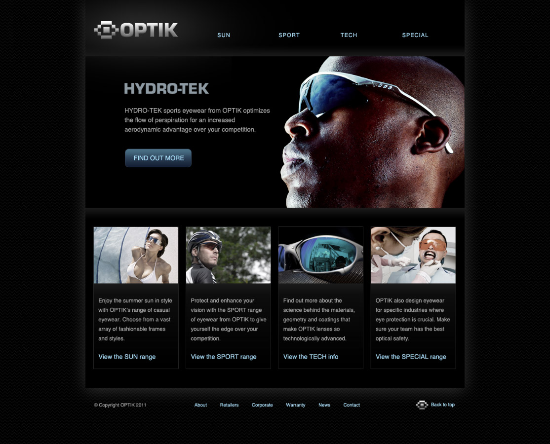
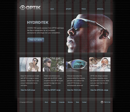
Here’s the complete website we’ll be creating. It’s a sleek design with subtle gradients and eye catching imagery based on an overall dark black/grey colour scheme. The whole website is laid out according to a solid grid which helps balance the page elements.
View the large scale website design concept

The fictional client I’ve made up for this tutorial project is a small eyewear brand named OPTIK. They want a website to showcase their range of products. It needs to reflect the sleek style of their sports eyewear and direct the user to their four product ranges. A selection of photography has been supplied, which needs to prominently showcase the products, otherwise you, the designer has free reign over the overall layout and design. If you’re looking to fill out your design portfolio or if you’re looking for a project to use as practice/experimentation, feel free to use this fictional client as a base for your own designs.
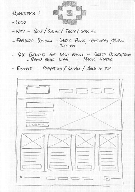
The design we’ll be creating as part of this tutorial begins on paper as a sketch along with simple notes. It’s always worth listing out the elements that are required on a page so you can make room and order everything in terms of importance. A simple sketch fleshes out the overall layout and gives us a clear direction when we open up Photoshop.

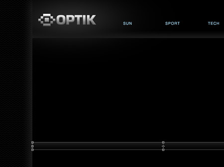
Create a new document in Photoshop. I have a preset template I use that already contains columns, gutters and a 24px baseline grid. Use the handy generator from http://grid.mindplay.dk to create your own, or if you’re an Access All Areas member, simply download the source file and save it for your upcoming designs.
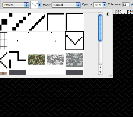
Fill the background with black, then use the zig-zag pattern from my Line25 pixel patterns freebie to fill a new layer. Inverse the selection, change the mode to Screen and reduce the opacity to 10%.
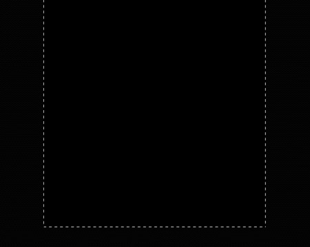
Draw a selection in the centre of the document measuring the full width of the grid and fill it with black on a new layer.
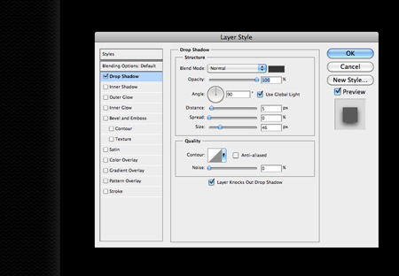
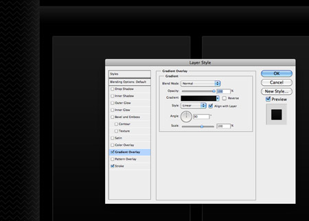
Open up the layer styles window and alter the Drop Shadow setting to produce a soft grey glow from behind the content panel.
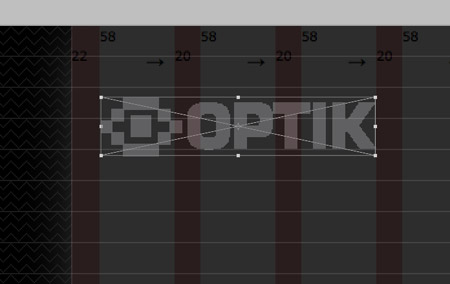
Paste in the OPTIK logo and align it to the grid, spanning three columns and aligning the baseline of the text to the baseline grid. Here I’m using the original vector version, but I’m sure a little magic wand action on the JPEG above will allow you to use the same logo.
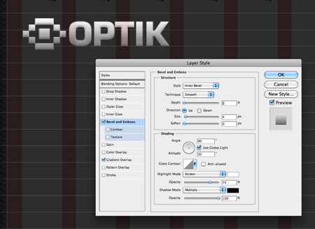
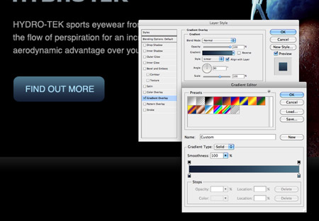
Give the logo some cool treatment in the form of a subtle grey gradient and very light Bevel and Emboss effects to give a basic metallic style.
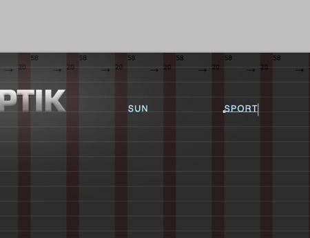
Use the text tool to type out a navigation menu along the same baseline with each item aligning to a column. Set the font styling to uppercase 14pt Helvetica with a light blue fill.
Draw a thin selection across the width of the content panel and fill it with a subtle gradient. Duplicate and flip this gradient and reposition it to outline a feature area at the top of the homepage design.
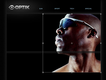
Paste in the first of the so called product shots, which is actually a stock photo of a cool fellow in some sunglasses courtesy of ThinkStock. Scale the image to size to fit within the feature area.
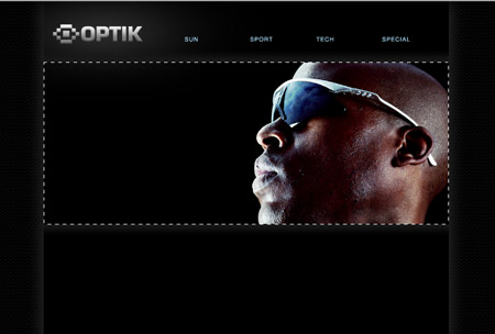
Draw a selection and create a layer mask to hide the unwanted portions of the image, leaving a letterbox style feature panel.
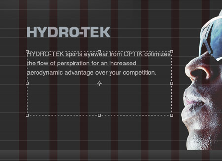
Use the grid to align some content relating to the feature image. Here the Hydro-tek logo has been imported from Illustrator using the same Eurostile font, while the body text is added in Photoshop as #9d9d9d 16pt Helvetica.
Use the Rounded Rectangle tool to draw the basic shape of a button, then bring it to life with a gradient and fine 1px stroke. Colours have been picked from the image to tie everything together while keeping the basic hue as blue in order to provide a recognisable and consistent colour between all clickable elements and links.
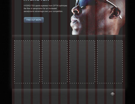
Draw four boxes underneath the feature area aligning their size according to the grid. Fill all four boxes with black.
Open up the layer style window and give the boxes a subtle grey gradient and 1px stroke to define their outline. These four boxes will relate to the four main links of Sun, Sport, Tech and Special.
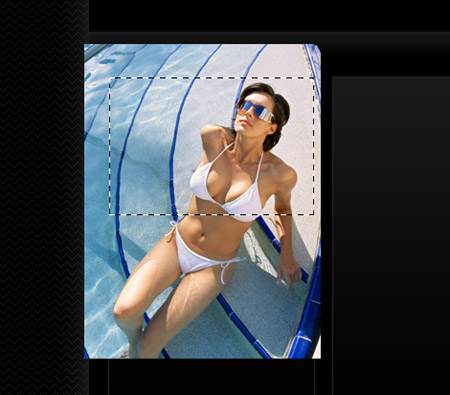
Import an image that relates to the Sun product range and clip it to size with a layer mask to fit within the little content box. This particular image is another from ThinkStock.
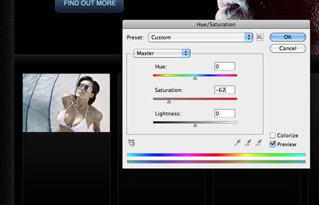
Duplicate the image layer then go to Image > Adjustments > Hue/Saturation. Decrease the saturation by around 60%. We’ll save both layers to create a cool hover effect on the final coded website.
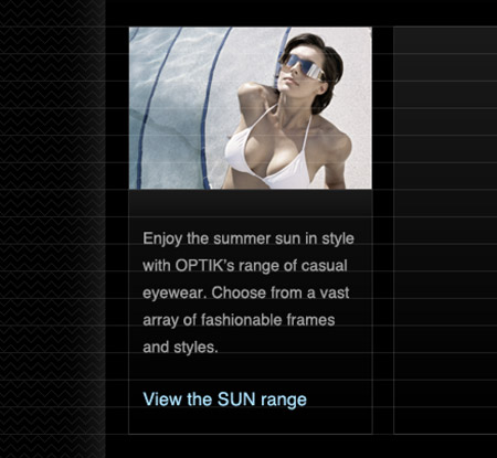
Type out a brief descriptive paragraph that relates to the product range, followed by a call to action link in the usual blue anchor colour.
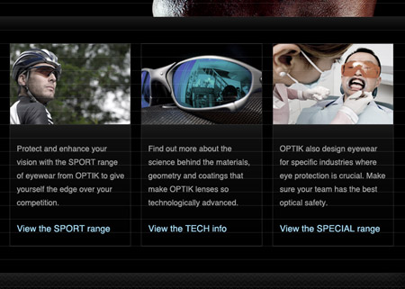
Finish off these little content boxes with images and content relating to the Sport, Tech and Special sections. More photos from ThinkStock were used alongside a creative commons photo from Flickr by Monsalvador.
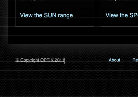
Underneath the main content panel use the text tool to lay out some typical footer content such as copyright notice, secondary links and a back to top anchor.
Take a step back and look over the design with the grid on and off. Aligning all the items to the columns and baseline grid helps achieve perfect horizontal and vertical flow, with every page element being neatly aligned.
The final PSD concept is now ready for coding up as a fully working website. If you’re excited to move onto the next step, check out part two over on my web design blog Line25. In the coding part of the tutorial we’ll build the homepage concept in HTML and CSS.

Man this is awesome, once again i am very greatful!
Thanks for the help, much needed!
There’s a lot of steps missing! Like how did the logo get that big glow? And when/how did you lighten up the whole header section? It’s a great tutorial, but it might be hard for beginners to keep up!
the tutorial was on how to use grid based web design. Not create the full website and art.
WOW!! Awesome Chris!… It will come in very handy!
Hi Chris,
Another great tutorial thank you very much and very slick design!
Wow, how do you come out with such a great designs!
Very nice – although most of that tutorial can be done using CSS.
Hey Chris, you make it look so simple! :) The outcome looks really professional and serious ;)
Thanks Chris! Really nice tutorial. This is very helpful for a beginner like me. Thank you for taking the time to do all of that.
awsome….
Hey Chris I really love your designs and it is really wonderful to learn from positive people like you. There is one thing that I still can’t understand from great experts like you and that is the combination of colors. How do you guys know what colors combine and what colors don’t combine? For example, this website all the colors combine and create a great contrast. How do you do that?
To make grids in ps, do you know guideguide ? it’s a usefull plugin to make easy grid with guides
http://www.cameronmcefee.com/guideguide/
Wow,This is awesome! Nice Tips. Thank you!
Love this – you’re the best!! :)
nice.thanks for the tips……
great tutorial, very grateful and thankful.
This is one of the best tutorials I ever read about creating website. Actually, I never read a tutorial about creating a website in photoshop before. Chris, your blog is still my number one source.. But if you could just write more frequently it will be great.
Thanks,
Haris.
Thanks for this and all the other great tutorials. I’ve been subscribing for a long time now.
There’s something that has always bothered me with grid designs so I do mine a little differen’t. I’m not saying that what I do is right thought I’d share.
The issue I see is that when you put all your text right up against the gutter, if you then add a box with text inside it you have to move the box text off the grid. On your example, the “S” of sport no longer lines up with the text inside of the “view tech info” box.
What I do is almost add padding (not the right word really) to all the gutters. So in your case I’d move “sport” to the right by the same width of the gutter so that all the text lines up horizontally. Boxes stay on the grid and text/content stays on the padding. I’ve been doing that for a while now and to my eye it works better.
Although this could be all down to a personal choice! – would be good to get your thoughts!!
Hey what a great post. Such a nice tutorial. I`ve been searching for smth like this
Great Post. Much needed inspiration for a Mockup. Why isn’t there a mention of PSD Slicing?