This post was originally published in 2011
The tips and techniques explained may be outdated.
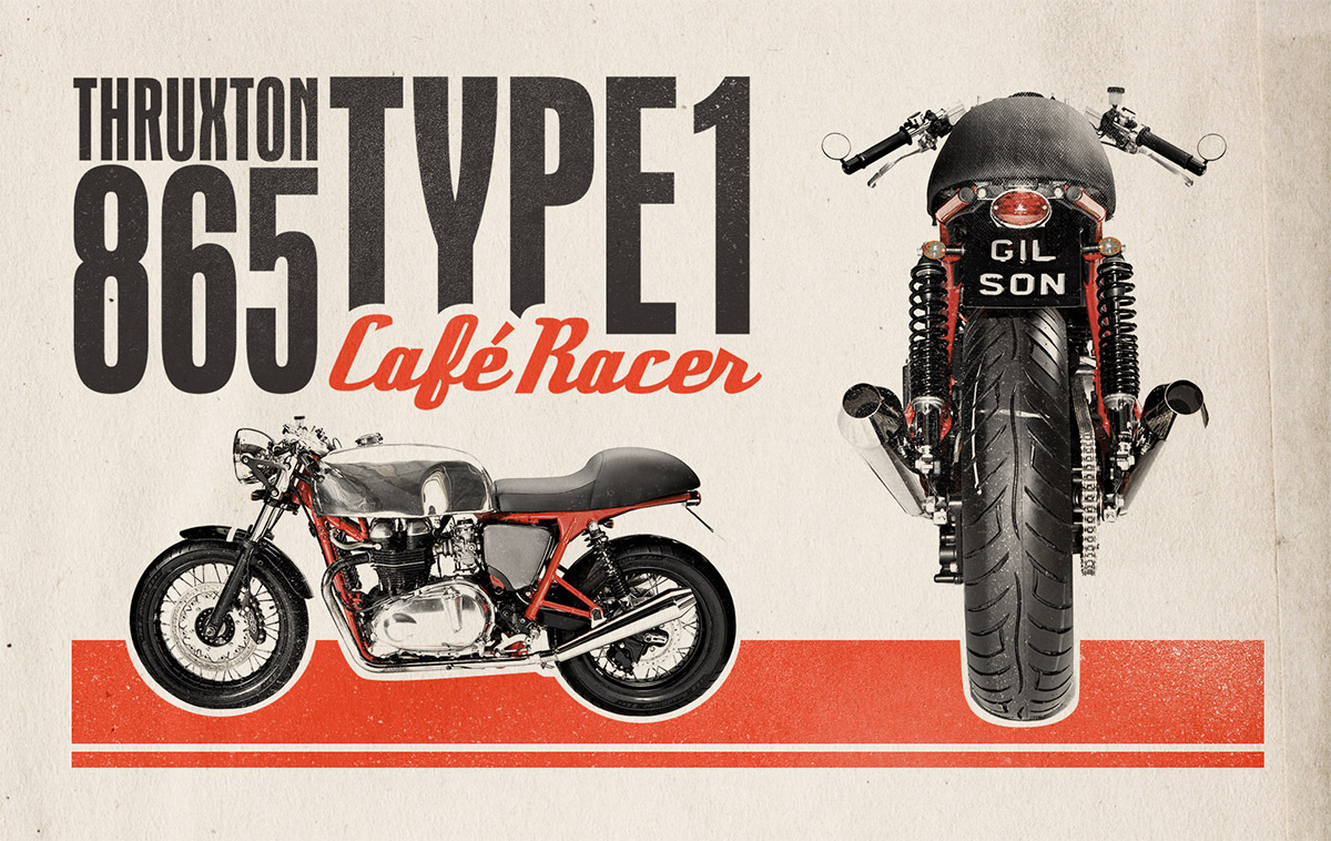
Follow this step by step tutorial to create a 1960’s style retro motorcycle ad for a modern café racer custom. We’ll mock up the ad design using inspiration from original ad designs from the time period then use Photoshop to replicate the basic screen printing effect and textures to give the artwork an aged appearance.
Our retro ad is based on the Triumph Thruxton 835 Type 1 Café Racer custom motorcycle by Gilsons. The bike is a modern day spin on the classic café racer style, with various modifications to the current day Thruxton giving this custom model that awesome stripped down retro look. We’ll also base our design on this throwback theme to give a kind of retro-futurism feel to the design.
View the large scale café racer ad design
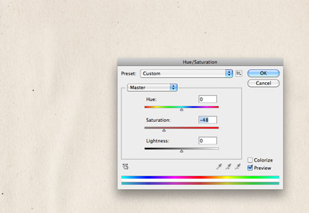
An aged paper texture is the perfect base for any retro or vintage themed design. Open up one of the paper textures from LostandTaken.com and slightly desaturate the image to lose some of the yellow tone.
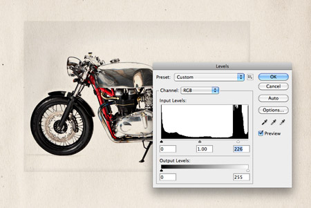
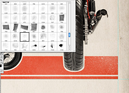
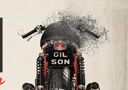
Jules Gilson has kindly made the profile photos of the custom Type 1 Café Racer available for Creative Commons use on Flickr. Download and open up the shots in Photoshop, set the blending mode to Multiply to render the white areas transparent, then begin cropping the highlights using the Levels window to brighten up the grey background until the bike is isolated. We’ll lose some of the colour fills from the chrome highlights, but this all adds to the basic screen printing effect where the original would be replicated with just black ink, a little like newspaper prints.
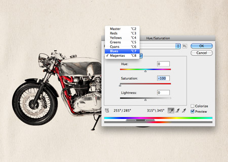
Open up the Hue/Saturation window and change the drop down selector to any colour other than red, then move the saturation slider to 0%. Repeat this process with all channels, leaving red as the only colour in the design. This again relates to the retro screenprinting effect where only one or two colours would be used.
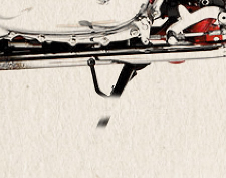
Use the eraser to carefully remove the stand from the bike image to tidy up the shot, then repeat the process for the second of the two bike photos.
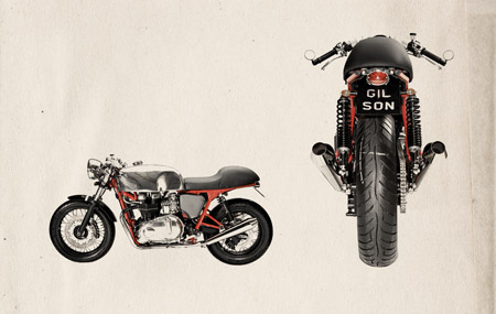
Arrange the two photos into a composition that leaves space for a spot of typography somewhere on the design. Keep the two images aligned along their bottom edges.
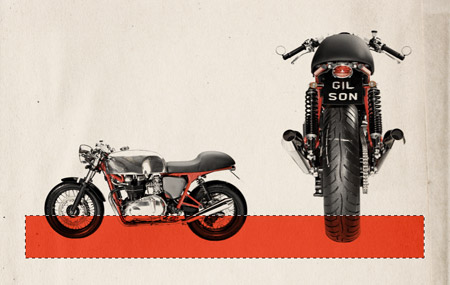
Use the rectangular marquee tool to draw and fill a band of red along the bottom edge. Use guides to maintain an equal margin along each side. Change the blending mode to Linear Burn.
Add a layer mask to the red band layer and begin masking out areas that overlap the bike photos, leaving a small margin. Don’t worry too much about being completely accurate as these inaccurates often help capture the misregistration from the cheap screen printing technique originally used.
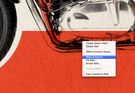
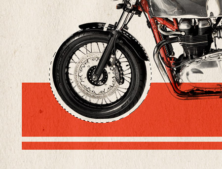
Use the Pen tool for areas that aren’t basic circles, draw an outline around the bike then right click and Make Selection.
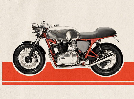
The design is already starting to look like an old generation print with the mix of stained paper and a limited colour palette.
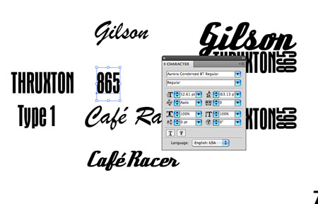
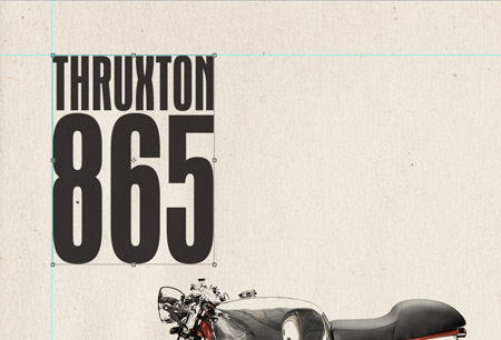
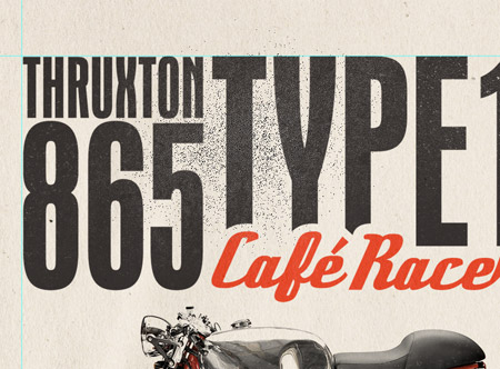
Move over to Adobe Illustrator to being laying out some type elements for the design. Use a range of fonts that capture that classic theme of old automotive ads. Here I’m using the fonts Aurora Condensed Bold and a freebie named Deftone Stylus.
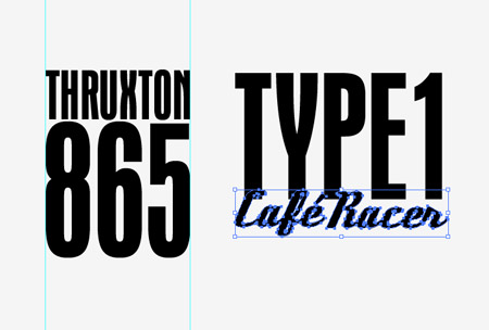
Convert the text to outlines then begin laying up the text into a typographic layout. Overlap the word ‘Café Racer’ so the gap between the two words is equal to the spacing between the letters of the ‘Type 1’ text .
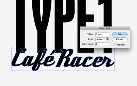
Go to Object > Path > Offset Path and enter 2mm in the options window to create a large border around the text running parallel to the original.
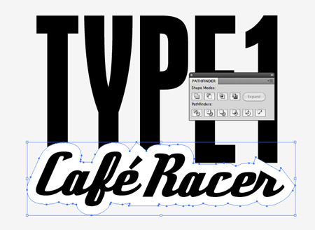
Ungroup the elements then Merge the separate pieces that make up the border into one shape using the Pathfinder tool.
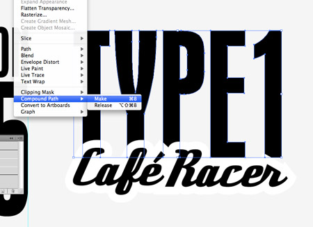
Ungroup the ‘Type 1’ text element then go to Object > Compound Path > Make to group the letters into one object.
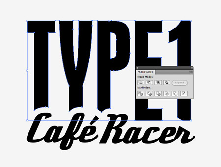
Select both the border and the ‘Type 1’ text element and hit the Subtract option from the Pathfinder window to punch out the shape, leaving both words perfectly legible with no overlap.
Paste in two portions of the text elements and align them to the upper left corner according to the margins. Give these black elements a blending mode of Multiply at 90% to allow the paper texture to subtly show through.
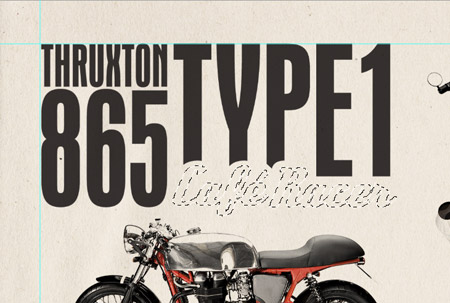
CMD+Click on the ‘Type 1 Café Racer’ layer thumbnail to load the selection, then hold ALT while clicking with the Polygonal Lasso tool to remove the ‘Type 1’ wording from the selection.
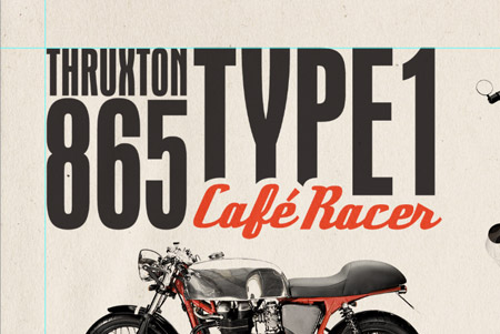
Fill the ‘Café Racer’ selection with red on a new layer and change the blending mode to Linear Burn. Delete the words from the original black text layer.
Our overall ad design has now been laid out, now let’s get busy with some grungy Photoshop brushes to rough up and distress the design to give it that aged appearance. Create a Group containing the red bar then add a layer mask. This will help keep the layer mask for the Photoshop brushes separate to the layer mask that outlines the bike photos so changes can be easily made if necessary at a later date.
Add a range of various brush effects using packs such as the Subtle Grunge brushes from Function. Add each effect using a layer mask as opposed to the Eraser tool so the changes aren’t permanently destructive.
Finally add a few brush effects to the type elements to give the impression that ink has been lost from the page over the years due to wear and tear.
Our final ad really does capture that retro theme with the help of the stained paper texture, limited palette and stylish typography.
Nice Tutorial…good choice of colors and typography…thanks a lot…
nice, so subtle
Love the type!
Thanks for sharing. This is a great tutorial!
Ace!
dynamite….
Simple yet so effective. Thanks for a great tut.
Absolutely loved it chris. I’m a fan of triumph anyway, so this just makes a great tut even better!
Top marks.
Really love it. Esp love the typography. Thanks for yet another quality tut.
Great work on that, I love the retro look/feel and the colors are spot on…
Nice article, thanks :)
Thank you for the wonderful post
i LOVE all of these
Nice website and tutorial :-)
Thanks :-)
Awesome tut, booked marked this for my next poster design!
Another great tutorial Chris. Thanks
Great tutorial Chris. I found the tips on working with this style of type particularly useful as this was something I hadn’t done before.
Thanks!
Thanks for this tutorial. I like it.
Loving the cut away typography. top notch work as always
Great tutorial as always. Keep em’ coming… Cheers!
thanks, although my lust for a cafe racer has just gone up a notch, not sure if that’s a thanks too: )
Thanks for the killer tutorial! I like the back view of the Triumph! The chain and springs…. Looks so good!
this is great! This is really helpful to advertising and selling a motorcycle
güzel bir uygulama olmuş teşekkürler
Thanks have a nice application
Thanks for sharing. cool tutorial
Good comedy is great.
Nice tutorial
:)