This post was originally published in 2011
The tips and techniques explained may be outdated.
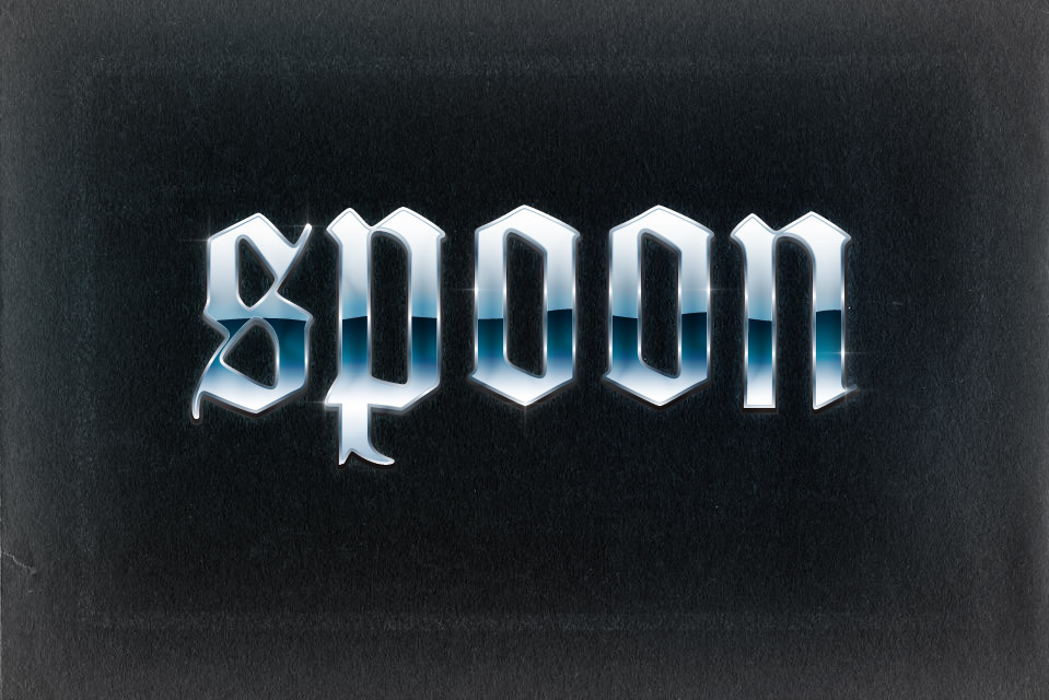
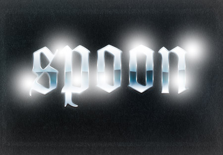
Follow this step by step tutorial to create a super cool retro chrome text effect in Illustrator. We’ll use a range of gradients to give the impression of bright highlights, then take the text into Photoshop for some finishing touches.
The chrome effect we’ll be creating is inspired by the popular effect from the 80’s and 90’s. Lots of gradients help build up the effect of highlights, while the reflection along the centre of the text is typical of this style of text effect.
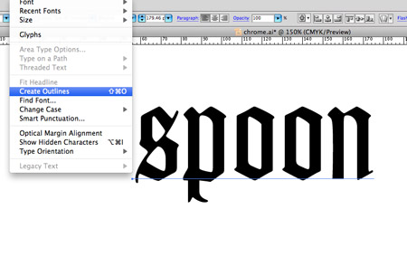
Open up Adobe Illustrator and add some text in the font of your choice. Here I’m going all blackletter with font Goudy Text. Press CMD+Shift+O or go to Type > Create Outlines to convert the text into solid shapes.
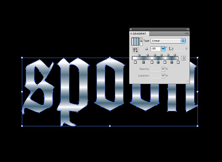
Give the text a gradient fill using alternating colour swatches between white and a dark blue. Change the angle so the gradient flows horizontally.
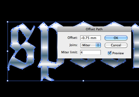
Select the text and head to Object > Path > Offset Path. In the options box enter an offset of -0.75mm. Once done, right click on the text to ungroup.
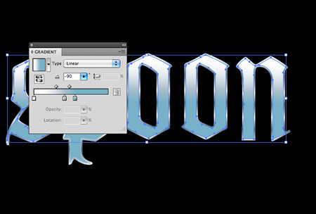
Swap the gradient fill of the new offset shape to a vertical blue gradient and give it a 0.75pt stroke using a mid-blue from the gradient colours.
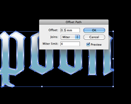
Select the outer shapes once again and add another offset path, this time enter 0.5pt in the offset settings.
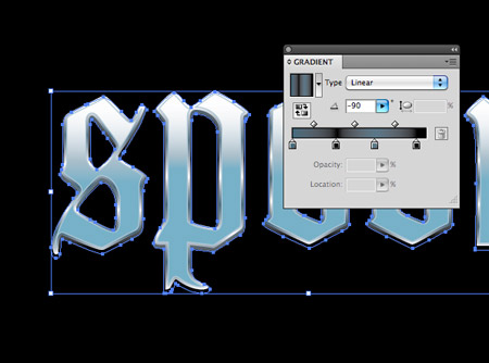
Change the white swatches in the gradient window to black, then nudge the text downwards slightly to give more of a three dimensional appearance.
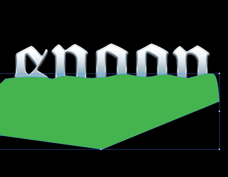
Use the pen tool to draw a rough shape around the text. Pay attention to the line that cuts across the centre of the text to make sure the curves are neat.
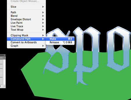
Copy and Paste in Front (CMD+F) a duplicate of the inner text shapes. Select them all and go to Object > Compound Path > Make.
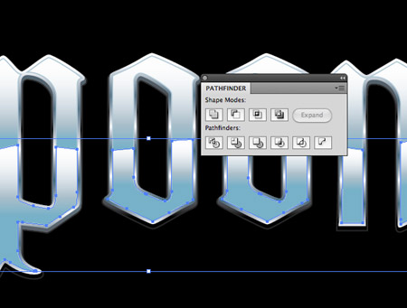
Select the compound path along with the temporary shape and hit the Intersect option from the Pathfinder window to trim the shape to size.
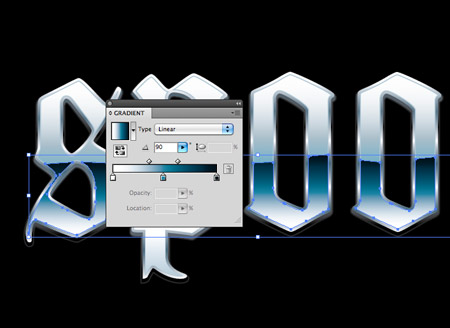
Adjust the gradient fill of the inner shape to flow from black to blue to white. Alter the handles of the gradient towards the centre colour.
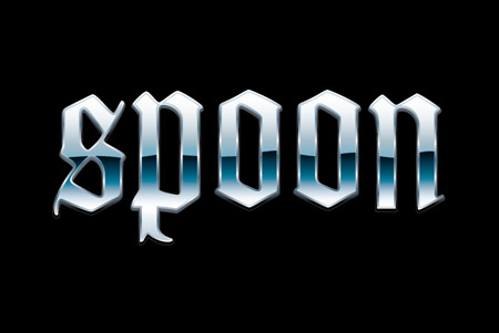
The various gradients really help build up a realistic series of highlights and reflections, which all add to that chrome look.
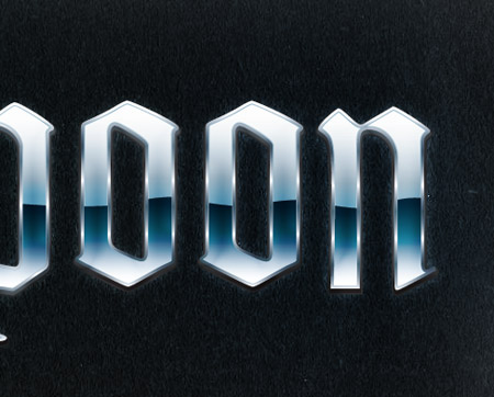
Finishing touches in Photoshop
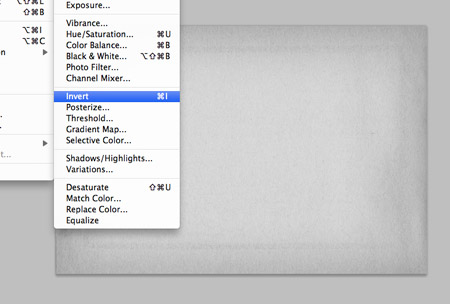
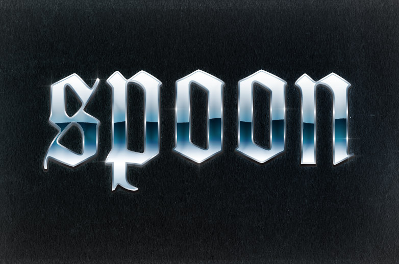
The vector version of the text effect looks pretty cool, but we can finish the design off with some good old Photoshop polish. Import a texture, desaturate and invert to form a nice background.
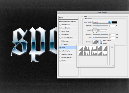
Paste in the text from Illustrator, then add a Satin layer style effect. Change the colour to black, blend mode to Overlay and contour to Half Round, then play around with the Distance and Size to adjust the amount of distortion on the gradients.
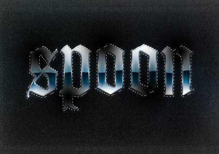
Dab a few spots of black on a new layer using a soft brush, then CMD+click the text layer to load the selection. Inverse the selection then delete out the excess. Change the layer style to Soft Light and adjust the opacity to create a few tonal changes to the text effect.
Repeat this step, but this time with some white blobs to add some tonal highlights to the text.
These subtle changes help add a touch of realism so the colours and gradients aren’t so uniform.
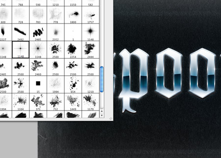
Finish off the text effect with some star brushes to create some specular highlights. Place a star shape on key areas such as corners which would reflect the light.
The Photoshop finishing touches really take the effect to the next level with tonal changes and highlights that just aren’t possible in Illustrator.

And now to relearn this same technique in Inkscape… ;)
Glorious! :)
Thanks!
this is so good, i will be using this in the future! and so simple!
Is it just me that because the metal band the text appears to be blurry?
Oh and Chris, I’m waiting for a detailed tut from you ;)
I thought the same thing. But I do love this simple and easy tut!
Is it just me or does the metal band makes the text look blurry?
Oh and Chris, waiting for a detailed super awesome tut from you ;)
Awesome tutorial… really simple (in a good way) technique to create a cool result. Keep up the awesome work!
Thanks a lot, Chris.
Simple, but really nice outcome :)
may i copy paste this in to my blog?
:)
hi Mr Spooner… would you mind to read my post about you? :) http://bit.ly/i0Oj4G
That’s a clean and shiny spoon, right there. ;o)
I really like that effect; reminds me of 70s and 80s rock group artwork like AC/DC or maybe Guns ‘n’ Roses.
Hi Chris – love your posts and the blog !
This made me remember the Amiga500 days when everything was bend in chrome and 80’s glitter ;-)
Love it !
Great one, thanks!
looks beautiful, specially the font is really very cool.
thanks!
VERY cool…
Thanks for another tutorial. I learned something new here. I forgotten to use star brushes at the end..
Dude, thanks again.
Haris.
This is very eye catchy.Nice graphics.
Super cool. Bookmarked
Wow looking very retro and cool!