This post was originally published in 2011
The tips and techniques explained may be outdated.
I’ve always love browsing the amazing style of art known as Vexel illustration and recently I decided to finally give it a go myself. Follow this step by step tutorial for the making of my first vector art portrait of Tron Legacy’s Quorra. Learn how the portrait is carefully traced and vectorized in Adobe Illustrator to create an interesting vexel style design.
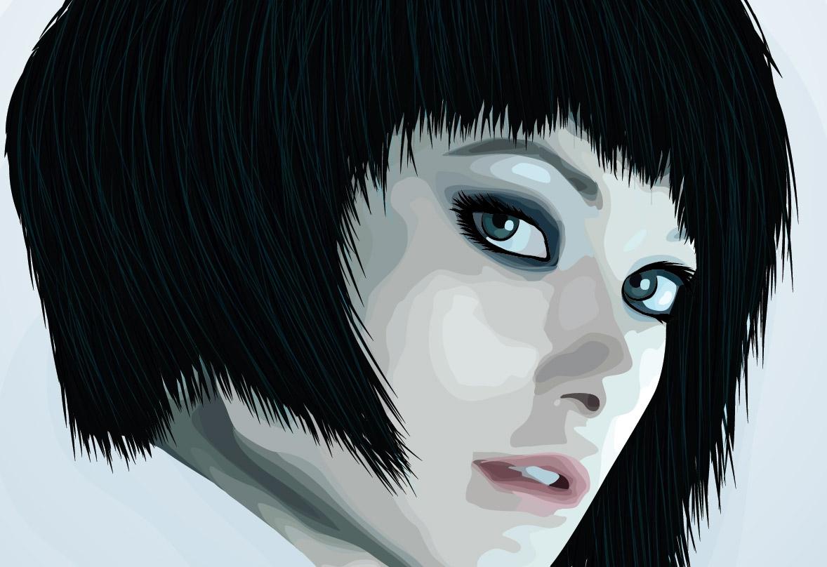
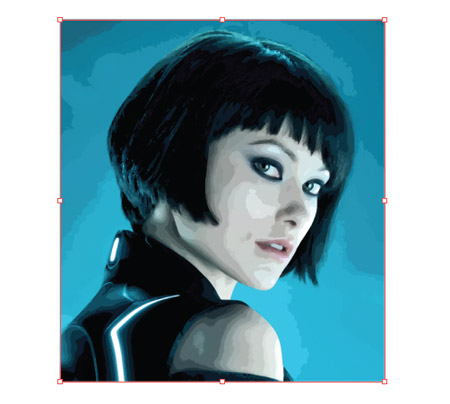
The portrait we’ll be working on features the beautiful Quorra character from Tron Legacy. The term vexel art matches the style of this illustration, where a semi-realistic image is produced from numerous layers, but to be fully recognised as a vexel illustration the artwork has to be pixel based. This design is created in Illustrator rather than Photoshop, which I think is the better tool for the job, but to keep the vexel purists happy we should refer to it as vector art.
When creating this type of artwork you can go as simple or as detailed as you like. The less layers, the more stylised and ‘artsy’ the illustration becomes, much like this piece. On the other hand if you have a good few days to spare a stunningly realistic design can be created using thousands of layers.
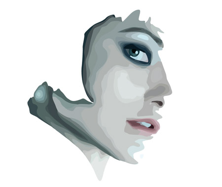
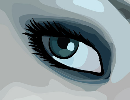
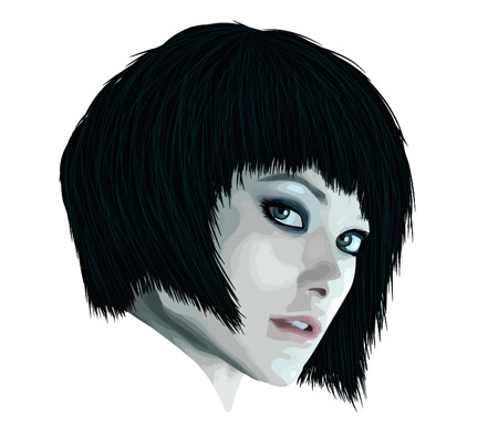
View the final Quorra vector art portrait
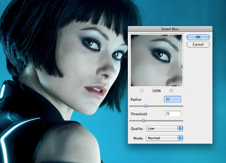
The first step when creating any vexel style portrait is to source a subject. I’m still buzzing from seeing Tron Legacy at the cinema so I’ve picked out this profile of the character Quorra. Open up the image in Photoshop and add a subtle Smart Blur to remove the finer details.
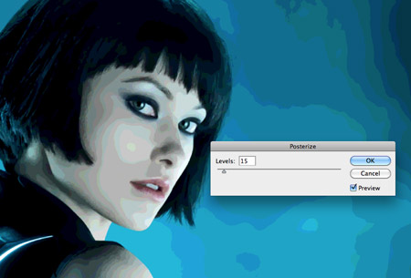
Next, make a duplicate of the layer and go to Image > Adjustments > Posterize and change the levels to between 15-20. As previously mentioned the more layers you create the longer you’ll be sat tracing, but the overall image will include a much deeper range of tones and will become hyper-realistic. Duplicate the Smart Blur layer one more time and place it above the posterized layer. Change the blending mode to Color to remove the ugly green and blue tones added by the posterization effect.
Take a snapshot of the base image and place it into Adobe Illustrator. The idea is to trace each ‘shape’ that has been produced from the posterization effect to recreate the image in vector format.
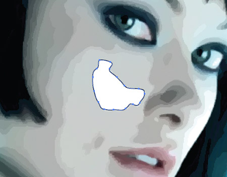
Use the Pen Tool to trace the brightest highlight on the cheek. Don’t worry about staying true to the exact outline, rounding off corners and drawing a more basic shape can often make for a better final image.
When the shape is complete, switch from the Pen tool to the Eyedropper and sample a tone from the base image. Switch out the default fill and stroke of the vector shape for this colour. Move onto the next level; trace; then sample the next tone.
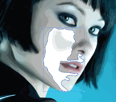
Continue the process of tracing each subsequent layer and sampling the tones from the base image. Soon the portrait will begin to take shape. As two areas of the design meet, you may need to alter the stacking order by pressing the CMD+[ or CMD+] shortcuts.
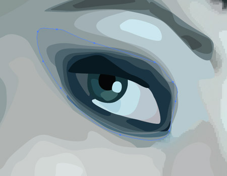
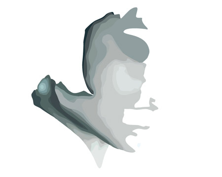
The eyes of any portrait are the most important areas, so take the time to build up as many layers of detail as possible. Notice how the whites of the eyes are more than just white – They include a range of subtle colour changes which make for a more realistic image when viewed from afar.
As the facial features are added to the portrait the design becomes increasingly recognisable, yet it maintains that cool stylised effect with the visible layers and shapes.
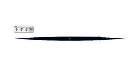
Elsewhere on the artboard draw a wide, flat oval. Use the Pen tool to convert the anchors on each end to create sharp points. Press the ‘new’ icon in the Brushes palette to create a new brush setting.
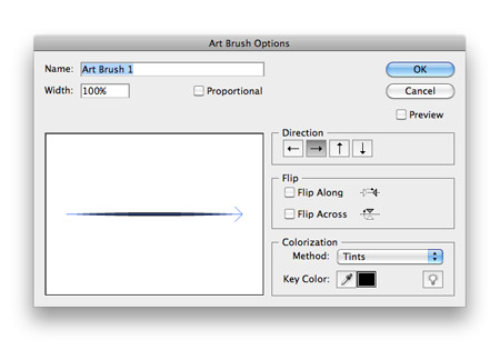
Select ‘New Art Brush’ from the options box, then change the Method to Tints. This will allow us to change the colour of the brush strokes if necessary.
Use the Brush tool along with the new brush setting to add some extra definition and detail to the eyes. Outlining the eye and drawing a series of eyelashes really helps them stand out.
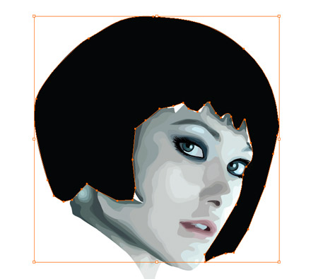
On a new layer use the Pen tool to roughly draw a shape to represent the basic hair line. It doesn’t matter too much about the awkward shape.
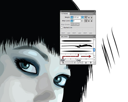
Use the brush tool with a 0.25pt stroke setting to draw in individual strands of hair to disguise the ugly hairline outline. If required, double click the Brush icon in the tools palette to alter settings such as ‘Keep Selected’.
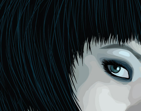
Subtle highlights in the hair can be created by drawing thin 0.15pt strokes using brighter blue colours. A graphic tablet really comes in handy here.
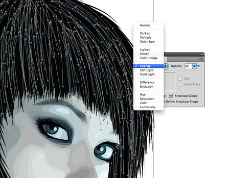
Draw a few layers of hightlighting strokes, then change the transparency mode to Overlay and alter the opacity of each layer to tone down their prominence.
The portrait is really taking shape now the facial tones and hair are complete, so let’s finish off the design with a cool background.
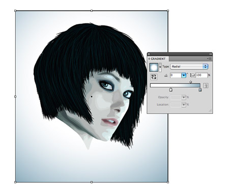
Draw a rectangle to enclose the design and send it to the bottom of the layer stack. Add a radial Gradient fill using soft blue tones from the portrait.
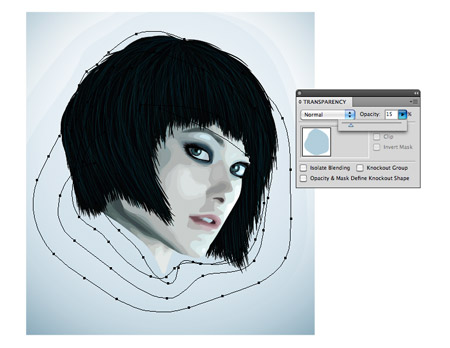
Using a range of vexel style contour shapes in the background helps complement the style of artwork used in the portrait. Change these shapes to 15% opacity to tone down their prominence so they’re hardly noticeable.
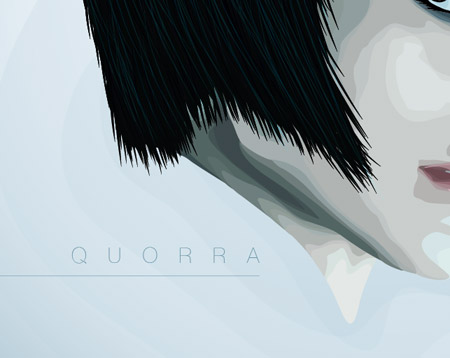
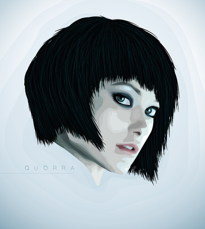
A simple line of text finishes off the design nicely. Here I’ve added the name ‘Quorra’ in ulralight Helvetica Neue with super high tracking, neatly underlined with a thin border.
The whole process can be a little tedious, but with patience it can be relaxing to get your head down creating simple shapes for hours on end. The final artwork makes it all worth it, especially if you take the time to create a super realistic design with numerous layers.
As always, simply fantastic Spooner. Good job.
By the way, what do you think about the trace tool? Perhaps it could also be useful
Chris this is well done but I wish you didn’t encourage tracing, a shortcut to really learning how to draw portraits.
@Andrea Austoni
Remember that when learning, the first thing you do is imitate other peoples work, until you understand the processes. Then as your skills develop you move on to improvising and developing your own style and approach. Its at that point you would start drawing your own portraits. If you are a beginner at illustrator or not confident at doing something as daunting as a portrait this is a great way to get started on the path, to eventually drawing your own stuff :-)
Nice tutorial Chris!
I don’t see how tracing the result of Photoshop’s posterize filter can teach you anyhting about capturing the features of a person, let alone develop your own style, but if you want to skip the development of observational and drawing skills and take the easy shortcut this is a great technique with impressive results.
I can certainly understand your point, I’d love to be able to create realistic portraits by hand. Even when I was actively pursuing more artistic methods during my Art and Design classes at college and uni I could never ‘draw’ anything as good as I’d hoped. But as the good old saying goes – Practice makes perfect. Maybe I just need to put more time into it?
I don’t think there’s anything wrong with these tracing techniques, like all digital design software it makes the creation of cool stuff much easier, to the point where someone who can’t ‘draw’ portraits can still create great looking portrait type work. The same can be said when comparing any type of modern digital techniques to more traditional methods that often require more skill. Take photography for instance.
Similar tracing methods are used by even some of the big name Illustrators I’ve come across. So if it works for them it’s definitely good enough for me haha!
With all that said I do love and commend you for your illustration work, especially knowing that you are working by hand. What’s even better is you take the time to also write tutorials to help share tips and advice.
I know this method has its merits and it certainly helps everybody get better results. I have a problem when it becomes the norm, though, and young designers think it’s a legitimate way to create high-end results.
Nothing can replace the patiently acquired skills of an experienced illustrator.
For my part, I’m currently struggling to overcome my limited drawing skills and offering portraits is a good, albeit risky way of putting myself on the line.
I’m learning quickly, though, thanks to the pressure.
I totally agree with Chris, I have some friends who are great designers but not much of a skillful drawer. I’m a good drawer but not yet a keen designer. Sometimes I think one must be very lucky to have both, and thanks to computer age which gives us the endless opportunity to deliver unlimited artsy creativity.
I think drawing and designing is very similar, they all need references, practise and experience, and the creator’s own feelings to give birth to an artwork. Although I love drawing and paintings very much, I respect and admire awesome designers whose works are made with different mediums, sometimes their artworks are far way more soulful than ones who only know how to draw, sketch and paint.
Oooh, nice one, Chris. I’ve been looking for a ‘smart’ way to do some nice-looking vector photo traces. This guide will help enormously. Cheers!
Great tutorial! Looks simpler than the actual doing time-consuming process, I figure.. hehee!
I love this tutorial.
thank you
Nice tut. I love how you use photoshop to simplify the photo, but could you use the blending tool in illustrator to merge together her skin? Or create a gradient mesh?
Dude, you make it look way to easy ;)
Well done on another awesome tut!!!
very very nice! i’ll give it a go later :)
thanks a lot mister spooner! moar power!
So good! :) Your skills still amaze me!
Very Nice Chris.. Fantasticoooo
Great and simple tutorial with a nice result!
Thanks for not trying to be too clever about the way you do stuff and actually going into detail.
different idea for create an beautiful vector as per requirement. thanks
it’s hard to find your Helvetica Neue font….
:(
What a truly well put together tutorial- in fact the whole site is impressive and I am glad I found you. Many Thanks!
A beautifully structured tutorial. Thank you for sharing.
thank you
Thanks for your sharing…
Great tutorial… but its most like “quick tips” =) thanks for share.. nice techniques =)
Hi , Mr … Very gooooooooooood Design Your
comment me is Iran
tanks…
great tutorial; love all the ornate ornaments…… your work is super
Fantastic tutorial!
I’m using your techniques to solve a problem that’s been vexing me for quite some time with a pic done in 8 bit graphics that I’m trying to do in Illustrator. The blur was what I needed to get a better working image. Thanks! :)
Awesome tutorial, this is simply fantastic. Nice. Thanks
Hello friends,this is a nice site and I wanted to post a note to let you know, good job! Thanks
Best regards, Natali, CEO of free music downloads
Hi Chris, this is awesome. Just did my own portrait as I am fresh out of college and really trying to do as much practice as I can to improve my design work. Love your tutorials and site. Thanks :)
Tools don’t matter; neither does style. If you get the vision in your mind into the viewer’s mind, you have succeeded. Everything else is ephemeral. Not so long ago, photography was not considered a true art form, because, “It’s just a machine doing all the work.”
Never thought of posterizing the image before going into Illustrator. It looks cool, but the posterize really shows and doesn’t give a unique look. Still, if I was learning how to use Illustrator for vector art, this would be a good learning step.
A thing I learned years ago when doing vexels/rasters was to build light layers of shading that were the same color. That way, you could get subtler effects and smoother blending between steps.
“Take a snapshot of the base image and place it into Adobe Illustrator.”
I’m a beginner with AI. Can you please tell me how to do this step? Thank you!
well done, thanks for sharing look really amazing
I thought this might be a Live Trace tutorial at first glance, so I was impressed that it went so far as to encourage tracing the shapes by hand. Personally I do think an artist can gain a better understanding of light and volume by observing the way Photoshop posterize flattens an image. It’s mechanical, but it helps you see the interplay of highlight and shadow in a way that is hard to observe between subtle gradients of color. So if you look at it for that info, it can help you visualize your own way of representing an object with depth in fewer colors. Maybe not the be-all-end-all of techniques, but certainly an educational one! Thank you!
interesting..tank you..
Amazing work, Chris !
From early, I was so interested to learn vector using Adobe Illustrator. But why is it difficult for me? I still use Corel 12
excellent…machi
Chris!
You’re good!! Though I browsed the web looking for info on using Illustrator to make street maps…u wowed me with your displays. I haven’t started using it, but I hope it won’t difficult!
Just a note that vexel isn’t a style. Nothing about this tutorial has anything to do with vexel art.
Vexel art is meerly the layering of raster objects, regardless of how the outcome looks like. This is just what is known as “posterize tracing” and associating it with vexelling gives a bad impression of vexel artists.