
This post was originally published in 2009
The tips and techniques explained may be outdated.
A great looking portfolio site is crucial for any designer to instantly present their work to potential clients or employers. A simple, single page site can do this effectively by displaying three key features of large header with short introduction, examples of your work and methods of contact all in one, extremely browsable page. Let’s take a look at producing a single page portfolio concept in Photoshop, constructing the page in XHTML/CSS and adding some fancy functionality with jQuery.
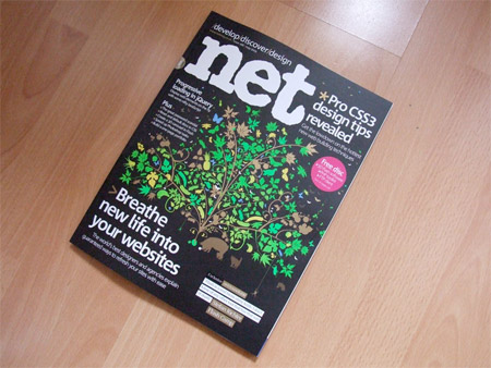
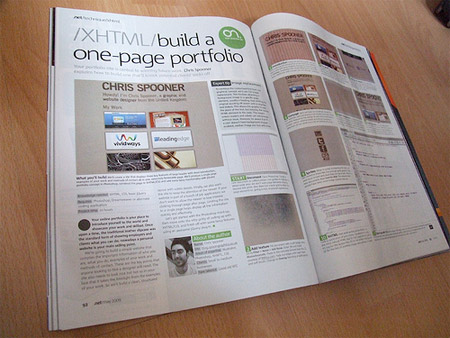
Last month, I had the pleasure of writing an article for internationally renown NET Magazine, also known as Practical Web Design in the US. The article titled Create Your Own Single Page Portfolio Site with XHTML/CSS and jQuery appeared in issue 188. The folks over at NET magazine have kindly allowed the article to be republished here on Blog.SpoonGraphics for those who might have missed it. I highly recommend checking out the new issues of NET magazine, and to catch them on Twitter for some handy web design tips and tecniques.
Your online portfolio is your place to introduce yourself to the world and showcase your work and skillset. Once upon a time the traditional leather slipcase was the standard form of showing employers and clients what you can do, nowadays a personal website is your main selling point. Sure, you could use websites such as Flickr, DeviantArt or similar to produce a quick and easy collection of work, but we’re wanting to look professional here, and nothing beats your own hand crafted site sitting pretty under your personalised .com domain name.
What we’re looking to achieve, is to build a simple website that compiles the important information of who you are, what you do, examples of your work and methods of contact. These are the key points anyone looking to hire a designer will need. The site also needs to look nice, but not to be too in-your-face that it takes the limelight from the examples of your work, so we’ll build a clean, structured layout with subtle details. Finally, we also want the site to keep the attention of the viewer, if your website is part of a bunch of job applications we don’t want to allow the viewer to lose interest clicking through page after page. Limiting the site to a single page helps display all the information quickly and effectively.
Let’s get started with the Photoshop mockup, then move onto the nitty gritty of coding up with XHTML/CSS, and finish off with some fancy features using an awesome jQuery plugin.
Prepare The Document
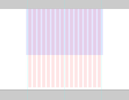
Start work by opening Adobe Photoshop, create a new document at 1680x1050px. Draw in guides to highlight a 960px wide area to accommodate 1024×768 resolution monitors. We don’t want any major page elements straying beyond this point. Also draw out a basic grid to align the page elements to, giving a nice, structured appearance.
Add Some Texture

Fill the document with a soft beige colour, then go to Filter > Noise > Add Noise. Enter 3% and check the Monochromatic option. Paste in a concrete texture from Bittbox.com. Fade out the edges with a layer mask and soft brush, then change to the Overlay blending mode at 40% opacity.
Introduce Yourself
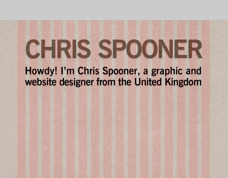
Using the grid as a guide, type out your name and a brief introduction of your services in your favourite typeface. Add a very soft Drop Shadow and change the blending mode to Overlay. Emphasise the visual hierarchy by making the name stand out with a larger size and stronger appearance.
Present The Goods
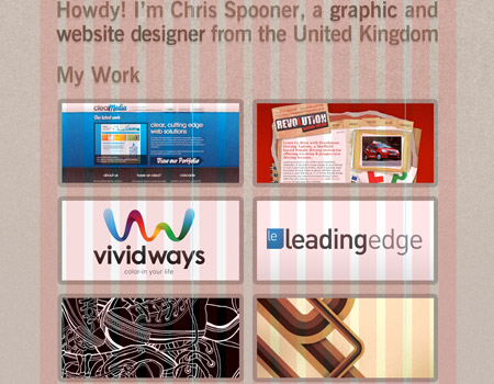
Pick out a small selection of your work and crop them down to thumbnails at 400x180px. Add a 10px stroke at 10% opacity to blend them into the design. Pay particular attention to their alignment to each other, making sure the horizontal and vertical gap between each image is the same.
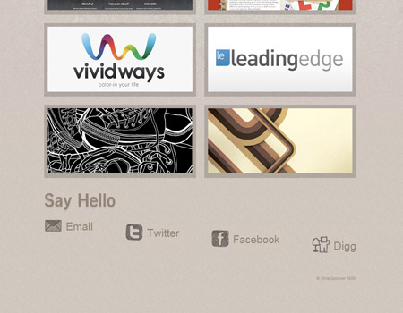
Methods of Contact
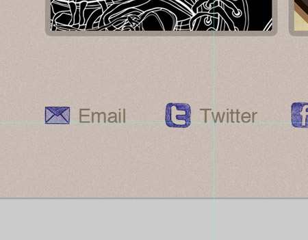
After the viewer has browsed your selection of work, they may want to get in touch or connect. List out your email alongside your main social networks, such as Twitter and Facebook. Use the doodle icons from a previous post here on Blog.SpoonGraphics.co.uk to spice up the links. Add a Color Overlay to blend these into the site colour scheme.
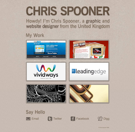
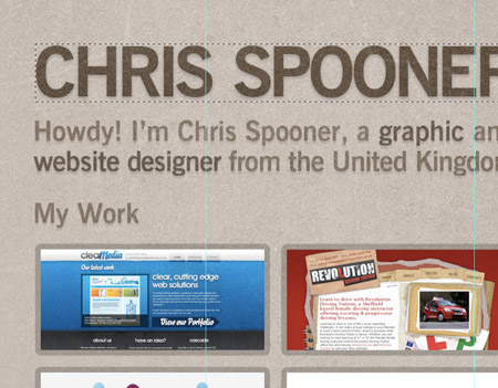
The Overall Concept
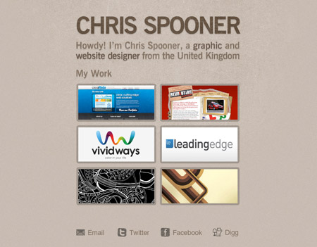
Here we have our graphical concept for our website, laid out exactly how we plan it to look. There’s a subtle texture to the design to add some visual interest, a basic colour scheme based around our branding, a selection of our work and a list of methods of contact. Time to take a well deserved break.
Export the Background
Our concept uses the large area of stone texture as part of the design, toggle the visibility of all the other layers and copy a large section of the graphic. Save for Web and tweak the compression to find a happy medium between file size and image quality.
Export the Page Elements
Continue cutting up the document and exporting the individual files. Due to the cool typeface and effects used on the text, we’ll have to export these as images also. However you could always sacrifice small design features in favour of web safe font styling, or even technologies such as SiFR.
Optimise Using Sprites

When it comes to exporting the icons, we can combine these files into a single sprite graphic. Copy each icon in turn and stack them on top of each other in a new document, then Save for Web. This reduces what would have been 7 image requests into 1, for a speedier page load.
Write Up the XHTML
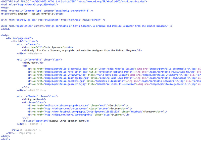
Start work writing up the XHTML in a coding application of your choice. Pay attention to using the most natural HTML tags for each page element, such as H1 tag for the largest title, H2 for the smaller headings and UL for the lists of portfolio images and methods of contact.
Style it Up with CSS
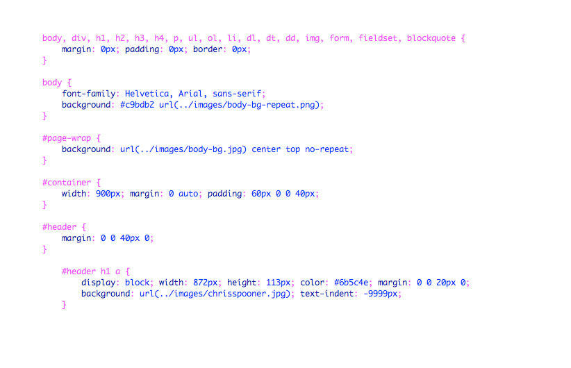
With the relevant HTML tags in place, CSS styling can be added to change the appearance of the code. Begin with a reset to remove any browser specific or default styling. The repeating texture can be attached to the BODY, while the larger background can be used along with a page-wrap DIV.
Lay Out the Page Structure
Style the container div with a specific width and add margin: 0 auto; to align the div centrally on the page. The headings can also be styled using the background-image property. Don’t forget to shift the default text off-screen using -9999px. This is a commonly used CSS image replacement technique.
Float The Thumbnails
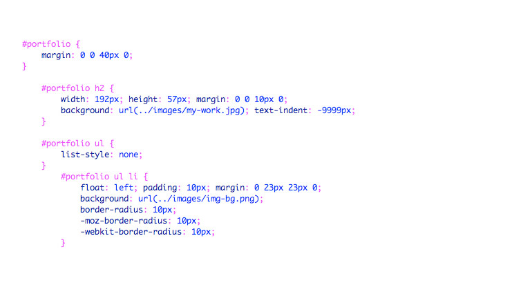
By default an unordered list will display vertically with ugly bullet points, but the good old UL can be extremely versatile with the help of CSS. Float the portfolio thumbnails to the left to lay them out side by side, then add some padding and margin to space them out just like the concept.
Put the Sprite Into Action
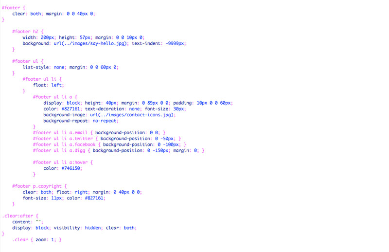
The image sprite we produced earlier can be implemented with CSS. Style the #footer ul li a with any generic options such as margin, padding, color and font-size, as well as adding the contact-icons.jpg background-image and setting to no-repeat. Then for each individual anchor class, target the appropriate icon using the background-position rule.
Spicing Up With jQuery
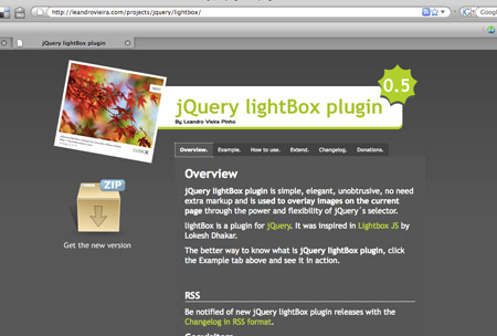
By default the image links for the portfolio will simply open in the browser, but that’s boring! With the use of some awesome, ready made plugins along with the jQuery framework we can easily add some great looking effects. Download the jQuery Lightbox package from Leandrovieira.com.
Copy The Files
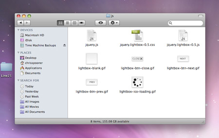
The jQuery lightbox downloads as a complete example, pick out the files we need and copy them to your own project folder. We need jquery.js, jquery.lightbox-0.5.js, jquery.lightbox-0.5.css and the 5 image files. Link up the Javascript and CSS files in the HEAD of your HTML document. Then, write the jQuery script to target the portfolio links.
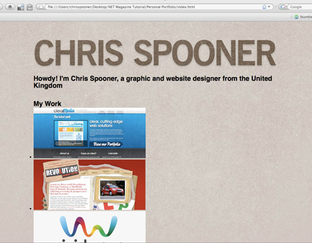
The Completed Website
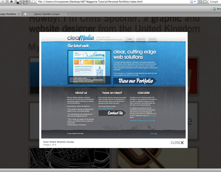
With the jQuery functionality in place our website should be looking spot on. We have a simple one page site, with short introductory sentence, a collection of work examples that launch with a stunning animated effect and a range of contact portals. Our website is complete, or is it?…
Browser Testing
It’s crucial to check our site in a range of everyday browsers. Our valid code might look great in Firefox, Safari, Chrome and Opera but Internet Explorer can sometimes display rather strange issues. IE7 seems fine, but IE6 is showing the typical ‘stepdown’ bug on the footer links. Display: inline to the LI soon sorts that!
Time to Launch
With the peace of mind of a correctly displaying site in various resolutions and browsers we can go ahead and place our freshly baked website live for the world to see. Check out the working demo, including a fully commented copy of the stylesheet.

Simple yet effective and useful – Exactly what we want. Well done Chris!
It’s so clean! I love it. Keep it up!
I would be happy if you took a quick look at my blog. you might like it!
Very nice, as I’ve already said when I bought the .net magazine when I knew you had a tutorial in it! Keep up the great work!
Very Cool!
Thanks for the tutorial. :)
This is really useful .. simple and to the point! Thnx for sharing this Chris :-)
Nice idea to make them talk about you and come to see your portfolio, dude!
I have to admit, I hadn’t read that section of my .NET but it was a great tutorial.
very thanks for you
Excellent tutorial
You are a genius!
You are Amazing!!!… Excellent tutorial.
Thank you very much.
Great tutorial Chris!
I’m trying hard to understand what is the simplest way to put an ajax/php contact form (you know: your name, your email, your message) in a portfolio like this.
Not an hosted service, of course.
suggestions?
A nice, simple PHP contact form I’ve come across is this one from CSS-Tricks.
Cool; I’ve been using a page portfolio for 1-2 years now.
http://web.ics.purdue.edu/~rohicks
Nice! Been looking for something like this. Question: does it work with .swf files to showcase flash work ?
The lightbox script used the tut doesn’t mix with flash, but there are a bunch of similar javascript scripts that could be used instead. Check out http://planetozh.com/projects/lightbox-clones/ for a handy comparison chart.
Thanks for the reply and link, Chris!
You an use a simple pop over or popup javascript, simple is often better remembering that flash is not readable with Google so make sure you title and alt the flash display to show the accessible (nice) side of yourself.
You can also use DHTML or open a new page using css and target=”_blank” very old school but the advantage is it does not get blocked by popup blockers, combine that with a javascript resize on the new page/tab and you have a simple way of showing your work off.
Better yet with your current clients just put the image of the work you have done, and give a link to the actual site where your work currently resides. That stops the issue of swf files. You client is happy and you give them a link.
Very nice.
We just made one for our designer – http://colvacne.com
Awesome! This will come in handy for my portfolio class!
Another very usefull tutorial. Thank you Chris :)
thanks a lot! I have a feeling this will come in very handy for me in the near future.
nice work, thanks for the tutorial
Outstanding tutorial. Might want to make such a Portfolio myself.
A nice, simple PHP contact form I’ve come across is this one from CSS-Tricks.
i think it’s perfect, gonna test…
tnx!
Really enjoyed the tutorial in the magazine Chris, handy to have it online as well!
Super nice! Single page portfolio is just perfect. Thanks for the tutorial!
Thanks for sharing your tutorial on building a single page portfolio. Everything the clients needs to see! Thanks!
Great tutorial. Thanks for posting.
really, i love all your article
i can improve mys skill
i need learn more
cause i’m a newbie web designer
Hey great tutorial, Chris
good information
thanks
Wonderful tutorial, Chris, I already read your work in .Net, and I really enjoyed it! Keep up the good work!
really a nice and cool tutorial. thanks Chris and keep up the good work. cheersssssssss :)
This is the BEST tutorial I have seen in a very LONG time. Well DONE. I will be subscribing to the magazine.
Nice work! :)
Well it sounds doable, even for me. Great job explaining the details.
Nice tutorial. Quick question though from someone who’s green with javascript. Where/How do you edit in the caption information that pops up with your image in the lightbox?
It’s all done in the title attribute on the link.
Another example of why Blog.SpoonGraphics is on my subscription list. The tutorial simultaneously covers 4 topics very cleanly! -> 1. simplifying a design to the bare minimum for maximum impact; 2. slicing and preparing Photoshop mockup for practical use; 3. creating a clean style sheet; 4. Using an existing javascript library to add some zing.
Nicely done!
This is a great article for a Fresher. Keep it up.
Sweet tutorial, Chris! Read it in the mag as well and loved it. I like that it shows the process from start to finish. Awesomely radical!
Great tutorial :)
having problems exporting the img-bg.png for the images
Great work buddy. Thanks a lot. I was badly looking for this.
Nice guide, but allow me to ask. How do you achive this: “Draw in guides to highlight a 960px wide area”? I tried to use the ruler, but it is impossible to get it centered.
w0ow nice design!! is to simple!!
Excellent tutorial nice and simple thanks
I think the future lies in one-page websites. Please check my one-page site and tell me how you liked it.
thanks for the wonderful write-up.
It would have been helpful to indicate that a knowledge of coding would be required for this tutorial – without this the tut is pretty much useless. Sorry, but “Write up the XHTML in a coding application of your choice” just doesn’t cut it for a how-to.
The 2 Screenshots of the XHTML and CSS clearly show how to do it, it’s just a case of replacing the file paths. Hes not giving a masterclass in XHTML. This is a one page portfolio site if you don’t know XHTML you probably shouldnt have one anyways.
Great tut btw.
this is fantastic and helpful~
thank you.
Very nice and modern
Excellent tutorial, very helpful and thanks for sharing it :)
@ Jodie Matthews:
I didn’t realise the code images were clicky, since none of the others were I didn’t think to check, thanks for pointing that out. Having said that, a support file would be helpful as it isn’t possible to copy/paste the code from the image to then edit it.
As for not knowing XHTML precluding me from having my own portfolio site: I’m a professional graphic designer with a print background, but I’m no coder. I’m sorry I appear to be the only person here who isn’t blowing smoke up this guy’s ass but the reason I was here was in the hope of learning something. I’m terribly sorry if my ignorance offends you.
Excellent tutorial, thanks for sharing it. I may well use. :-)
Nice work. I like the example.
Dugg this for you matey. Loving the hand drawn icons btw.
Freshly baked website? Hats off for a wonderful breakdown in plain English ,it has been helpful.
Great article which i originally saw in .Net. Thanks!!
thank u.. :)
Wow, Awesome m8, I will use this for sure, I have wrote an article about how to get inspired on css and graphic design also and you can find it here. http://creativedesigns.gr/blog/?p=208
Немного не в тему, но вопрос такой возник автору. А почему вы именно вордпресс выбрали для своего блога. Я вот ваш блог постоянно читаю :)