
This post was originally published in 2010
The tips and techniques explained may be outdated.
If you’re looking to develop your Illustrator skills, here’s a tutorial for you! Follow this walkthrough to see the how adding layer after layer of vector shapes, along with a range of gradients and a spot of texture can quickly create a great looking icon-style clock graphic.

The main ingredient we’ll be adding to this design, other than a bunch of circles to build up the overall shape, is a range of gradient fills. These gradients are what really adds that extra touch of depth, and combined with an extra shadow or two, results in a fairly realistic looking graphic.
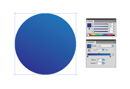
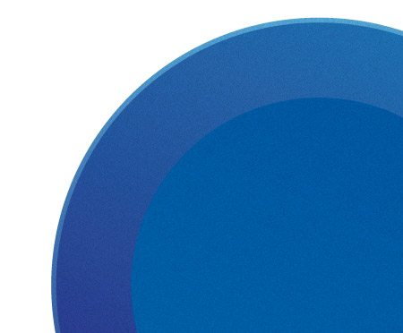
Open up Adobe Illustrator and create a new document. I personally use the CMYK colour mode, simply because I find it easier to manage the level of black in each colour, but you may certainly use the RGB for a wider spectrum of colours. Draw a circle on the artboard. Hold Shift to maintain a perfect circle and fill with an angled linear gradient from dark to light blue.
Press CMD+C to copy the shape, and CMD+B to paste behind. Grab the corner with the Selection Tool and scale up very slightly. Remember to hold Shift to keep the shape proportional. Adjust the lightest swatch from the gradient to a lighter shade of blue.

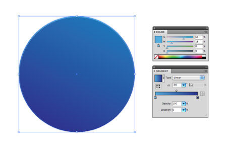
Copy (CMD+C) the outer shape and press CMD+F to paste in front. Scale the shape down while holding both the Shift and Alt key. Adjust the angle of the gradient so that it flows diagonally in the opposite direction.
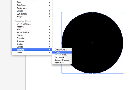
Press CMD+F once again to paste another copy of the large outer circle on top of the stack. Fill this shape with black, then go to Effect > Texture > Grain.
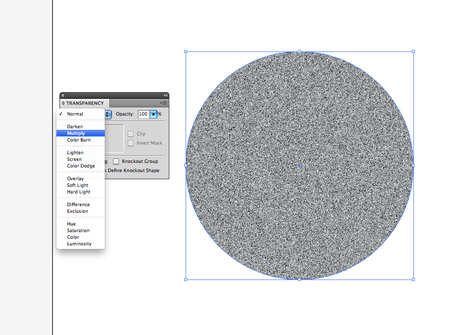
Change the blending mode of the grain-filled circle to Multiply, then reduce the opacity right down to around 15%.
This grain adds a little texture to the clock casing, which helps add a touch of realism. After all, things aren’t perfectly smooth in real life.
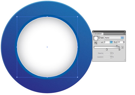
Paste in another circle and scale it down to fit in place as the clock face. Replace the fill with a radial gradient from grey to white. Adjust the sliders to ensure the gradient doesn’t creep too far towards the centre.
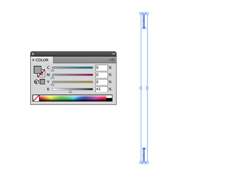
Elsewhere on the document, draw a small thin rectangle. Fill the rectangle with grey, then duplicate it by holding the Alt key and dragging the shape downwards. Hold the Shift key to keep the axis constrained vertically.
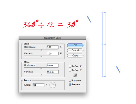
These two shapes will be the base of the clock face metrics, but we need to duplicate them accurately to fill the remaining space. Group the shapes together (CMD+G), then to go Object > Transform > Transform Each. 360 (degrees in a circle) divided by 12 (figures on the clock face) equals 30 degrees each, so enter 30 in the Angle option. Press Copy to initiate the first transformation, then simply press CMD+D to repeat the action.

When you have a complete set of metrics, group all the shapes together and position onto the clock face.
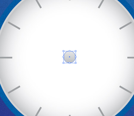
Copy and paste another duplicate of the clock face, then scale it right down to the centre. Adjust the gradient to flow vertically with a medium to light grey.
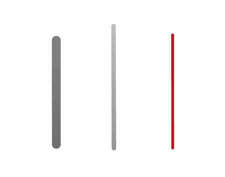
Grab the rounded rectangle tool and draw a few fingers of various sizes. Fill each one with a relevant colour, such as a darker grey for the ‘little hand’, a light grey for the ‘big hand’ and red for the seconds counter.

Rotate and position these shapes onto the clock face. Use the shortcut CMD+[ to alter the stacking order so that they appear below the centre circle.
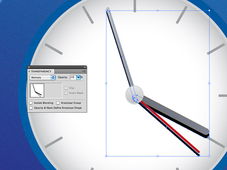
Select all three circles and duplicate by pressing Alt and the downwards cursor key. Change the fill of all three shapes to black and change the blending mode to Multiply at 20%. This creates the impression of a little shadow underneath the fingers.
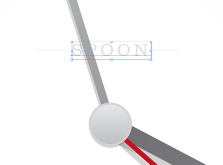
Use the Type tool to brand your clock. Remember the CMD+[ shortcut to adjust the order of the objects so the text is below the clock finger.
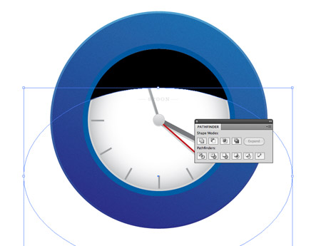
Copy and paste another copy of the clock face and fill with black. Use the Ellipse tool to draw a temporary shape across the black circle. The aim is to achieve a nice flowing curve that intersects the black object. With both shapes selected, use the Minus Front option from the Pathfinder palette to chop out the shape. Change to Multiply at just 3% to form a subtle shadow.
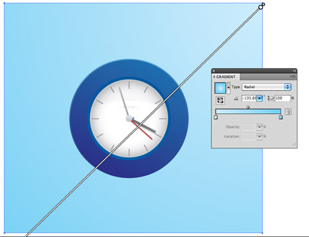
Let’s start on the background. Grab the rectangle tool and draw a large square then fill with a diagonal cyan gradient. Use the shortcut CMD+Shift+[ to send the object to the back.
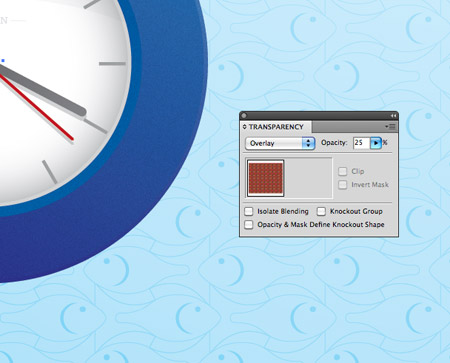
Copy and paste in front the background square and fill the new object with a repeating pattern. This horrendous fish pattern is hidden away in the default Illustrator swatches collection. Change the blending mode to Overlay to merge the colours with the blue gradient.
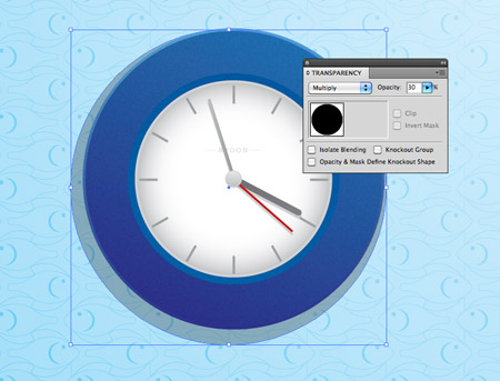
Draw a slightly larger black circle behind the clock, change the blending mode to Multiply at 30% and offset towards the bottom right.
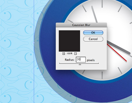
Keep the black circle selected, then go to Effect > Blur > Gaussian Blur. Enter a 30px radius in the options panel.
This pretty much renders our little clock complete… Just don’t rely on it for the correct time!

Very nice tut as always Chris. Always thought your Ai tut’s where very good. I’ll defiantly give this one a go tonight.
Thanks!
Thanks Russell!
I hope you have fun with it tonight.
Nice, thanks! Always looking forward to more illustrator-related stuff.
Very simple but very nice!
Thx Chris.
very cleanly written tut man!! well done!!
will give it a try now!
Ur fan !!! nice worked Can i teach your lesson in mongolia n student I’m study creative design in Mongolia I wanna to post my blog. :D
Very nice tut Chris thanks.
Looks great! I’ve never really uses the textures in illustrator, will give it a try!
Nice tutorial Chris, simple and effective.
Nice tutorial – and the clock will be correct at least twice a day!
Really useful, trying to learn more about illustrator. Have always used photoshop much more as I’m more comfortable there but tuts like this really help, cheers
Very cool design, looks like a clock from ikea :)
So simple but some great effects. I especially love the subtle grain texture you applied. It takes it to another level. Thanks for the tutorial!
Awesome :)
very simple n very clean
Thanks for the kind comments everyone, glad to hear you enjoyed the tut!
There’s always this tut http://css-tricks.com/css3-clock/ if you want to make your clock tick!
I’m impressed Chris. I’ll give it a try as soon as possible. Friday. And I will share my result with everyone here on this blog.
This is damn cool, I’m really impressed with the end results! I’m not so good at Illustrator, but if I have some time I’d love to give this a real try.
Nice tutorial :)
i go to make like this in adobe flash.
thanks!
Very easy job, even have nothing to say…
Great simple tutorial Chris. Thanks for the post!
Really nice Chris. I like your work very much!
Excellent tutorial! Thanks for sharing!
As a newbie to the world of graphic design, I’ve been following you quite closely and trying to absorb everything you put on your blogspot! I think you are great and love this “tut” for illustrator. Would love to see more from you very soon!!!
I went through all of the patterns and I still could not find that fish pattern. :( I was really bummed, so instead I used some really ugly floral pattern. :) Other than that I really liked this tutorial!
Hi Chris,
One more great tutorial…
Thanks….
Hi Chris……..
its great…………..thanks…keep rocking……….
Nice tutorial thanks!
http://www.estudioflow.com.br
Too simple one Chris, OK fine expecting some thing more stunning than this soon. Though i am not enough to comment on ur design, let me request some thing, can u add alternative edge for the clock, thin one so as dial will be too much attractive. Sorry if a foolish comment :)
treat…..!!!
Longtime ago, designers for watches have done design with illustrators, because of the speed of it. And its still a kind of standards before going to three d and construction. The funny things is, that they do it , still now ! Keep on going, watch designer….
Hi! Thanks for a great site Payas..
Very nice!! :D
Blog: http://www.ATOLADOS.com
Twitter: @atolados
Excellent. Cool design. I like it.
Chris just one more nice tut, You are making the way of describing designing techniques very distinguish.
Keep it up man.
Thanks !
sweet nice tut chris
Thank you so much for taking the time to share your expertise with us. Great, clear Tut. Had a lot of fun with this and learned a lot. Love more.
L
Looks very fresh and cool.
Love the tutorial Chris! :) Thanks :D
Superbe réalisation ^^
that’s really a fantastic post ! added to my favourite blogs list.. I have been reading your blog last couple of weeks and enjoy every bit. Thanks.
Perfect. Everything in here is just perfect. Love this blog.
Fantastic!!!
vary nice good post thanks..
Very cool – I love your site btw :-)
that’s really a fantastic post ! added to my favourite blogs list.. I have been reading your blog last couple of weeks and enjoy every bit. Thanks.
Very Useful! Keep them coming!!!
Thanks man.
This is my clock: http://www.flickr.com/photos/dide/4464015045/
great work, im begining with Illustrator and you helped me a lot.
Great tutorial Chris, keep it up!