This post was originally published in 2008
The tips and techniques explained may be outdated.
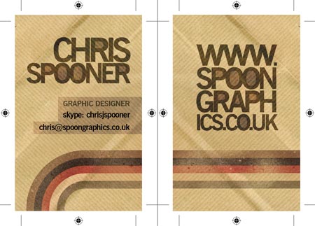
Business cards are a useful resource for any business, for designers in particular it gives an opportunity to create something a little out of the ordinary and artistic to showcase their creative flair. Follow this walkthrough in Adobe Photoshop, Adobe Illustrator and Adobe InDesign to create your own double sided business card design, resulting in a print-ready file to send to your favoured print firm.
First of all, find yourself a printer to produce the cards. Although there are some common dimensions used throughout the industry, your printer might be different. Check the specs beforehand to ensure you send out artwork at the correct size and bleed.
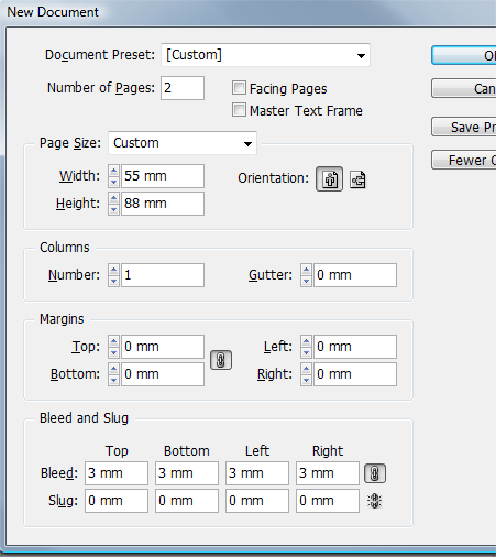
The print firm I use produces business cards at 88x55mm, with 3mm bleed. Remember a recent article about Setting Up Your Document with Crops and Bleed? This is where that info is put into practice! Anyone who fancies a little information on designing for print, why not also check out The Ultimate Guide to Designing with Black.
Because the design is based on a paper texture and includes some manipulation of imagery for that distressed look, most of the design work will be taking place in Adobe Photoshop. For other types of styles, such as a clean corporate image you might want to concentrate on producing the artwork in Illustrator or InDesign for ease.
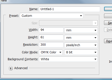
Start work by opening up Adobe Photoshop and creating a new document, remember our dimensions of 88x55mm with 3mm bleed? Three millimetres multiplied by two equals 6mm, therefore this is added to the original 88mm and 55mm making the total document size 94x61mm.
We're designing for print, which means we'll need the industry standard resolution of 300dpi.
Don't forget to set your Color mode to CMYK, we're designing for inks not screens.
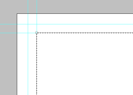
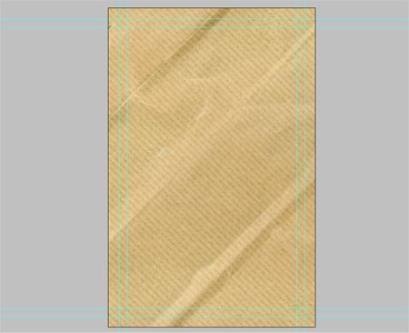
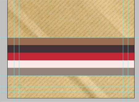
After setting up the document, I like to place in some guides to visualise where the edges will lie after the bleed is cut off, as well as a 5mm or so margin to keep any design elements away from the edges. I'm sure there are a gerzillion ways of setting this, but I transform a mask selection to the appropriate dimensions and snap the guides to the edges.
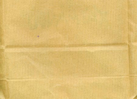
Our design is going to be based on a low-fi brown paper texture, head over to the free textures post and chose your favourite.
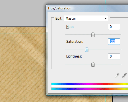
Drag into the document and scale into shape. The colours look a little too vibrant for my liking, so adjust the saturation helps fix this.
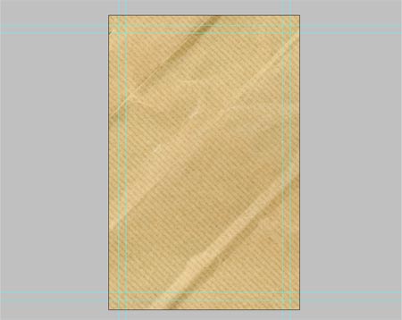
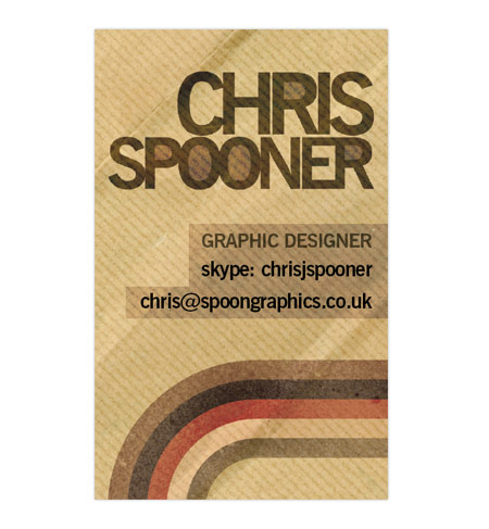
So far the business card is set at the correct dimensions and has a detailed background texture. Notice I'm going for a portrait layout, the dimensions stay the same, just switch round the figures!
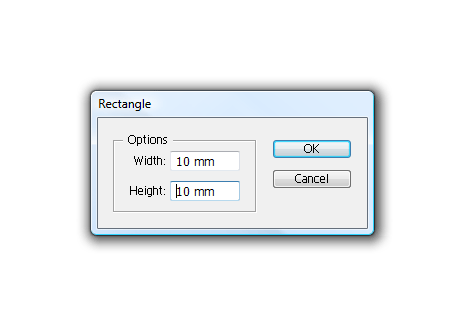
To create a design element for the card, jump into Adobe Illustrator. Choose the Rectangle Tool and click on the artboard, create a 10x10mm square.
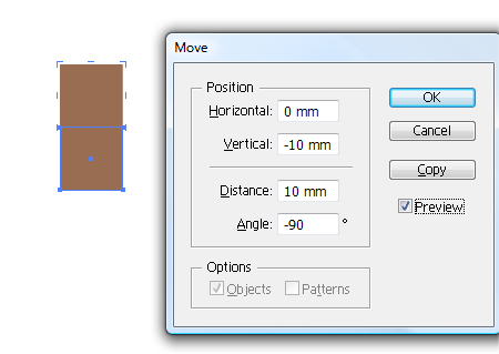
Fill the rectangle with a colour of your choice, Copy (CTRL C) and Paste in Front (CTRL F) the square. Hit the enter key to Move the object and enter 10mm vertically.
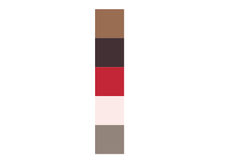
Keep pressing CTRL F to paste a new copy and front, then CTRL D to repeat the Movement until there are five or so squares in a row. Fill each with a colour of your choice.
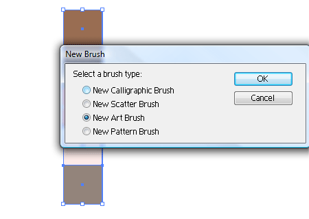
With all the shapes selected, click the New Icon in the Brushes palette, choose the New Art Brush option.
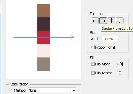
Check the direction of the brush in the options window, making sure the direction cuts across the shapes. Press OK to save the brush in the Brushes Palette.
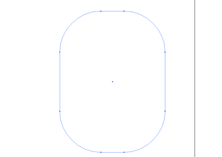
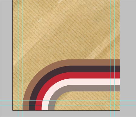
Select the Rounded Rectangle Tool and draw a wide cornered shape. Use the keyboard cursor keys to adjust the roundness while dragging or click on the artboard to enter exact dimensions.
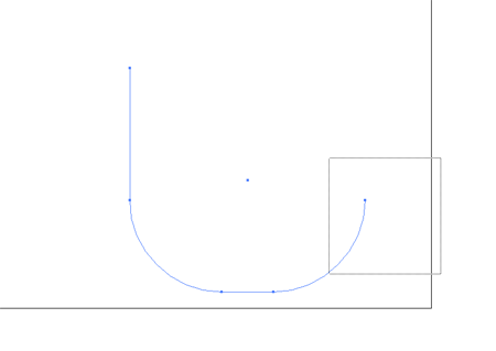
Use the Direct Selection Tool to delete out two of the corners, leaving more of a curved 90 degree line.
Click the previously created brush to produce a striped effect on the curved line. Watch out for an acute angle which might obscure the inner stripes, if so, recreate the line with a wider curve.
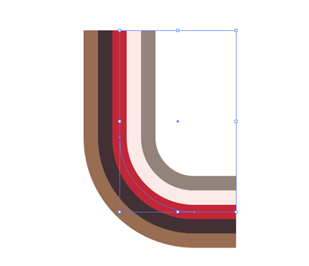
Copy the stripes and paste into Photoshop as pixels, position on screen to enter from one side, make it's turn and leave off the other side.
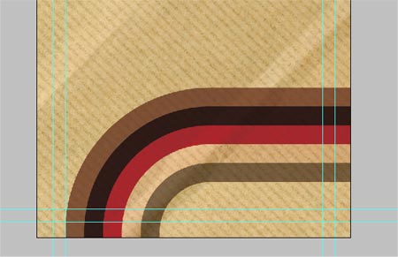
The colours look way too contrasting and clean against the textured background, change the blending mode to Multiply to bring out some detail through the shape.
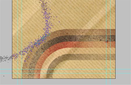
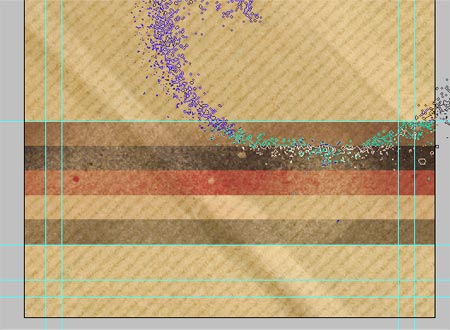
Now we'll need the recent high res spraypaint brushes to grunge up the stripes.
Use a layer mask and paint using black to erase out areas of the shape.
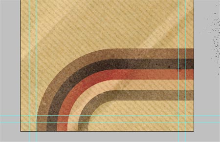
It's sometimes useful to duplicate the layer and adjust the opacity and amount of brushwork to fine tune the level of distress.
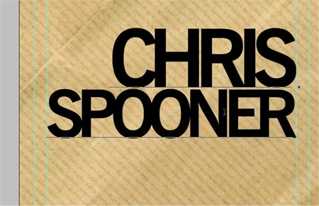
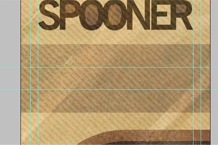
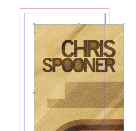
We're going to go for some large type on the card, here I've set out my name in the fabulous News Gothic (Bold), adjusting the tracking, sizing and line height for that contemporary feel. You might like to use your own name here!
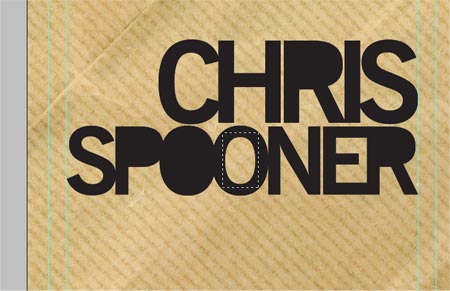
To take the overall style further down the low-fi route, duplicate the type layer, then rasterize the bottom instance and fill in the counters with black.
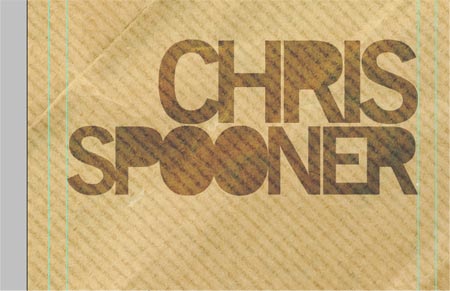
Change this layer's Blending Mode to Color Burn and adjust the opacity to around 75%.
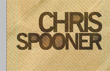
The top type layer can then be changed to Multiply at 45% to produce this interesting effect.
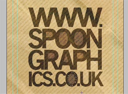
Draw a rectangular selection on a new layer and fill with Photoshop black, change the blending mode to Color Burn at 30%.
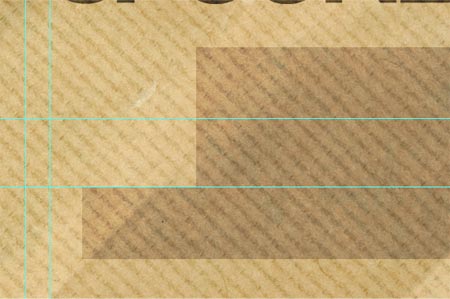
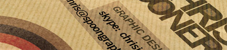
Using the Mask Selection Tool, cut out segments of the rectangle leaving varied line lengths. The idea is the produce a background for the name, contact and email address which will all be different lengths. Quickly flesh them out directly in Photoshop with the Type Tool to check their size.
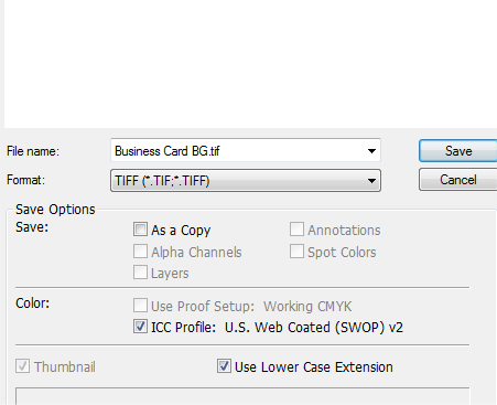
Flatten the whole document (Layer > Flatten) and Save As a TIFF file.
Open up the original PSD file and save a copy as the rear of the business card. Hide or delete the unwanted layers.
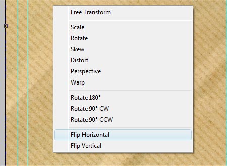
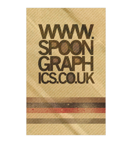
Crop the artwork down to it's current dimension to chop away any hidden extras beyond the edges of the document. Then flip the background texture horizontally.
Use the shape previously created to paste in a straight line onto the artboard. Use the curved version to adjust the size and position so that it will appear to flow seamlessly from one side to the other on the final card.
Repeat those steps of distressing the graphic with the spraypaint brushes.
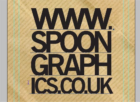
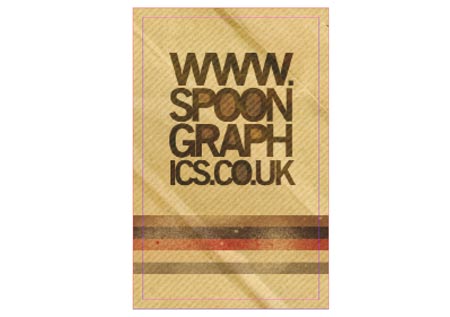
Back with the type tool, draw up an interesting typographic layout for your website address. Here I've cropped each line and scaled each one to the same width. Although the layout slightly affects the legibility of the address, it's the creativity that counts.
Repeat the process of filling in the counters and adjusting layer modes to replicate the type effect.
Export the rear of the card as a TIFF image.
Open up Adobe InDesign, create a new document and fill out the options corresponding to the business card specs. For instance we want 2 sides at 55x88mm with 3mm of bleed on each edge.
Place in the background TIFFs on each page and use the X and Y coordinates to align them to -3mm to match up to the red bleed lines.
Don't worry about the pixelation, InDesign has settings to render low-quality previews of large size TIFF and EPS files which is useful when working on that 100 page brochure. Go to View > Display Performance > High Quality Display.
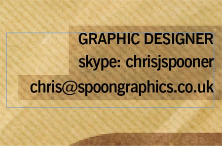
Draw in a textbox over your front side and enter in your contact details, adjust the font, size and tracking as appropriate.
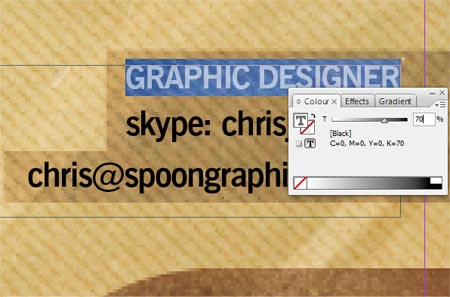
Change the blending mode to Multiply and change the colour of the Job Title to 70% black to add another visual touch.
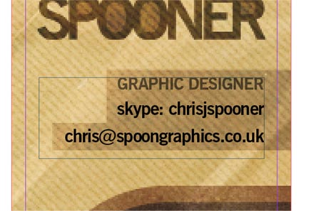
Move the text into position to match up to align with the other page elements such as title and background rectangles.
The rear of the card simply needs placing in and moving to -3mm coordinates.
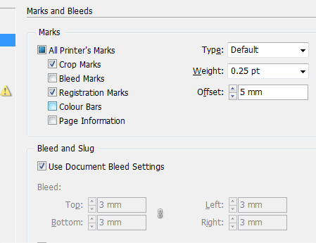
Go to File > Export to save your file as a print ready file. In the PDF options select Press Quality, then head down to Marks and Bleeds and check Crop Marks and Registration Marks. I tend to offset these to 5mm so they don't collide with the artwork. Also check the option to use the Document Bleed Settings, which will pull through the settings entered earlier.
The final artwork will then be print ready in PDF format, check over the design for any final tweaks. It sometimes helps to open up the PDF in Photoshop and cut down to the crop area to check the page elements in relation to the edges of the final business card size.

Nice look! Thanks
Great tutorial, I like to see print topics too.
In the Illustrator portion: why not, instead of creating squares and copying in front, create a rectangle and then go to Object>path>split into grid and set the gutter to 0. You can then fill each square with whatever color you want. Seems a bit easier to me.
Thanks!
Great post! I must say I really admire your style. This tutorial is just what I have been looking for to kick start some ideas for my personal business card as well. Thanks Chris.
Nice clear tutorial Chris. I use InDesign every day and didn’t realise the ‘offset’ drop-down section in the PDF output was for the registration marks, that’s good to know :)
Great tutorial, Thanks!
another great tutorial… i keep finding myself coming to your site several times a day. you always have great info and great links…. nice job!!!
Yet another tutorial with a GREAT outcome, thanks Chris! Could you send your card to me, would love to add it to my collection of awesome / well designed business cards ;) .
Thankyou all for the comments.
@Marco, I’m afraid this card was created purely for the tutorial, but I’m quite tempted to go and get it printed up!
Your tutorials are always very easy to follow. Here’s to another great tutorial. Thanks!
useful tutorial, thanks…
Very cool! I love it. It has dimension.
Beautiful tutorial (Y)
That’s cool. Thanks for sharing this
Great tutorial, I actual began a template in indesign to set up 8 cards to be printed on one sheet, with the bleed options
i hope they come out good
God what a long tutorial. Thanks for the effort on sharing this tutorial dude. I just save them on MS Word for later use. Cheers!
“Design a Print Ready Business Card for Designers”
For starters please change the title :)
What a PARADOX!!!! Another tutorial for uneducated technologicaly impaired “designers”. Those things always seem to amaze me. How could a designer that gives a crap, print out a template for his bussiness card? Isn’t the point of designer to design himsell? Today it seams to be some new stream of designers i guess. Those who are too lazy to explore or to educate themself in the field.
Hi Chris, Thanks for this tut!
I’m relatively new to Photoshop and have gotten stuck on the part where you need to use the “Mask Selection Tool, cut out segments of the rectangle leaving varied line lengths”. I’m not sure what that is? Any help would be greatly appreciated!
Annette
I really like your design, I think it is immense. I think that people usually forget about carrying their full design through to business cards and it is a wasted advertising means. I really like what you have done.
” You might like to use your own name here!”
Nah, impersonating a well-known designer gives more business. :)
The free brushes are GREAT… WE love YOU!! You’re amazing.
For all those trying them out in CS3 they work – you’ll have to load the brush though.. poke around, you can do it.. it’s worth the time.. BELIEVE ME!! Thanks for being cool dude.. Big Ups to you matey
so awesome ,man great tutorial ,keep em coming.
keep up the good work.
Added to http://www.psaddict.com
I would like to see how this business card looks printed out, You should choose some interesting material to get good results. Thanks for pointing out the basics!
nice job :)
very nice look. It completely ties in with your brand
nice tutorial, i´ll hope you can bring us more lessons like this
very nice work and great post. it really help to design such a beautiful card. thanks.
some nice tips here