This post was originally published in 2010
The tips and techniques explained may be outdated.
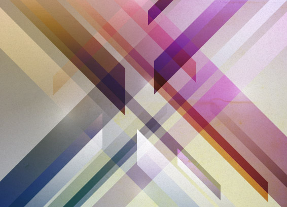
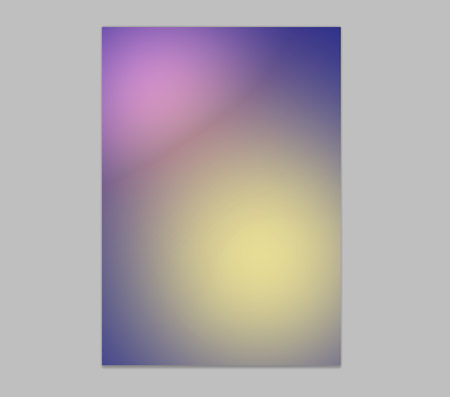
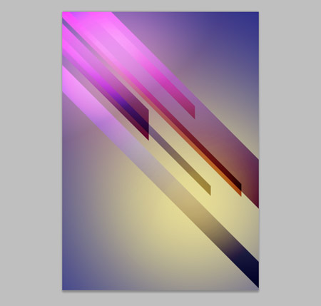
The theme of retro futurism combines digitally created graphics and abstract shapes with distressed and aged textures, giving that cool mix of old and new. Let’s take a look at how to create our own bright and colourful retro futuristic poster in Photoshop, using dynamic lines, vibrant gradients and rough textures to build up the design layer after layer.
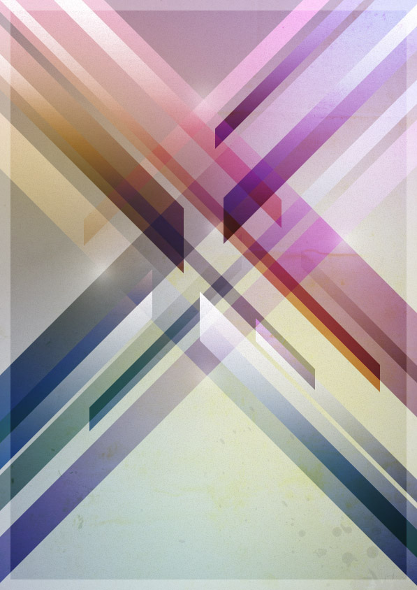
The design we’ll be building is made up of a range of abstract shards that spread across the page at 45 degree angles. As each layer is overlapped with various gradients and blending modes the design soon starts to develop a cool and vibrant futuristic theme as the colours interact with each other. Mixing this up with a couple of paper and cardboard textures then adds a twist to the digital design, making it feel more tactile and weathered.
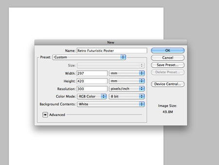
Open up Photoshop and create a new document. Create the document at your desired dimensions, here I’m using a size of 297×420 (A3), with a resolution of 300dpi to give me the option of having the poster professionally printed if I so wished in the future.
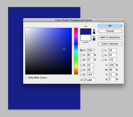
Fill the background with a dark blue, such as #171a8b. This will act as the base colour that all proceeding layers will interact with.
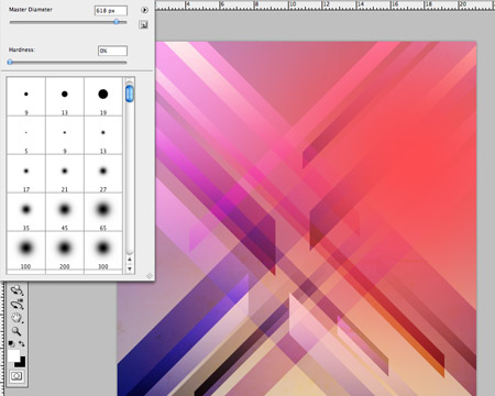
Use a large soft brush to dab two spots of colour onto a new layer. I’ve chosen a bright pink and yellow. These two spots will also help act as a base for any future layers to interact with.
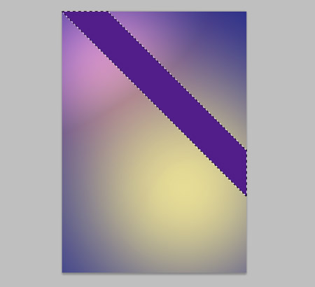
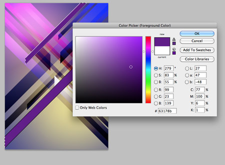
Use the Polygonal Lasso Tool to draw a diagonal rectangle across the width of the document. Hold the SHIFT key throughout to constrain the axis to 45 degrees. Fill this selection with a random purple.
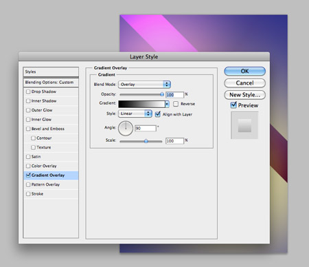
Change this layer’s blending mode to Soft Light, then double click the layer to open up the Layer Styles. Add a Gradient Overlay with the blend mode of Overlay.
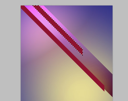
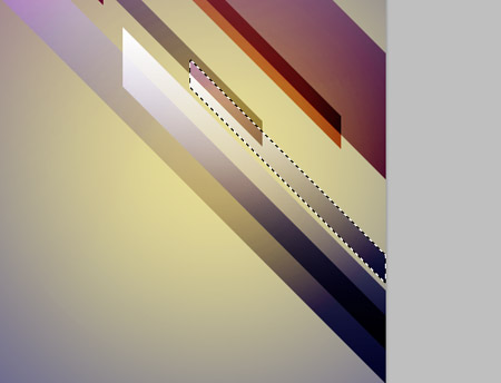
On a new layer, draw a couple more diagonal shards, this time make them slightly smaller in size and overlap them with the original rectangle. Fill these with a red hue.
Right click on the layer of the original rectangle and select Copy Layer Style. Right click on the new layer of shards and choose Paste Layer Style. Continue this process of drawing new shards spanning from the top left, and paste the layer style on each.
As the number of shards builds up, begin to add a couple that span from the bottom right to fill out any gaps in the design.
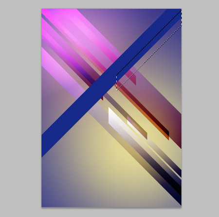
Begin adding some shards in the opposite direction, spanning downwards from the top right of the page. Keep the SHIFT key held throughout to maintain those angles.
Give each shard a different colour, choosing between blues, purples, reds and black. Each colour will give a different effect as it interacts with the underlying gradients.
As the design builds the overlapping shards will interact and create new highlights and hues within the design. Take a step back to review the design once you have a healthy number of layers.
The design is looking pretty cool so far, but it’s a little too ‘digital’. Find an old paper texture from SXC.hu that contains various imperfections and marks. Paste it into the document at the bottom of the layer stack and scale to fit, then drop the opacity to around 40%.
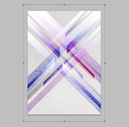
Overlay another texture onto the document and move the layer to the bottom of the stack, this time find a cardboard image that contains a tight and detailed texture. Press CMD+SHIFT+U to desaturate and drop the opacity to 20%.
The layer styles of Soft Light will interact with the underlying textures, adding more highlights and cool variances on hue and tone. Adjust the opacity of the textures to avoid any colours blowing out or any digital artifacts appearing in the design.
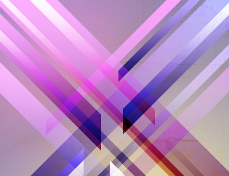
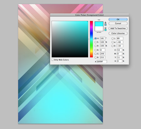
Add a new layer to the top of the stack and dab a large soft spot of red onto the canvas with the brush tool. Change this layer’s blending mode to Color Dodge at 55%.
On two new layers, add large spots of yellow and blue. Change the layer styles to Hue and Lighten at 80% and 50% respectively, or experiment with the layer styles yourself by pressing SHIFT + on a Mac, or toggling through the blending mode dropdown with the cursor keys on Windows. Each blending mode gives different range of tones as the colours interact, which can relate to different styles depending how ‘retro’ you want to go.
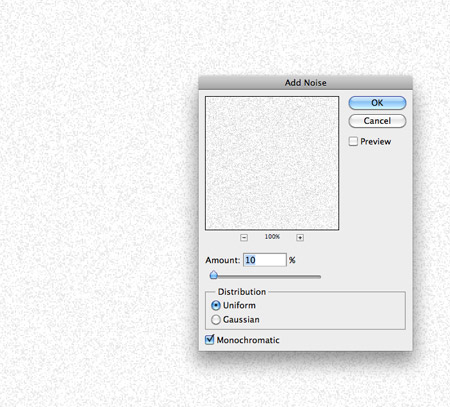
Add a new layer and fill with white. Then go to Filter > Noise > Add Noise. Enter 10% in the Amount options and set to Uniform and Monochromatic. Change this layer to Multiply at 40% to add yet more texture to the design.
Use a soft brush to create a few simple highlights where two diagonal lines cross. Change the layer style to Soft Light.
Add yet more varied tones by dabbing two large spots of black onto a new layer. Set this layer to Soft Light at 40%. The trick is to build up the design will lots of layers that are hardly noticeable when looking at the overall design, but when they’re turned off the design lacks their input.
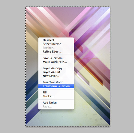
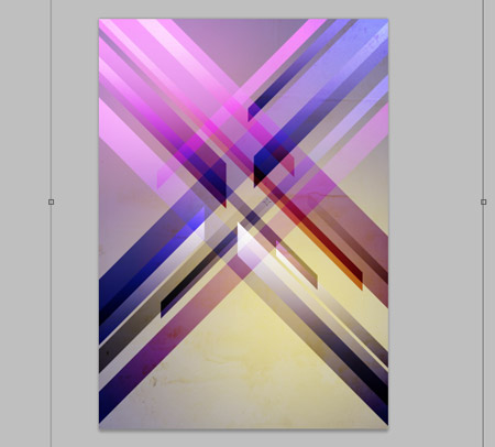
Press CMD+A to select the whole canvas. Right click and select Transform Selection, then adjust the width and height properties in the header bar reducing each figure by 20px. Right click to change the measurement from percent to pixels.
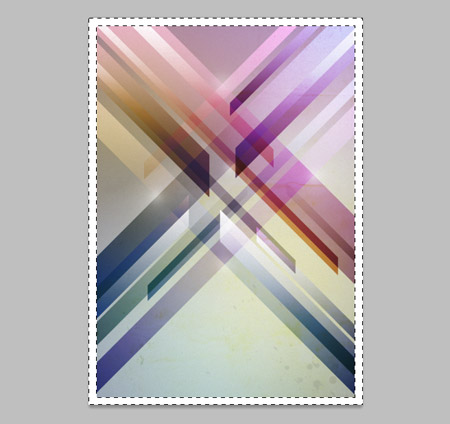
Inverse the selection with the shortcut CMD+SHIFT+I, then fill with white.
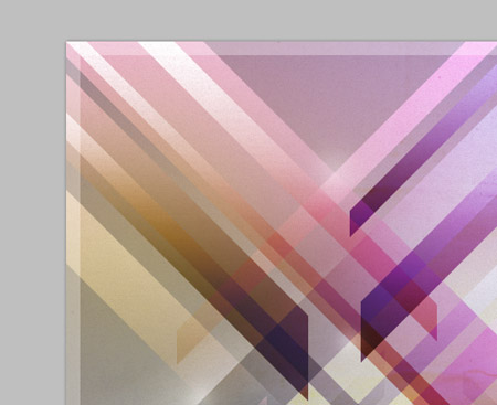
Change this layer to Soft Light at 70% to create a tidy border around the design.
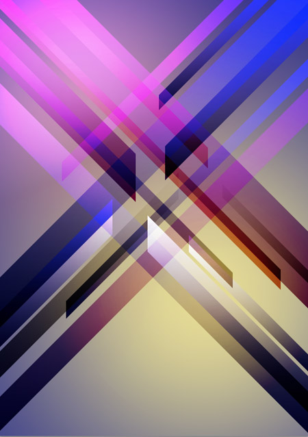
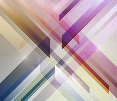
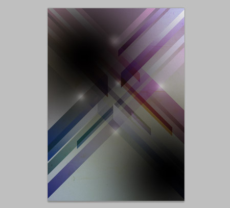
The final design

Excellent tutorial Chris. I think it would look even better with some type of title with a nice text treatment. Great job!
Definitely! I might add a little more to the design in some spare time and experiment with some type additions.
Simple steps, yet a brilliant finish. I wish you added a dark background to give a better depth to retro-ism. This looks more like a grunge poster.
But, a lovely tutorial. Will try this now. Thanks Mr. Spooner!
A dark version certainly sounds interesting, I’ll have to play around with the colours and see how it looks. I’m not too sure on the criteria between ‘grunge’ and ‘retro-futurism’, I’d say they’re used more as generic labels that help describe a particular style.
Am Rohini from India
I ve No words about this,,,,,,,,,,,,, excellent , i wnt ur advice in designing nd i hope that………………..
Nice Article Chris. I particularly liked the detailed treatment you gave for the colors.
However as Jad (Design Informer) mentions, a Title or Text with proper treatment would do immense justice to the poster.
Very awesome Chris, it’s very simple yet it has a ton of impact.
very nice outcome, I will try it out for sure! thanks for sharing :)
very nice Chris! to re-quote others, this is a great tutorial on how simple techniques can lead to great results. thanks! keep them coming.
This poster design makes me miss my cool “design” wall I used to have in my office….might have to break out all my vintage posters….
Really great design Chris! It reminds me a bit of James White’s work.
There’s no doubt James White’s work has been an inspiration for this one, I love checking his work, and the work of other designers/illustrators who create artwork in this genre!
Lovely use of colors and composition. I’ll definitely try to do something like that on my own.
Coming from NYC and moving to the Graphic Design scene of Indianapolis, these tutorials are going to help so much! Thanks! I think I’ve found one of my new favorite blogs. :)
Very nice great tut Chris. Thanks
Wow, great final product! It’s been too long since I’ve done anything in Photoshop besides web design, this tutorial might change that!
Nice Tutorial…..
I Like It…….
Very nice tutorial!
Wow Chris, this is nothing short of delicious! Think I’ll have to give this one ago. Thanks as always. I do love the simple techniques you use in photoshop.
Another great tutorial. Thanks Chris. Would be great if you had a desktop version as well :)
good article !
Really cool! I tried myself but I didn’t got the same excellente result as you, I’m trying to use another colors, blending modes and changing opacity.
BTW, this is my first time posting a comment here =), your work is really impressive and your blog is cool too, you’re a great designer.
Great tutorial, very detailed!
I like the outcome, especially colors, great tutorial ;)
Will go to our “Best of Week”.
Bookmarked. Can’t wait to make this!
Thanks Chris!
great!
Looks nice, great job!
Awesome definitely gonna try this out here tonight.
Really cool and beautyfull final result! ^^
I think I’ve seen it before But still…truly awesome!
that was fun, not really the same result as you though
http://sideradesign.com/wp-content/uploads/poster.jpg
I tried it out and decided on a much whiter design, but the guide was invaluable!
I just have a few troubles with your sizing, 297mm x 420mm with 300dpi adds up in pixels, so I didn’t get how 20px for the white border was enough for you at the end there. I ended up using 90% width and 93% height reduction.
Thanks for sharing!
Wow, what a perfect find. I’m doing something very similar in my high school design class at the moment and this tutorial is definitely going to help me get top marks (hopefully).
Your whole website is awesome!
thanks for the sharing knowledge.
Thanks for this Tut. I like it because it is fairly simple — yet I learned something and it is a cool effect. Please keep ones like this coming!