
This post was originally published in 2007
The tips and techniques explained may be outdated.
Probably one of the most popular and recognisable icons in the web universe; the RSS icon is displayed on many website to indicate the availability of a subscription feed. There are pre-made icons you can download and place on your website, however this tutorial cover the process of creating your own custom vector RSS icon in Illustrator.
Since the icon is to be created in vector format, it can be scaled up or down in size for implementation on future websites you may work on, unlike a raster version which would have to be remade in larger dimensions to prevent pixelation.

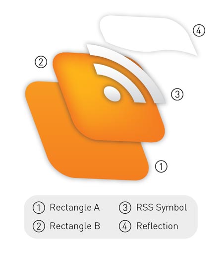
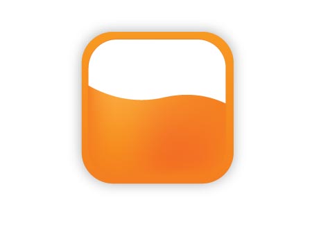
For beginners to Illustrator, the following diagram shows the structure of the elements that will make up the icon. Similar to Photoshop, Illustrator works in layers but also, multiple objects can also be stacked on top of one another within a single layer. By using 'CTRL/CMD + [' and 'CTRL/CMD + ]' you can alter the stacking order of a selected object and furthermore, pressing 'CTRL/CMD + SHIFT + [' and 'CTRL/CMD + SHIFT + ]' will send an object to the bottom and top of the stack respectively.
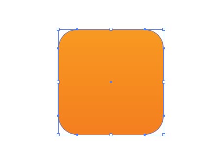
To begin, draw a rounded rectangle. Tap the cursor keys Up and Down to adjust the roundness of the corners before releasing the mouse, and hold the SHIFT key to constrain the proportions to make it square. Alternatively, simply clicking on the artboard will bring up a dialog box where precise measurements can be entered.
Fill this shape with a vertical gradient ranging from a dark orange to a lighter tone.
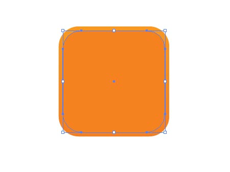
Press 'CTRL/CMD + C' and 'CTRL/CMD + F' to copy the shape and place in front. Then scale down the shape slightly while holding ALT. Fill this shape with the darker of the orange tones previously used. Press 'CTRL/CMD + C' to Copy the shape.
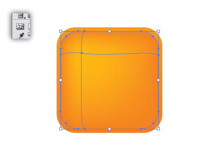
With this smaller shape selected use the Gradient Mesh Tool to add a highlight in the top left, adjust the colour sliders to produce a brighter yellow hue.
Press 'CTRL/CMD + F' to paste in the shape copied in the previous step. We copied the shape before adding the gradient mesh because the mesh can limit the editability of the shape and basically mess things up! Fill the shape with white.
Use the Pen tool to create a shape that covers the lower half of the white object, and add a curve to the top, this will be used to cut away the shape to create a reflection.
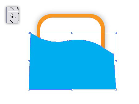
Select both the white object and the new shape created with the Pen tool, then click the Subtract From Shape Area button in the Pathfinder Window, then Expand. Lower the Opacity of this shape to 20%.
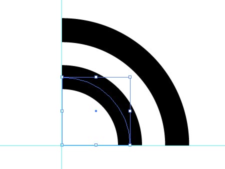
To create the actual RSS symbol, draw a circle (hold SHIFT) and add a black stroke. Increase the stroke to produce a broad ring. Take a note of the size, in my case it was 12pt, but yours may depend on the size you are working at.
Use the Direct Selection Tool to select and delete two of the four points that make up the circle, this will leave you with just a quarter of the circle. Copy this shape and move down 45degrees to the left.
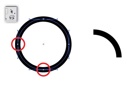
Use guides for visual assistance while you scale and align the shapes, depending if your preferences are set to scale strokes, you may need to reset the stroke of the second shape to 12pt (or whatever size you noted down earlier!).
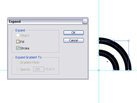
Select the pair and go to Object > Expand and select the Stroke checkbox to convert the strokes into complete shapes.
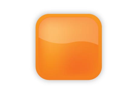
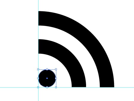
Complete the symbol by adding a circle, hold SHIFT to constrain the proportions and use guides to align with the other objects, press 'CTRL/CMD + G' to group the objects then fill with a gradient from white to a light grey.
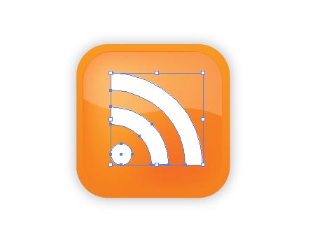
Align the symbol with the orange background objects, then order the reflection to the top of the stack by pressing 'CTRL/CMD + SHIFT + ]'.
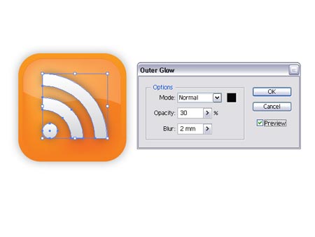
Finish off the icon with some subtle shading by selecting
Effects > Stylize > Outer Glow.
great!
nice and clear…like it!
Great and easy tutorial. Thanks for sharing.
Where did you get this wp template? I’ve been looking the whole day for something like this but I’m about to give up :((sorry, I know it’s not really on topic)RegardsNaida
Hi Naida
I created this design from scratch then modified the Default WordPress template to suit.
If you are comfortable with CSS why not have a go at making your own template? The Firefox Web Developers Extension is very much recommended if you do decide to have a go!
Chris
Great. looks vey nice
a bad job
It’s fantastic!
Pretty neat tutorial!
Hello! Good Site! Thanks you! shnusdkbpb
A couple of problems with this tutorial.
Error 1 – Offset the Path
Do not copy the rounded rectangle and scale it. As you can see, the rounded edges on the inner rectangle do not match the outer edges. By offsetting the first rectangle you maintain the proper radius for the rounded edge.
Error 2 – Transparency
The transparency setting on the outer glow should be set to Multiply. This will prevent a the black from looking muddy and will allow it to mix nicely with the orange below.
That’s all i’ve got. Hope this helps.
Very Nice….and very impressive…
Excellent tutorial.. thanks for all.
thanks for the GREAT post! Very useful…
Thanks for that. Was reasonably easy to follow for a beginner and produced really pleasing results.
Nice one!
nice,
it can help in creating logos
Superb tutorial. keep it up.
Excellent tutorial, thanks for posting this!!
Just wanted to say thanks for this tutorial. That’s a real sexy RSS icon.
Thanks for that very nice tutorial from germany. It was a big help for me.
Wow… this is a really great one! Thanks for the tutorial…
Also, your blog looks really awesome! Cool! Keep it up…
Bookmarked it… :)
Thanks!!! it was so useful!
cheers,
dmn.
i did it and it turned out completely perfect
thnx for sharing
Hi,
We would like to create a tutorial section about Illustrator and Photoshop on pluginsworld.com. If you have any tutorial to submit, do not hesitate to contact us.
Thanks!
So how do i delete two of the four points? The author is assuming that everybody is a master and this makes the tutorial is useless
hey!! thanx man..that was really helpful
thank you once again
Here is the completed files in Photoshop format.
http://www.readydone.com/files/RSS-vector.psd
You’re welcome.
(Not perfection, but as close as 16×16 would ever need.)
Really Cool.. Thanks for sharing… Obrigada por compatilhar..
I don’t have illustartor. So how can you achieve the same result using fireworks? trying to design some icons for our martial arts gym website at: tri-c-a.com but I am rather strugling. any help would be great appreciated.
thanks in advance!
Really brilliant tutorial!!!!
Nice tutorial :) and btw bad ass blog design ^^
Love the tutorial
Wow! thanx for making this tutorial! :) I love it! And since I’m a relative beginner to Illustrator, it was so easy to follow and has a great result!!
This no doubt great tutorial. I like it and learned very much about it.
whats does mean CTRL/CMD + C? this is used in plataform from Mac or what?
Van-Leeuwen,
“Ctrl” is for PC and “CMD” is for Mac. If you have a PC, use CTRL + C, or vice versa.
Great read thanks. Liked it better without the shadows.
I’m a beginner to illustrator and this helped me out a lot.
Thanks for posting.