
This post was originally published in 2008
The tips and techniques explained may be outdated.
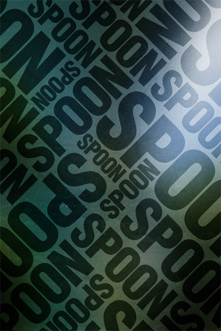
Using simple shapes can produce some great looking contemporary designs that fit well as impactful posters, a good example being the recent Trendy Geometric Lines tutorial. This time we'll look at stripping back the tools to creating an interesting and eye-catching poster with a single typographic word.
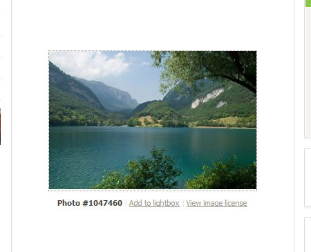
Find a random image to base the design on, the subject of the photo isn't at all important, just choose a picture with varied contrast and preferably tailored towards your chosen colour scheme. In this case I've picked out a landscape scene with a mix of blues and greens.
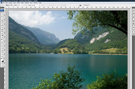
Open up the image in Adobe Photoshop and resize accordingly.
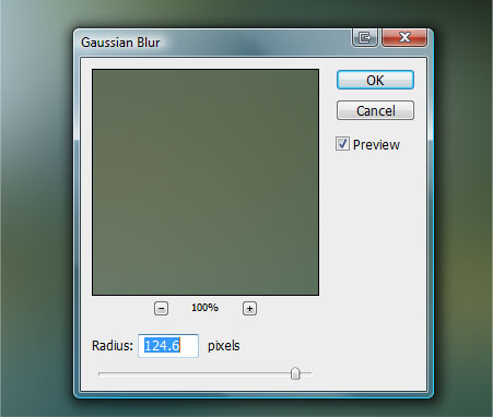
Go to Filter > Blur > Gaussian Blur, drag the slider almost all the way to the maximum to completely disguise the original subject and blend together the colours and tones.
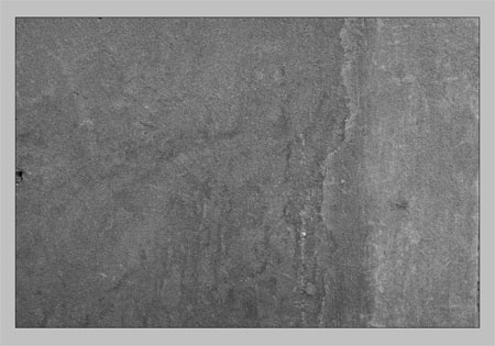
Head over to the fantastic Bittbox.com and download one of the free high-res textures. Place the texture on a new layer in the Photoshop document.
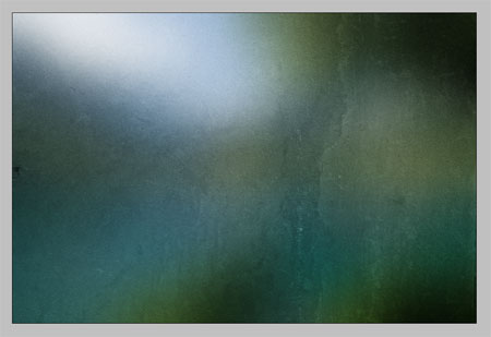
Desaturate the image then change the blending mode to Soft Light and drop the opacity to suit, adding a little detail and roughness to the image.
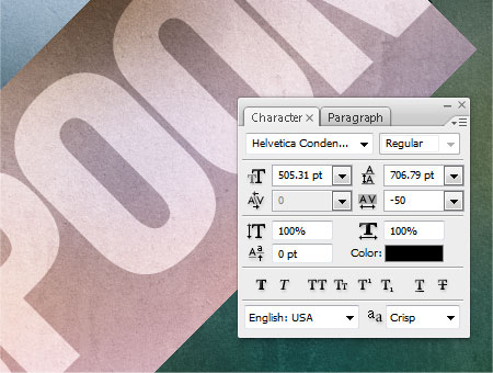
With the Type Tool, write out your desired wording. Of course, I have used the word SPOON and set in the bold and prominent Helvetica Condensed Black.
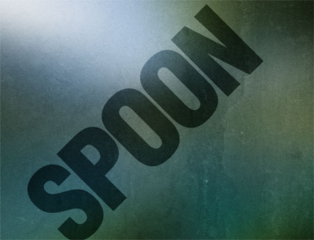
Rotate the block of text to 45 degrees (hold shift to constrain the angle). Set the blending mode to Soft Light to allow the underlying texture to show through.

Position the text to encroach onto the document covering the top corner. Whilst holding ALT drag a copy of the text and scale into a new position.
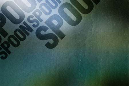
Hold the ALT key and drag two more copies of the text, resize them and position to fill out space on the document.
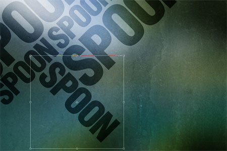
With the next copy, rotate the text by 90 degrees leaving it perpendicular to the other variations. Move the text into place leaving the same gap between the other text objects.
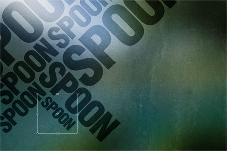
Create more instances of the text and rotate and scale into varying positions, ensure that each block aligns to the diagonal gridlines of the composition that are being formed.
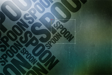
When gaps appear in the document, visualise how the word can be scaled or rotated to fill the gap whilst aligning to the gridline and leaving the same gap around the objects.
Also take into consideration the spread of large and small instances of the text to ensure that the sizes are varied without clusters of similar sized objects creating an unwanted focal point.
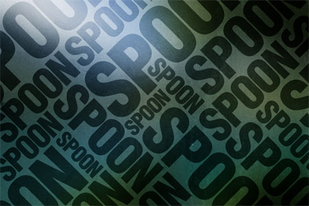
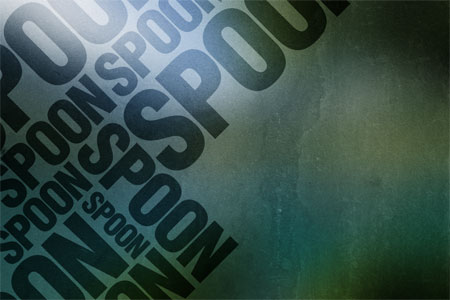
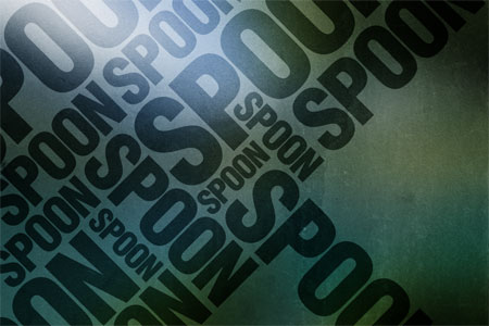
With multiple copies of the text being scaled and rotated into place the document is now completely filled.
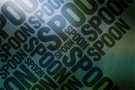
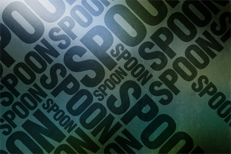
Make any final tweaks to the poster such as altering the overall layout and making small edits to the individual objects, leaving a trendy poster design based almost solely on a typographic layout of a single word!

Cool mite use these techniques in an upcoming contest
Great tut Chris. I’ve got a couple of typography design layouts planned as personal projects, and your method will help immensely.
Thanks Chris even with expert help I can never get it quite right ;)
http://styl.eti.me/styletime.jpg
Lovely tutorial man, great end result too! Thanks.
I definitely like the idea of blurring a photo to get an interesting variation in background colour. Nice job.
Simple, yet effective (as it should be).
Nice job.
Woow :D Very cool
I’m trying this one right now :P
baah, never thought to blur colorful image and add texture to it – great advice! Great outcome, though technique is simple, but yeah, all genial is simple..:)
Great image. I’ve done something similar before, and what’s great is that utilising photography and texture in the background adds a certain depth that’s almost subliminal.
Great tutorial, thanks so much for putting it together. I had never thought to get my basic color scheme by blurring a photo.
It is AWSOME hope you like mine (URL)
http://www.flickr.com/photos/macarena0/2841553548/
Thanx Chris
nice typography poster:)great tuts Chris.
Very nice result and tutorial. I love the fact that it looks great but it’s not overly complicated in appearance or execution.
You have a great eye for simple design. Really nicely executed.
I used paintdotnet and no very little about graphic design, but this was easy enough to follow along.
I didn’t finish…
http://www.flickr.com/photos/25114327@N04/2842319747/
Thanks, mate.
This tut was just what was needed for my last project. Quick, easy and looks great!
Thanks
-E
love your tuts
Cool tutorial – I always struggle with random backgrounds. Mine always look a little forced, I never thought to use an image and blur it to get a random effect.
It’s the simple ideas that are the best…
easy and nice tuts
Very cool effect.
Great use of blend modes!
Thanks for making this.
I always love typografic work! looks cool!
great tut! I tried inverting the text and then changing the blending mode to screen so the background image would show through.
This is such a fantastic idea! I can’t wait to make one! I’ll be linking to this!
This is an interesting post. Thanks,
Conrad Gorny
Freelance Graphic Designer
http://www.conradgorny.com
Great tutorial! I used it to make new desktop backgrounds: http://flickr.com/photos/nirak/sets/72157607269524948/
Great Tut…
Nice, really nice.
Like many of the comments here, I really like the use of an image and Gaussian blur to create a simple yet beautiful background on which to place the text.
I’m planning on using this technique to create a bunch of desktop backgrounds, using the server name as the text to use on our company servers to make it quick and easy, yet aesthetically pleasing to identify which server one’s about to shutdown ;)
Thank you.
Thats very trendy…it remembers some style from the 80th. i like it very much. great work.
its so simple but has great effect.
Wow, I guess I need more knowledge of photoshop. The instructions were not quite detailed enough for a beginner. More intermediate.. Still, your design looks great.
Well in my opinion… it’s nothing to do more with photoshop…. here you just need to be creative.. That’s all !!
Really nice! Thanks for this as well!
You can get some great effects by laying typography over a background and using the transparency filters.
Great tutorial! I created a Halloween one that looks great. http://pixojo.com/node/125
Thanks for tut, lovely!!!
Very nice result and tutorial. I love the fact that it looks great but it’s not overly complicated in appearance or execution.
Great tutorial. Here is my attempt using GIMP…
http://www.flickr.com/photos/30654258@N08/2968085760/
Thanks for the tutorial!
Thanks for the great tutorial.
Tried it out immediately:
Oops forgot the address sry
http://www.flickr.com/photos/29921115@N03/2975619362/
Hey! Super tutorial, I used it for a project of mine – http://figmentmedia.ca/blog/081112/081112.html. Check it out, hope you like it. :)
awesome tutorial! it helped me out a lot! thank you :)
wow so sample but really great one thank you so much
we need more nice tuts like that pls :)
i will back again for more
This is so amazing!!! It took me about 15 minutes to put together and it was incredible! Really really great idea and tutorial. Thanks so much
nice! thanks for tut…
Damn you are good, how long have you done graphics.
Added to http://www.psaddict.com