This post was originally published in 2009
The tips and techniques explained may be outdated.
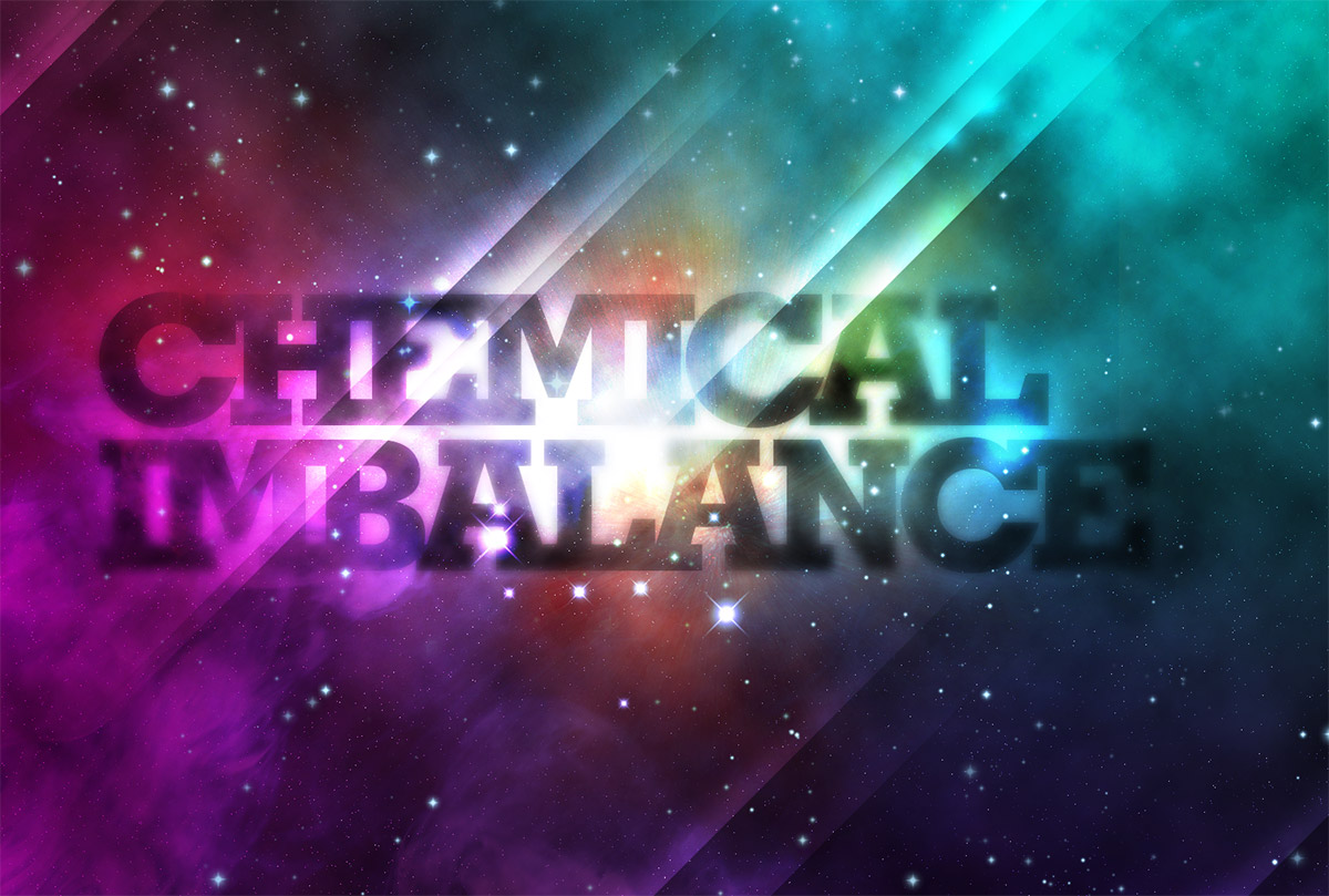
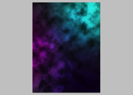
Galactic space scenes are a popular theme for digital art, they’re packed full of texture and vibrant colour, which are two ingredients of an awesome design! Using Photoshop’s blending modes along with a mix of textures and brushes, let’s get lost in space and create an abstract cosmos poster design.
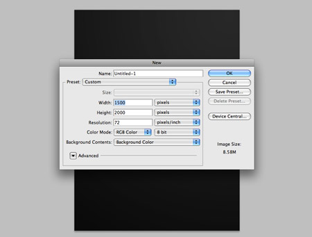
Open up Photoshop and create a new document. Depending on your overall aims, you might want to specify dimensions for a printed poster, otherwise a 72dpi document is perfect for on-screen use. Fill the background with a dark grey.
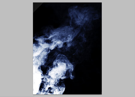
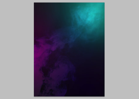
Grab a couple of source images of smoke clouds, these particular images are courtesy of Shutterstock (1)(2). Paste the images into the document and position to flow diagonally across the design. Change the blending modes to Screen and drop the opacity to around 15%.
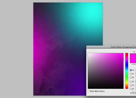
On a new layer, dab three bright colours with a large soft brush. Pink, turquoise and purple work well together.
Change the blending mode of the colour spots to Overlay to allow the colours to cast over the underlying textures.
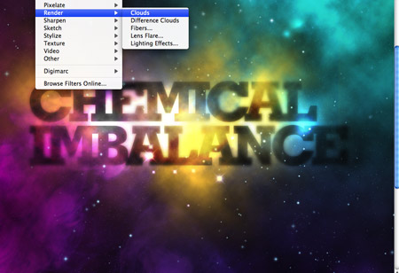
On a new layer, change the colour swatches to their default black and white settings (D). Then go to Filter > Render > Clouds. Change the blending mode to Overlay and tone down to 65% opacity.
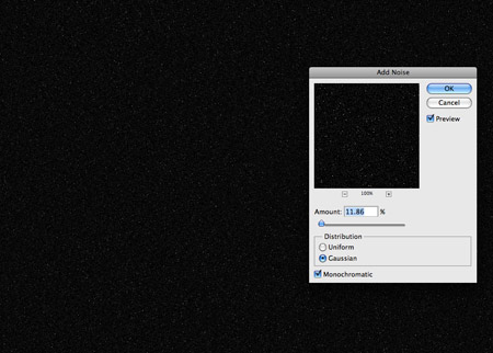
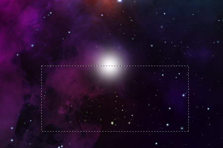
Fill a new layer with black, then go to Filter > Noise > Add Noise. Select an amount of around 10%, with the Gaussian and Monochromatic options selected. Change the blending mode to Screen and adjust the Levels (CMD+L) black and white points to create a field of distant stars. Create a Layer Mask and dab areas with a large soft brush to add variance to their intensity, making some brighter than others.
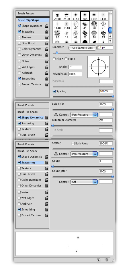
Download this handy collection of Star Brushes, then set up your brush settings in Photoshop as follows. Select a star brush from the pack and turn down the size, also adjust the spacing to 1000%. Under the Shape Dynamics tab, change the Size Jitter to full and Minimum Diameter to 0%. Under the Scattering tab, change the Scatter to full.
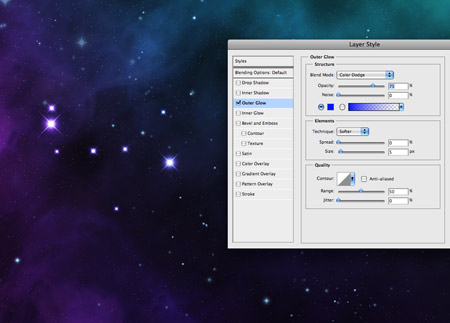
Paint in a variety of stars to fill out the space scene, adjust the brush size between strokes to give a wider range of sizes. Give the star layer an Outer Glow of a light blue, then add a Layer Mask to adjust the intensity of the stars.
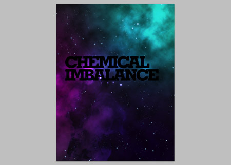
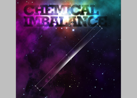
Grab the Type tool and create a simple typographic layout. Here I’m using the words Chemical Imbalance, with a fat slab-serif font (Geometric Slab-Serif). The tracking is tightened and leading shortened to spice it up.
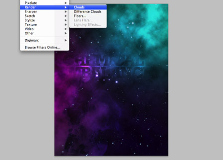
Add a Layer Mask to the type layer, then go to Filter > Render > Clouds to erase out random areas of the text.
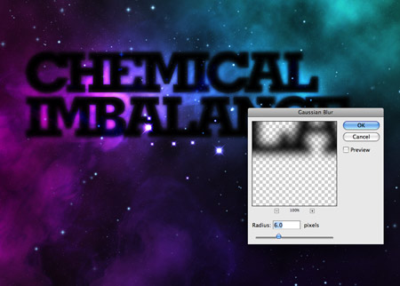
Duplicate the layer, then add a Gaussian Blur of around 6px. Change the blending mode to Overlay.
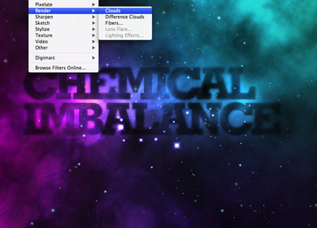
Add another clouds rendering to this layer’s mask to erase out different areas of the text. Use a normal soft brush to also manual erase out specific areas of the text layers.
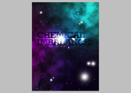
On a new layer, paint in a range of white spots with the Brush tool. Changing these to Overlay will give intense areas of light.
Continue to paint in more dabs of colour, this time spots of yellow around the text.
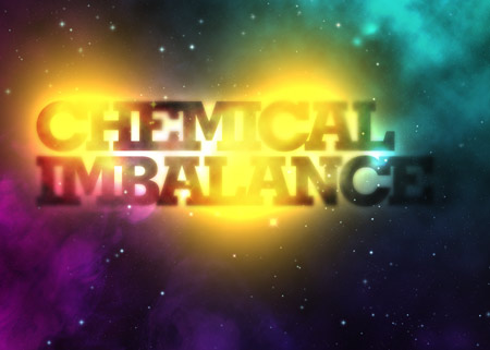
Add a layer mask to the yellow spots, then add a rendering of clouds to give a textured appearance.
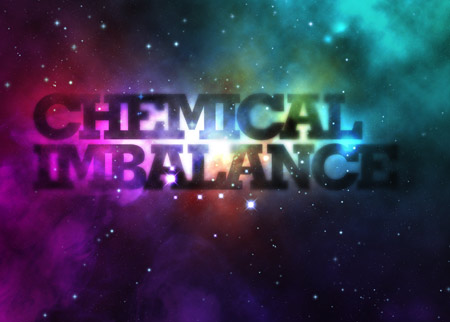
Change the blending mode to Color Dodge to blend the colour spots into the design as casts of vibrant colour.
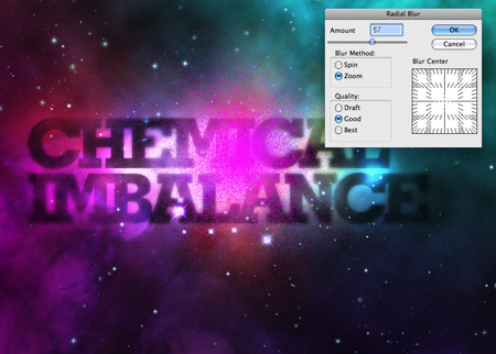
Paint a spot of pink, then change the blending mode to Dissolve. Add a Radial Blur of around 60% using the Zoom setting.
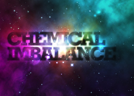
Merge this pink spot with a new blank layer (CMD+E) to reset the blending mode back to Normal, then change the mode to Color Dodge. Change the Opacity to around 60% to tone down the effect.
On a new layer, draw a spot of white using a soft brush. Grab the mask tool and delete away half of the circle.
Press CMD+T to transform the semi-circle, then stretch and squash it into a cast of light. Rotate it by 45% (hold Shift) and move into position on the design.
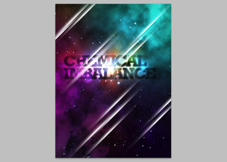
Press the ALT key and move copies into various places on the design. Overlap a few casts to give the impression of streaks across the whole design.
Change the blending mode to Overlay to allow the white to interact with the underlying colours.
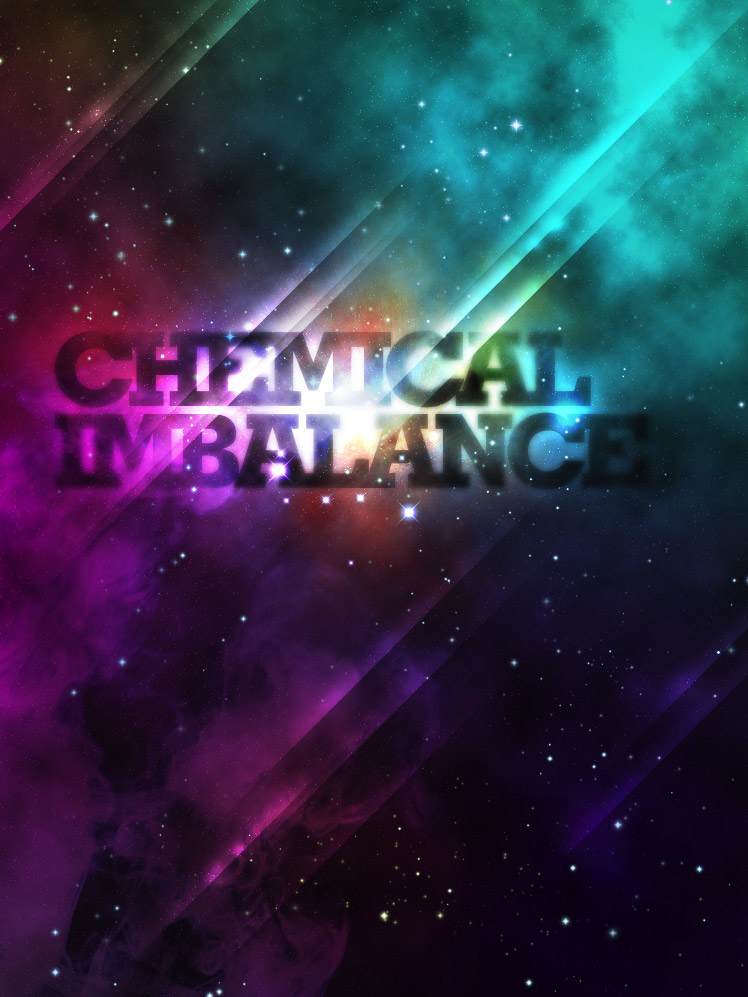
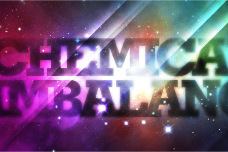
Sit back and cast your eye over the design, make any tweaks to the opacity of layers or tone down areas with brush strokes to the layer mask to erase out areas taking too much prominence.

amazing effects.
Thanks~~
First article i read this morning and i think itt´ll be the best today ;)
Thanx nice one!
U R the greatest!
Great design. Thanks for sharing! Will definitely use it.
Very nice thanks for sharing!
I always wonder how to do those light streaks, now I know. Thanx Chris!
Once more an amazing tutorial.
I love it!
I like the way you dealt with the lightning streaks in the end. Overall another great tutorial!
Now that, is pretty damn epic.
Nicely explained, love the outcome! Be good to see this as a screencast.
Oooh, can’t wait to try that out :)
that’s a great TUT i’ll try it now
nice tut Chris. so simple and great outcome.
Great tutorial! thanks
Awesome tut!
Thank you for the useful tutorial.
An excellent, fun tutorial – many thanks.
Great tut! Thanks
awesome!
way to ruin James White’s career!
LOL i kid, i kid!
Another great tutorial – keep ’em coming!
Thanks
Very N·I·C·E!
The Colours are great..
Great stuff, really love the outcome!
Nice photoshop skills! I’ll be trying this out later :D
Great post as usual, Chris. Two thumbs up!
that is cool how will u think about that type of work
This design is good for Party flyers
Wow! Brilliant work! Thanks for sharing this tut. Cheers
Simple and to the point. I’ve always wanted to know how to do those lines. Thanks!!! Can’t wait to figure out the other one.
Amazing tutorial , I love it
Thanks
Very nice tutorial, I have done something similar before. Though I might try this tutorial out.
Check out http://www.knrdesigns.com
Keep up the good work!
fun tutorial! im gonna do the blackberry ad one later today
hi once again,
well i just tried your imbalance tutorial..back 2 back..
n the results were awesome…
you r my guru my inspiration..thank you so much..
keep them coming..please!!
It looks like a great tutorial except you have to pay to get the smoke cloud pictures from shutterstock, so I didn’t do it.
great design ya.. very very good look
Awesome use of colors … Thanks for sharing with us :)
Great Tut man
wonderful tutorial! Clear and very understanding! Terrific!
Thank you for great tutorial
Very very nice illustration, thank you for the tutorial!
Thanks, it’s so great~
This is pretty cool Chris! Thanks for the tutorial.
none of the blending options results are the same as yours. i realized i was set up in CMYK. is that what’s causing the problem for me? thanks!
to answer my own question, most of the problems were due to being in CMYK mode instead of RGB. though in doing it again, i still had a couple issues. maybe because i used different cloud images.
ok i tried to download the smoke but it says i need to pay for it whats with that >.>
its great info,thanks for sharing.
Woow :|
Amazing, thank you so much!
I Love futuristic/retro design :D
..just worked through this tutorial.. really really cool!
I’ve picked up a few new photoshop tricks.. and also have an awesome new desktop piccie.. :D thanks!!!
My name is Vikas.I read in class 5 in D.A.V.school.My address is b-103 Ashirwad apartment,exhibition road,behind abdulhai complex.Patna-800001.Bihar
My uncle and father are owner of Comman Service center that called-Sahaj vasudha kendra.Sometime we need to work on photoshop.We don’t know how to work on photoshop.I will be greatfull to you if you will teach me how to work on photoshop.So please send me the imformation from which i can learn to work on photoshop.
I’m stuck on the section where you start to add white and yellow to the text, specifically to get that vibrant color and sharpness around the text.
Do you paint it spot directly onto the text layer, or do you do it on a new layer? This part is really messing me up.
I really like this, especially the idea of using clouds as a mask, way clever.
Exellent piece of work
great tutorial, i wish when i try it the result will be the same!
sure you will get the same , Spamer
I’m stuck at the part where you add noise to create far stars… my levels adjustments won’t stick…. I can preview it as I move the sliders around, but when I press okay it goes back to the uniform gray noise. Whats up with this, is it because I have my document in 300dpi?
Amazing tutorial dude!! I love it!! :D
I must not be doing something right… Might is doing nothing of what this tutorial is showing me…
I like the artwork, however, in my opinion its ruined by the last 4 steps.
ummmmmmmmaaahhhh!!!!
sorry, if that’s embarrasing!! ;)
just couldnt stopt it!! i was trying to get that kinda effect since long time… and here it is…
dude this is awesome
very nice tutorial,
nice blog-site…
wow , that’s wonderful . I’m so happy to find your website & thanks.
Nice tutorial for the effects. But as a written tutorial it can be quite difficult to follow. More explanation at certain points would be helpful, basically I think every step needs a blow-by-blow process. And not only say ‘do this’ but explain what it does and why. This is a tutorial after all. Good work though.