
This post was originally published in 2010
The tips and techniques explained may be outdated.
Follow this step by step design tutorial to create a simple vector mechanic character in Illustrator. We’ll build the basic shape of the character using simple shapes, then slowly build up the details with a range of linework. To finish off the character we’ll fill the design with colour then add a few touches of shading and highlighting.
The character we’ll be making is made up of basic rounded shapes, which gives that cool stylized style while keeping the character cute and friendly. The clever varied weights in the linework and the shading are popular illustrative techniques that really help add depth and definition to the finished character, moving it away from a plain old flat design.
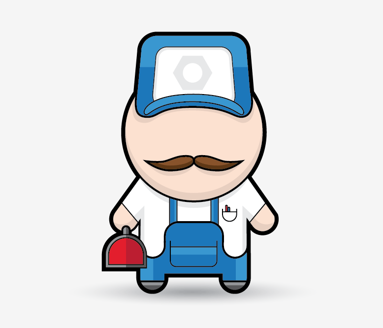
View the mechanic character design
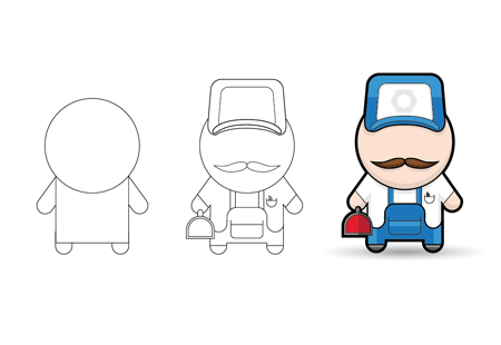
There’s basically three stages of the creation of the character. First is the core structure is built from basic shapes, then the finer details identify the character as a mechanic and finally the character is brought to life with colouring, shading and highlights.
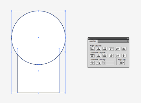
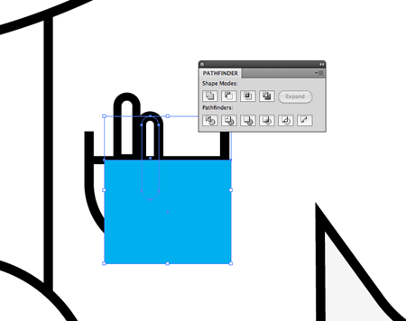
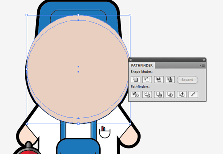
Open up Illustrator and create a new document. I tend to use the CMYK colour mode for ease of adjusting the black in the color palette. Draw two shapes on the artboard, a simple rectangle as the body and a circle as the head. Align the two vertically with the Align palette.
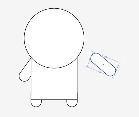
Use the Rounded Rectangle Tool to draw some limbs. While dragging the shapes press the keyboard cursor keys to adjust the radius of the corners. Rotate the arms by 45 degrees and position them under the body elements using the CMD+[ shortcut to alter the stacking order of the objects.
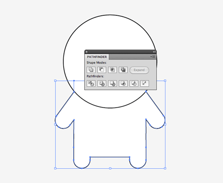
Select all the objects that make up the main body and merge them together with the Pathfinder palette.
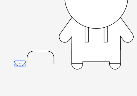
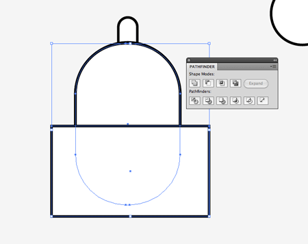
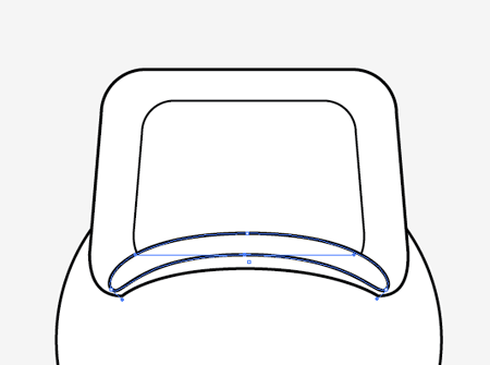
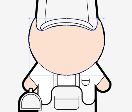
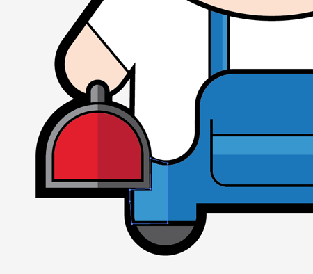
Now the outline is in place it’s time to draw in the finer details. Draw a rounded rectangle on the artboard and delete out the lower most points using the Direct Selection tool leaving just the top edge. Do the same with a smaller rectangle similar to the shapes used for the limbs, but delete out the upper points to leave a semi-circle.
Position the elements to form the outline of the overalls on the mechanic’s body. Zoom right in to carefully align the points so the line flows seamlessly. Use simple rectangles to create the straps and draw straight lines to split the trouser legs from the feet.
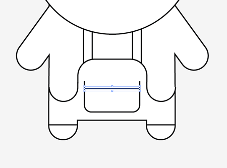
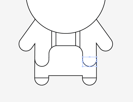
Draw a large pocket using another rounded rectangle. Finish this off with a straight horizontal line. Make sure the line begins and ends inside the width of the black stroke to avoid any gaps.
Add a smaller pocket containing a couple of pens. Use thin rounded rectangles to draw the pens, then remove the lower portion with a temporary shape along with the Subtract option from the Pathfinder.
Elsewhere on the artboard begin drawing a simple toolbox. Use a large rounded rectangle for the main box, and a smaller version for the handle. Remove the lower half of the box using a temporary rectangle and the Pathfinder palette to leave a straight edge.
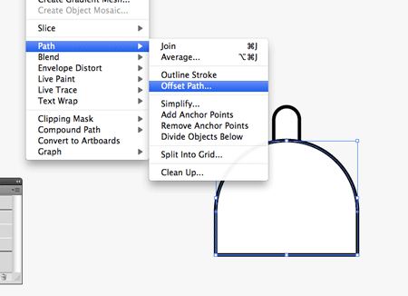
With the toolbox body selected, go to Object > Path > Offset Path. Enter -2mm to produce an inset line running parallel to the original.
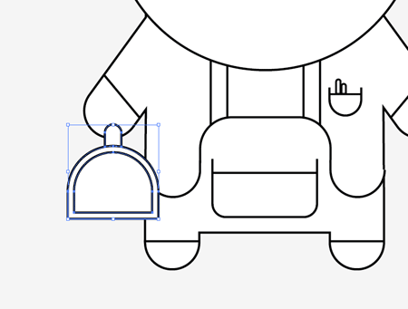
Select the three objects that make up the toolbox then move them into place over the main body. If necessary alter the stacking order of the objects using the shortcuts CMD+[ or CMD+].
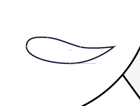
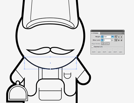
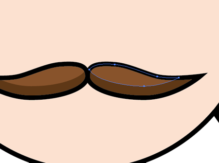
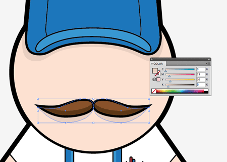
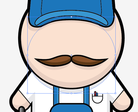
Use the Pen tool to draw one half of a moustache on the face of the character. Draw each point with long bezier handles to create a flowing line, but click the right hand point before continuing the line to convert the anchor point into a sharp corner.
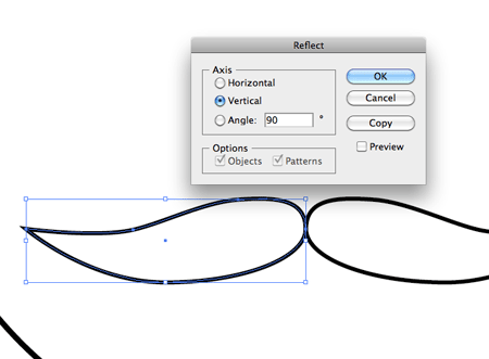
Select the moustache object and go to Object > Transform > Reflect. Choose the Vertical option then hit Copy to duplicate the shape.
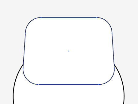
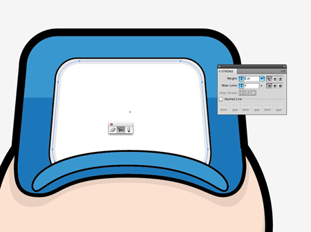
Draw the basic shape of a hat using another rounded rectangle, but select the bottom two points of each lower corner and move them outwards by three nudges with the cursor keys.
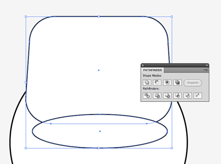
Clip out a curved lower edge using a temporary ellipse along with the Subtract option from the Pathfinder palette.
Draw another ellipse, then use the Direct Selection Tool to grab and move the lower most point vertically upwards to bend the shape into the outline of the peak of the hat. Duplicate and scale down the main outline of the hat to create a front panel.
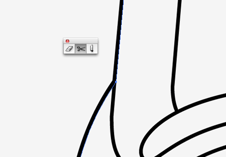
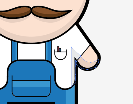
The details of the character are all complete, but in order to use the varied line weight technique the paths need to be split and joined. Select each individual shape that forms the outline of the character and use the Scissors tool to intersect the line where it continues inside the character. When the lines of two shapes have been split, select both end points with the Direct Selection tool and use the shortcut CMD+J to join them. Follow the path around the whole outline of the character until you’re left with one single outlining path.
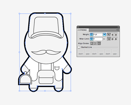
Once this main outline is complete, increase the stroke to 4pt and align the stroke to the outside using the options in the Stroke palette.
Select each of the remaining lines inside the body and alter the stroke weight. Lines that form the structure of the character need to be higher in weight, whereas those lines that make up the finer details can be thinner. Some points may need to be carefully tweaked into position to continue the flow where the line changes from a thick outline to a thinner line. Use the Direct Selection tool to carefully tweak these points into position.
Now it’s a case of painting by numbers. Use the Pen tool with a relevant fill colour to trace the outline of each segment of the character. The outline doesn’t have to be neat, but it must stay within the confines of the black lines. If you find you keep accidentally selecting an existing anchor point and mess up the outline, try locking the linework on a different layer. Press CMD+Shift+[ to send each colour fill to the bottom, so the neat linework sits on top.
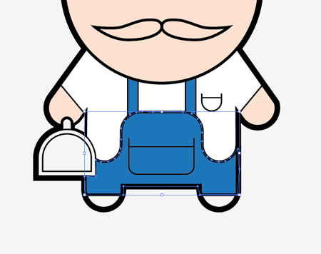
Continue filling each area of the character with a relevant colour fill. The sections that make up the overalls are filled with blue, whereas the three areas that make up the t-shirt are filled white.
The character is starting to take shape now the varied line weights and coloured fills are in place, but to really make it pop a few shadows and highlights are needed.
Use the same technique to create more colour fills but this time use a lighter tone of the underlying colour. Also make sure the line intersects the original shape, but this line should be smooth and flowing, unlike the jaggy outlines that are hidden by the black linework.
Highlights don’t have to be scientifically accurate. Even splitting the leg down the centre and filling one half with a lighter tone will help add depth to the design.
Create shadows for specific elements like the moustache and hat by duplicating the existing linework shape, changing the stroke for a darker shade of the skin tone and sending the object below the original items with the CMD+[ shortcut.
A shadow along the lower edge of the face can be created with a new shape entirely. Draw a circle over the whole face, then clip this to size with a duplicate moved vertically a few nudges.
Use the Pen tool to carefully draw individual shadows on the lower halves of the arms and follow these onto the body. Use darker tones of the original colours to create subtle shadows. This is where that CMYK colour mode comes in handy as the K channel can simply be increased slightly to create a darker tone.
Finish the shading off with a subtle shadow under the chin to lift the head from the body. Draw a large oval filled with grey, then send this object underneath the head elements and underneath the overalls, but above the t-shirt elements. Use those CMD+[ and CMD+] shortcuts to alter the stacking order of all the individual objects.
Fill the front panel of the hat with white, then copy (CMD+C) and paste in front (CMD+F) the shape. Switch the fill for a light grey stroke then clip out the lower edge using the Scissors tool.
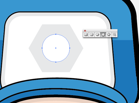
Draw a simple nut emblem on the hat to reinforce the character as a mechanic. A simple hexagon drawn with the Polygon tool and a circle in the centre will do the job nicely.
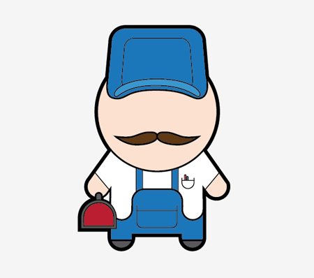
That leaves our cool little mechanic character complete. The basic shapes can be used to create any kind of character. It’s then down to the linework, colour fills and shading to transform the design into a complete character.
Excellent looking little man !
Great tutorial, Chris. Definitely one for the beginners, and helpful towards the more experienced! Thumbs up!
Cheers again Chris, I really need to get learning Illustrator more.
不错 呵呵
I like his ‘stashe ;)
Especially for ‘Movember’!
I thought it was ‘Novembeard’?
Cute character, a great tutorial. Thing the character should have some eyes though :P
Brilliant tut! Love that little character. It looks really cool. Those shadows and lights make a huge difference.
Cheers
Nice tutorials, I love the style of this little character. I could see a whole series being done with this style of different professions.
It’s funny you should say that as it’s something I’m hoping to do. The core character could be transformed into anything!
you did excellent job in this beautiful tutorial.
Pretty Nice , but i think you need to add Chin :D
did the plumber inspire you to do this tutorial. A really nice fun illustrator character. :)
Hey Chris, You already know that I think you are a genius. I love this, but I agree that he might need some eyes in that head of his ;o) All the best, Simon
what about compromise – give him only one eye .)
So cute … but where is his eyes ? :D
Great looking mechanic. The shading is really helpfull to learn..
great tut. it took me long time to finsh, I am new to illustrator.
Wow another great graphic design tutorial. Nice job Chrs
Great Tutorial! There is no big secret but the. Tecnique is fantastic.
Greetings from Brazil
Great Tutorial! There is no big secret but the. Tecnique is fantastic.
Greetings from Brazil
Keep up the great work, I’m loving these illustrations of yours.
keep up the great work i loving…..
nice use of basic shapes n design principles,specialy balanced colors,love spoon graphics!
ammizin’ work chris :)
I wanna see more of these kinds of tutorials . .
thanks !
It’s interesting Chris !*
I like it so much , colorful an it’s good for icons using :D
thanks !
very cool :) and quite good tutorial.keep the good work.
cool result.
Great tutorial as always Chris, thank you. Wish I had you as my illustrator teacher, hope my teacher is not a reader of your blog :).
You could do a spoon man too, get it :). On a more serious note, Are you thinking of doing video tutorials of the same or even audio files, so we can listen to the instructions as we go along ?
I totally want to learn Illustrator to have a alternativ to my Pixel-Art I do in Photoshop.
Thanks for intitiating that!
_Spazz
Didn’t you get my comment? There’s comments that weren’t there when I commented so you’ve obviously read it and not approved it for some reason. I’m not expecting you to approve this comment, I understand, but all I wanted was an answer to my problem. Is it too hard to believe that you may have got something a little wrong or typed mis-understandingly?
PS: Can I have an answer now?
For people who want eyes on him, why? I think he looks great now. Why not try yourself, don’t always ask for help! You can do it. : )
I’m stuck at the scissors part. It’s a bit confusing. I cut it, but don’t have two endpoints.
A video tut at least for that part would help.
Thx.
thanks for posting such great tutorial it is very useful to all keep posting.
Im also stuck at the scissors part.
but great tut
Cool guy and you responded to somebody saying you are considering expanding it to a full line of illustrations. Ever thought about trying to making it a community project? That could be kind of interesting. Basically outline the ideas and then people who follow your blog sign up for them and submit their work. You then choose the best ones for a final set. Yes? No? Bad idea?
I really like the process and final result, bold, simple and cute!
Im new to Illustrator obviously. Was wondering why when I merge my arms and body together, all I have left is a path and no lines? I cant see anything once they are merged together.