This post was originally published in 2009
The tips and techniques explained may be outdated.
I recently had the pleasure of creating a fun website design for NET magazine’s website build-off series. The topic of the challenge was toy sites for kids, so it naturally entailed all kinds of bright and colourful elements. Let’s take a look at the process of creating the fun illustrated landscape scene I used for my design.
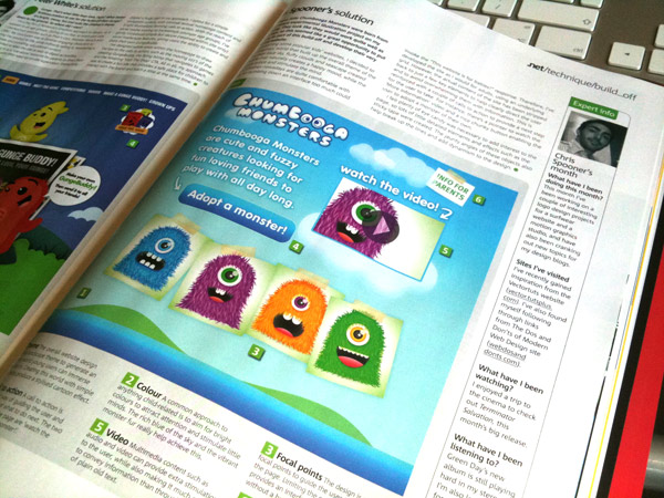
The complete build off challenge can be found in issue 193 of NET magazine, be sure to check it out!
The aim of the challenge was to develop a website that promotes a children’s toy to the appropriate target audience age, while taking into consideration best practices and ethics. My design features a range of bright illustrated elements to create an imaginary scene to get lost in.
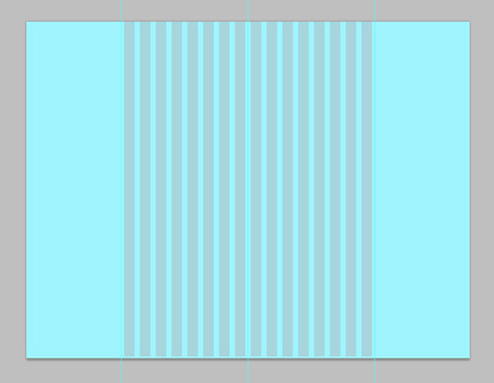
Start by opening up Photoshop and creating a new document. To give a clear indication of how a design will look on a widescreen monitor, I used a large canvas of around 1680×1050. Fill the background with a sky blue, and add guides to simulate a 960px safe width in the centre.
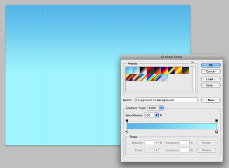
Select a darker shade of blue and draw a linear gradient running vertically across the top half of the canvas.
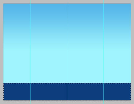
At the bottom, draw a selection across the width of the canvas and fill it with a deep sea blue.
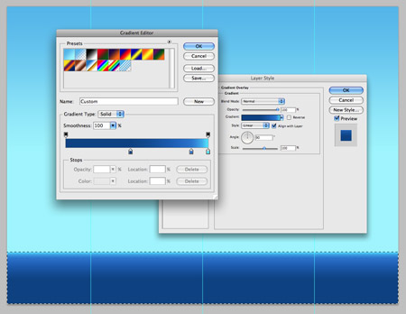
Double click the layer to edit the layer styles. Add a gradient running from the dark sea blue to a lighter sky blue.
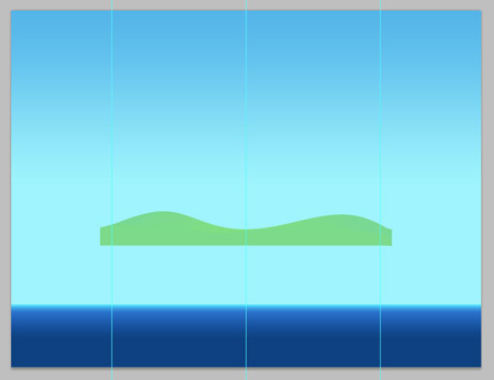
Use the Pen Tool to draw a couple of flowing hills, fill the shape with a grassy green. Position these hills behind the sea layer so that they poke out of the ocean like two islands.
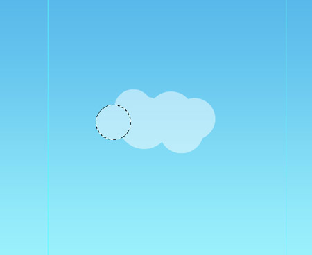
Draw some fluffy cloud shapes using overlapping circles. Fill them all with white and drop the opacity slightly.
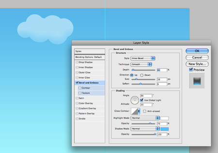
Add a large Bevel and Emboss effect using blue as the shadow colour to give the clouds a three dimensional appearance.
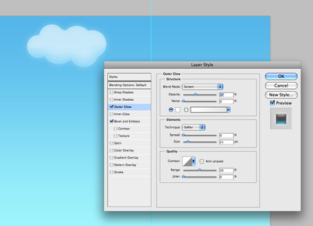
Finish off the clouds with a large soft white Outer Glow.
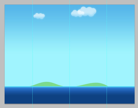
Duplicate the clouds and reposition them in a couple of places across the sky.
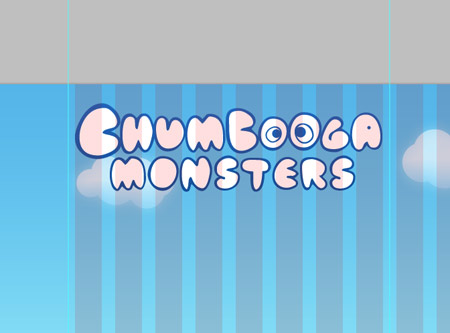
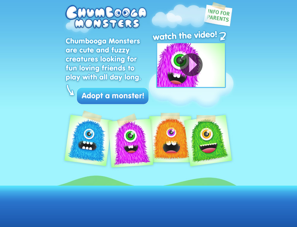
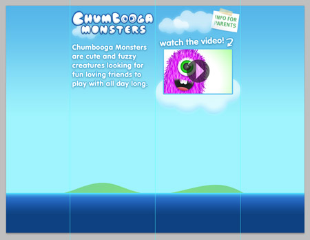
Create a simple logo for the site. With this site featuring a range of monster characters, I chose the random name of Chumbooga Monsters. Set the type in a creative font, or create a hand-drawn logo from scratch.
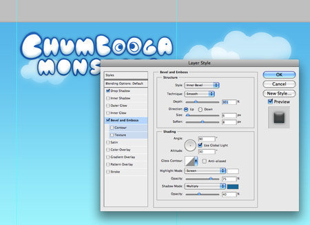
Add a Bevel and Emboss effect to add depth to the text, and a subtle drop shadow to lift it from the screen.
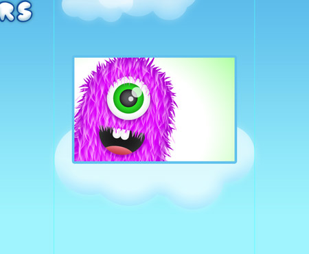
One of the main focal areas of the design is the large video area. Place a large cloud on the right hand side of the design, then create a video snapshot using the cute furry monsters from a previous post.
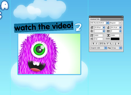
Place some text giving a call to action to draw attention to the video, I’m using the friendly rounded shapes of VAG Rounded to link in to the kids theme.
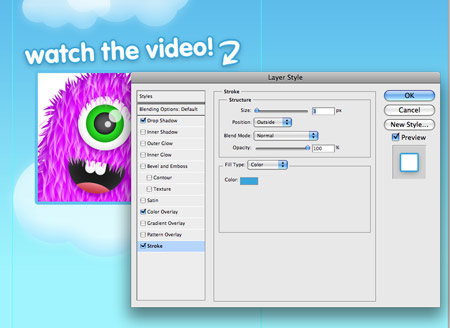
Tart up the text using a variety of layer styles, such as a white fill, a blue outline and a soft drop shadow.
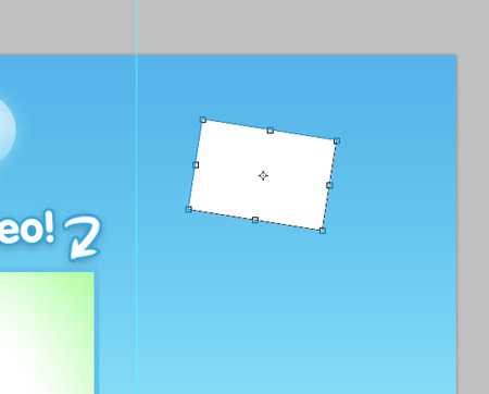
The design also makes use of a little notice hidden away in the corner. To create this, draw a white rectangle, then rotate to one side.
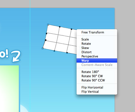
Use the Warp option from the Transform tool to distort the shape of the notice, bending up the corner slightly.
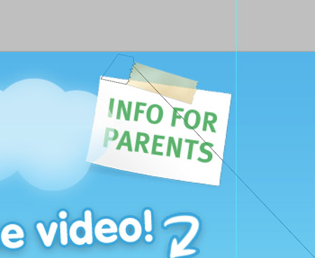
Draw a thin strip of tape and fill with an orangey-yellow. Delete out a jagged edge on each side to give a torn appearance. The aim of this notice is to provide information for parents, so set the font in a more serious uppercase sans-serif to contrast against the friendly rounded font of the main design.
Use the remaining space on the left to give an introductory sentence about the Chumbooga Monster toys. With the site being aimed at kids, lots of visual interest is of high importance, so we can sacrifice web standard fonts for styled Photoshop text using the font and all the effects we like.
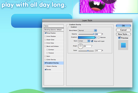
A clear call to action on the page will direct the user to fulfilling the aims of the site. To give indication of a clickable area, create a large button graphic with the Rounded Rectangle tool. Add a range of layer styles such as a gradient overlay, a stroke and soft drop shadow to style up the button into something enticing.
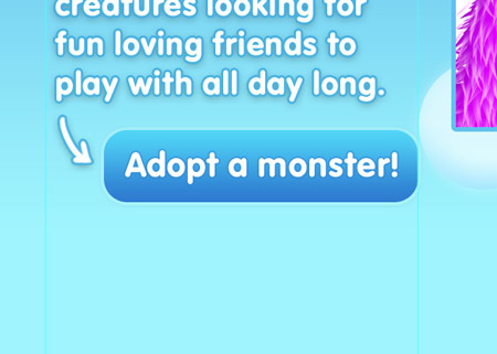
Finish off the button with a simple command, such as Adopt a monster! The idea is that adopting a monster rather than purchasing the toy makes the transaction much more desirable.
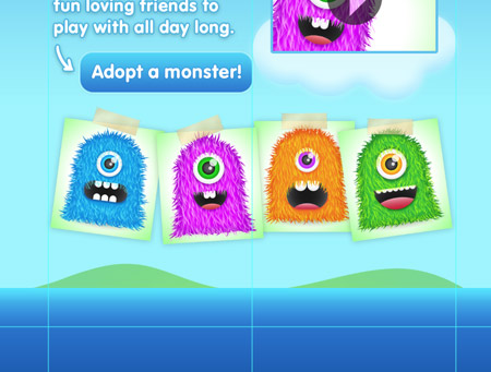
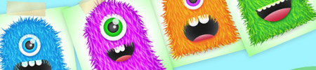
The toys being promoted should also be clearly presented on the page. Use the graphics from the previous post to create a layout of paper notes. The complete line-up can be viewed at a glance, allowing you to quickly pick out your favourite!

The design is just about complete. It uses vibrant graphics to entice the user, and is stripped back to the few important elements to avoid a loss of interest. Keeping an eye on the underlying grid also helps align the elements to provide a structured appearance, but being a site aimed at children, a range of jaunty angles help add excitement to the design.
The final design employs an imaginary world of blue skies and grassy islands to create a perfect scene with a happy mood. Bright colours help stimulate the mind and the information is stripped back to avoid overwhelming the user. A few calls to action provide a next step for the user to take. After watching the video and being introduced to the monsters, a large chunky button allows the user to adopt a monster of their own.

great tutorial mate
really cool illustrated site design. thanks
Another great tutorial and congrats with getting in the .NET mag…again!
Wow. You are a god. Thanks HEAPS for these tutorials… so clean and awesome.
Keep up the awesome work.
Cute!
Our Delhi-based Web Designing Firm is a one-stop solution to divergent website designing services. It offers a wide assortment of the best web designing services right from attractive and user-oriented website design to complete e-commerce web development packages. Over the past 5 years, we have created and implemented successful website designs since our inception.
Liked it!
So simply perfect, as usual! Thanxx!
Really cool ! Thanks
good stuff mr spooner
Great tutorial friend!!!
Niceeee BLoG!
Looks funny. :) And quite suitable for kids website. Thanks for sharing the step-by-step tut.
Another interesting post by Spooner. I will really help me for kids website designing.
Thanks for awesome post again
Very cool children’s site
This is a very nice and interesting site for young. Good post . Thanks a lot.
Easy to follow tutorial and congratulation on getting in the .NET magazine!
I’m a relative newie to creating sites. However, I’m self taught and I haven’t figured out where to go after you make a great looking PSD file like we find in this tutorial. Can anyone lead me in the right direction? What things should I learn now that I can create a good looking PSD? Do I need to know how to code? Do I need to know CSS? What should be my next step (or two… or three).
Thanks in advance.
praises!
Brilliant Tutorial Chris your stuff is always great!
Inspirational posts m8!
How have you placed the shadow under the “Info for Parents”? It’s not a second shape is it?
very usufful tutorial.
thanks for this post!
Awesome Tips
Thanks mate
cool teach
thanks man your designs are awesome
Ho howww :) Very good designss
Coooooooooool!
Nice tutorial, very clear to follow.
You’ve used some really nice techniques like the realistic tape and clouds, I’ll be definitely using those methods. Would have liked to see it in Flash though, some movement would have been even sweeter – BIG LOVE!
great job chris,pram from Indonesia say Hello, and wish you best always.thanks for the info.
very cool, thanks
Well done. It’s a neat looking site.
Nice, but you know what that fun design needs??? Comic Sans! That would take to the next level!
Great Tutorial Chris
thank you for good tutorial!
Great tutorial, and also a great site mock up. Trying to put it all together piece by piece.