This post was originally published in 2010
The tips and techniques explained may be outdated.
Follow this step by step walkthrough of my recent design process for the ‘Spectrum’ poster. Starting with custom made type in Illustrator, we’ll move our vector graphics into Photoshop for some serious distressing with Photoshop brushes, blending modes and more!
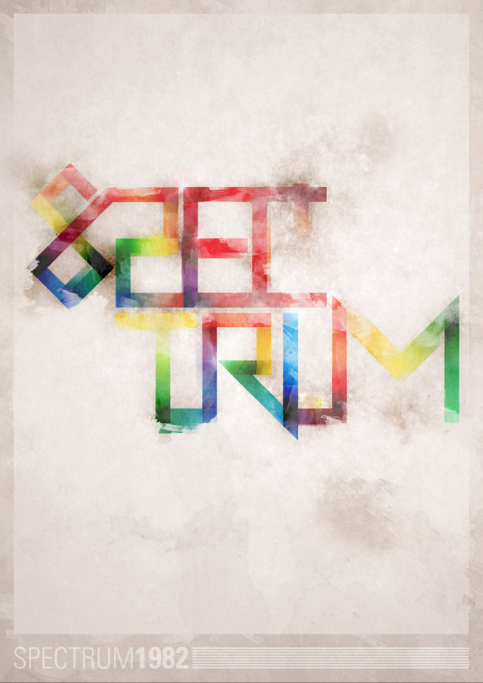
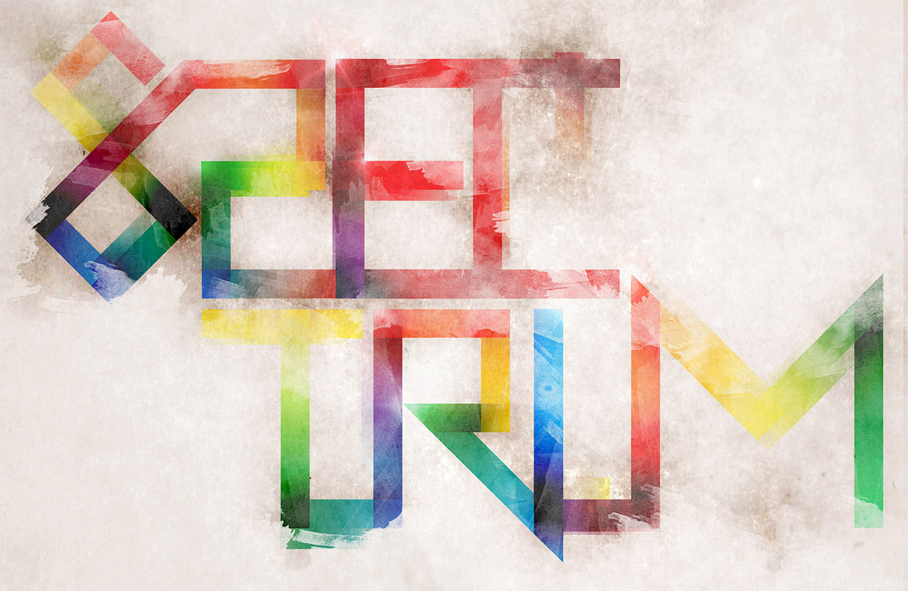
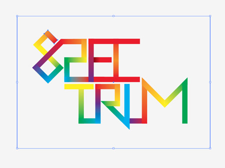
The Spectrum poster takes inspiration from the old ZX Spectrum computer of the 80’s, the feature of the design is the custom made abstract type, which is mixed with a full spectrum of colours then grunged up to the max with textures and muted background tones. The overall theme is a cool mix of 80’s retro and modern day grunge.

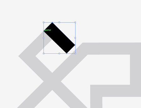
Start work in Adobe Illustrator. Create a new document and begin fleshing out the basics of the custom typography with the Pen tool. Hold Shift throughout to maintain strict angles between each line. The topic of the poster is Spectrum, so the word is designed as recognisable as possible while adhering to the angles of the paths.
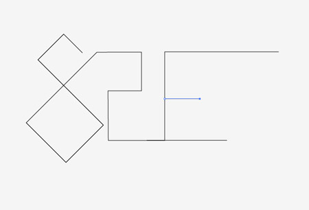
Aim to follow each letter from the previous to form one continuous line. However it’s inevitable that extra additions will be needed in places.
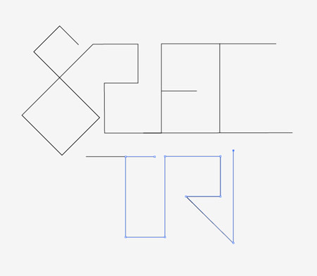
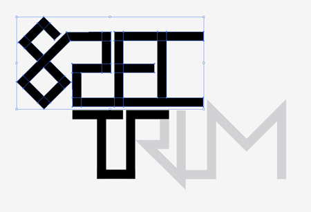
The word Spectrum is split in half to help compose the design and to add that extra touch of abstractism. Finish off the paths until you have a complete and recognisable word.
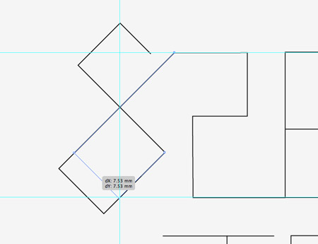
Drag out a few guides to match on key points of the path. Use the Direct Selection tool to drag paths into place to line up the typographic design. Remember to hold Shift to constrain those angles.
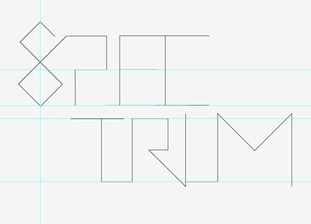
Once all the type has been aligned and tweaked, take a step back to review the design as a whole.
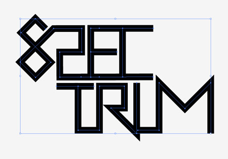
If all is looking good, increase the stroke weight of the path to thicken up the linework.
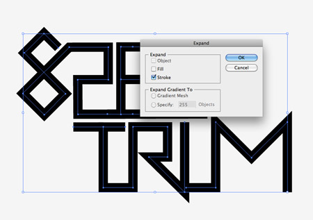
Select the typographic design and go to Object > Expand. Select just the Stroke checkbox to convert the path lines to solid shapes.
Fill the type with a light grey or reduce the opacity, then lock the object in place (CMD+2). Next use the Pen tool and trace each segment of every letter. Using Smart Guides (CMD+U) will be a huge help in speeding up this process.
Continue tracing segments of each letter. Every time the lines of the type changes direction, create a new shape.
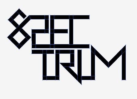
Once the whole selection of type has been traced, unlock the original and move it to one side. We’ll now work on this new version that’s made up of lots of individual pieces.
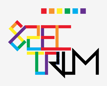
Set out a simple rainbow colour scheme of red, orange, yellow, green, blue, purple. Use this sequence to fill each segment of the type design as you follow the path.
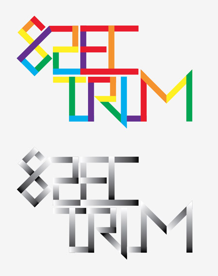
Duplicate the type and move it to one side. Replace the coloured fills with black to white gradients on the duplicated version, then adjust the angles of each gradient so the direction flows according to the orientation of the pieces.
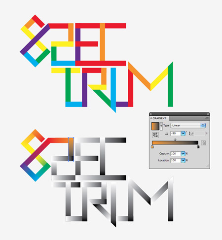
From within the Gradient palette, select the small black and white handles from the gradient editor and replace them with a colour swatch according to the solid colours of the original type design. The first block is red, followed by orange, so the first block’s gradient will run from red to orange. Basically each gradient should flow from the previous colour to the next.
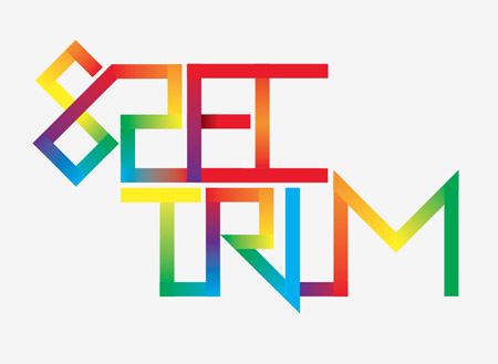
The design should naturally flow seamlessly through the colour spectrum, with the exception of some intersecting shapes, which should be filled with the closest available colour gradient.
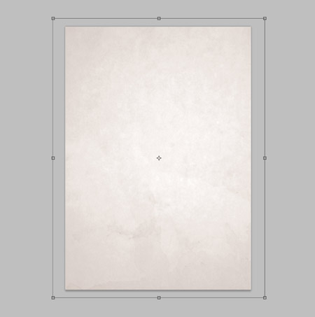
Create a new document in Photoshop, being a poster I’m using A3 dimensions of 297x420mm at 300dpi. Import a subtle background texture, such as this high res paper file from Shutterstock.
In order to maintain the editability of each segment of the type design, we’ll need to import each piece separately. Draw a box around the design and select it along with the first piece.
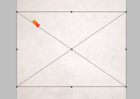
Paste the first object into Photoshop and render as Pixels. Switch back to Illustrator and select the next shape and container box.
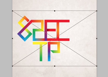
The container box will ensure all the pieces are aligned exactly, rather than defaulting to the centre of the document. Build up the layers with each individual piece.
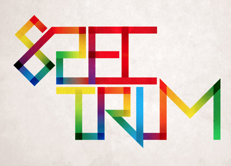
Select all the type segment layers and change the blending mode to Linear Burn. Group all the pieces together (CMD+G).
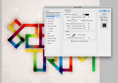
Double click the layer of one piece to open up the Layer Styles window. Add a large Drop Shadow set to Color Burn. Reduce the distance to zero, but increase the spread and size to extend the burnt effect far beyond the edges of the type. Right click this layer and select Copy Layer Style, then paste the layer style onto the rest of the type segment layers.
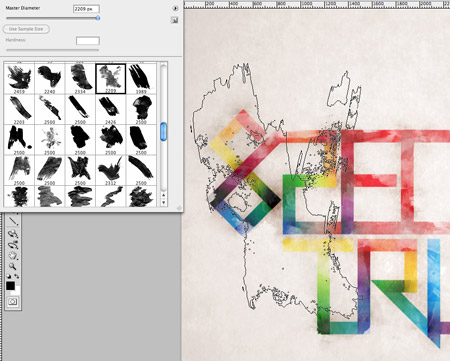
Add a Layer Mask to the Group of type segments, then use a Watercolor Photoshop Brush to rough up the type. Edit the brush to a low opacity to give multiple levels of tone, and rotate the angle from within the Brush options box to add variety to the texture.
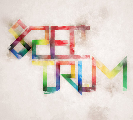
Distort the edges of the type slightly by adding cloned areas next to the edges of the words using the Clone Stamp tool. These cloned areas will also be affected by the layer mask of the parent group.
Make a selection around the whole canvas and fill with black to create a border. Change the blending mode to Overlay at 60% to blend the border with the background tones. Add a layer mask and distort the clean edges with a Watercolor brush.
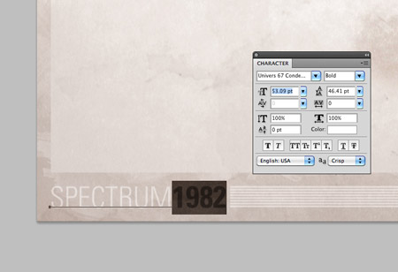
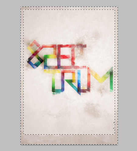
Finally, add a small credit or title to the poster design in the footer area. I’ve titled the design ‘Spectrum’, with the date 1982 being the launch date of the ZX Spectrum.

nice tutorial
love the idea!
Hey I like this Chris although I can’t help but feel it needs other elements to balance the text. It looks like it’s floating in space and my architectural background always forces me to see urban perspectives wrapping around text…
Great tutorial, thanks.
Well yeah, I wonder how your going to implement this design in your architectural background. May be float the buildings lol.
@ Chris
I admire your work sir.
Thanks Andrea, what kind of elements do you think would have fitted into the design to balance it out?
so stylish!!! =)
Thanks a lot..
simple and easy…but its all about the idea!!
useful post…thnx Chris!:)
This looks really nice, what format would you save it in before sending it to the printers?
I’d probably send it as either a flattened TIFF or JPEG, after conversion over to CMYK.
Nice work, i like style designs
Wonderful job chris! as always… ;)
very nice and stylish!! great work!
Thanks Chrs! :)
Nice tutorial. Sweet look you got going there! :)
Great tutorial as always Chris!
Have been following you on many tutorials, But I really liked where you dint give it a distortion look. Anyways the nice tutorial dude. Keep it up.
Nice tutorial, very easy to follow.
Thanks
I love this, great job Chris. Let me know if you ever get any printed ;)
One Word…. Fantastic!
Sorry for the misspelling, Thanks Chris!! The Tutorial is so great but it is little too advance for me! :)
Thanks for the kind comments everyone!
Great work…. Simple, yet a very unique result
I love… cant wait to test it out!
you using amazing creative sense in this beautiful tutorial. thanks for sharing
Great Tutorial, loved it, thanks a lot Chris
Love it! Thank you!
Really nice tutorial Chris! It would of looked pretty sweet if you’d added a ZX Spectrum image similar in style to your 1985 vector pack.
Nice effect :)
good thx for this tutorial
sweet
Great tutorial. Keep them coming
woow
Love it! Thank you!
Nice work! I like typographic style!
Nice walkthough, This will give me some inspiration. Glad i found this site. :)
Love it! I find your Illustrator tutorials are extremely helpful. Keep up the good work!
I have ZX Spectrum, 16KB :)
gods tuts)
nice tut.
nice and good tutorial, thanks for sharing
I simply love ur design tutorials! Thanks for sharing once again!
Awsome Tutorial, thanks a lot :D
This is fantastic design and tutorial as always, Chris.
I just think the re-tracing step after you’ve expanded the stroke is unnecessarily time consuming. You could just add lines where you want to separate the boxes and then in the Pathfinder palette click Divide. You can then select the smaller boxes with the Direct Selection tool.