This post was originally published in 2009
The tips and techniques explained may be outdated.
Follow these steps in Adobe Illustrator and Photoshop to create a range of vector shapes and graphics that can be combined into a great looking vector collage illustration. We’ll then finish off the illustration with some subtle touches of depth and detail, giving a polished graphic with hints of a retro-grunge style.
The header design here on Blog.SpoonGraphics has received many comments of praise and has been the subject of a good few questions and tutorial requests over the past year. So, I thought it was about time I created something which covers some of the processes of creating a similar graphic style. We’ll be using many of the same techniques I originally used in the website design, combined with some additional steps to create this neu-retro clean-grunge pop culture vector illustration.
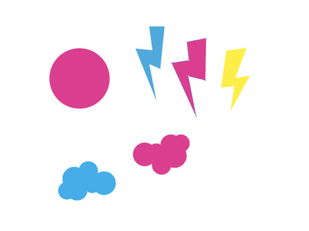
Get started by opening up Adobe Illustrator, create a bunch of simple shapes as resources for future use. Graphics that fit into this pop culture style include overlapping circles, lightning bolts, stripy lines and swirls. A fitting colour scheme would be to limit the artwork to Cyan, Magenta and Yellow.

Create a bunch of concentric circles by copying (CMD+C), pasting in front (CMD+F), then scaling down while holding the Shift and Alt keys. Alternate the colours of the circles.

Group the individual group of circles and duplicate multiple times. Scale and position each group to form a stack of shapes.
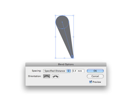
Create a swirl by drawing two circles, one large, one small. Select both and head to Object > Blend > Make. Alter the Blend Options to the minimum spacing in the Specific Distance option.
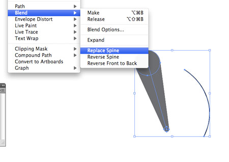
Draw a separate curved line, then with the blend and the line selected, go to Object > Blend > Replace Spine.

Repeat the process to develop a bunch of swirls with various curves and directions.
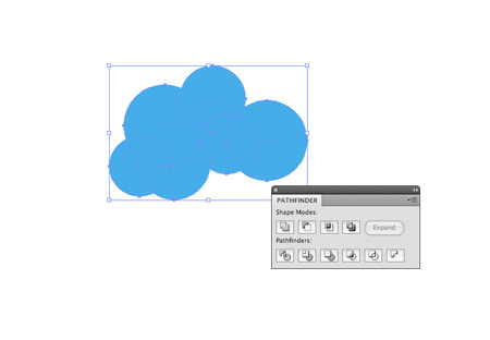
Create a collection of overlapping circles with the Circle Tool, holding shift to keep the shapes proportional. With a bunch of shapes selected use the Add to Shape Area option from the Pathfinder window to merge them all together.
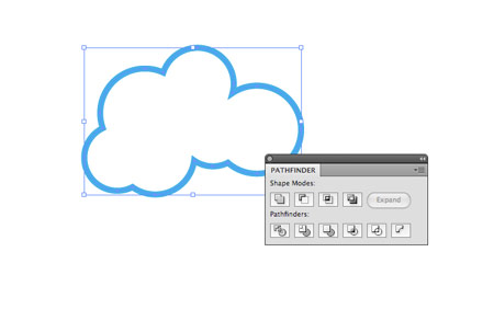
A variation of the circles would be to simply swap the fill for a thick stroke.
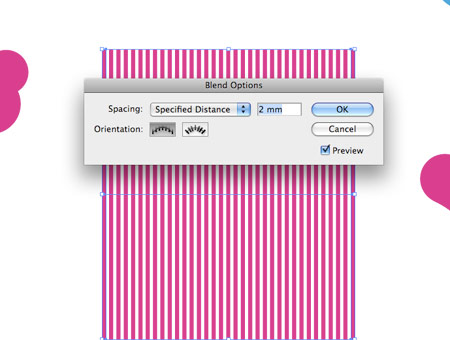
Draw a long, thin rectangle on the artboard, duplicate and move to one side. Use the Blend tool to create a range of stripes. Go to Object > Expand to convert the effect into a shape.
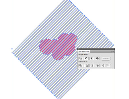
Rotate and overlap the collection of stripes onto a merged group of circles. Use the Subtract from Shape Area Tool from the Pathfinder to cut stripes into the underlying object.
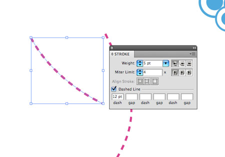
Draw a couple of curved lines with the Pen Tool, add a stroke and select the Dashed Line option.
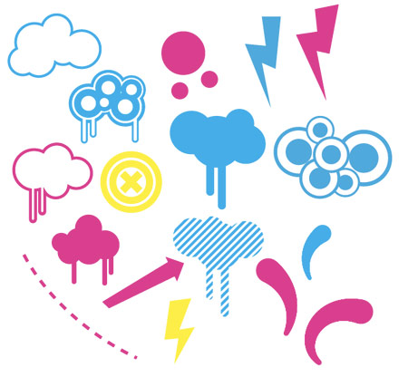
These few simple steps soon generate a little toolbox of resources to use in the illustration. We can use these elements in various colours to build up the collage.
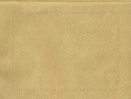
Open up a paper texture in Adobe Photoshop, you can find this one from the collection of 5 brown paper textures post here on Blog.SpoonGraphics.
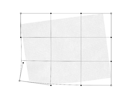
Paste in a selection of paper into a new document, adjust the colours and saturation to give a subtle paper texture. Use the Warp option in the Transform command to add a little curl to the corner.

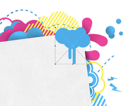
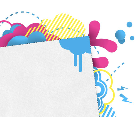
Begin pasting in the vector elements from Illustrator into Photoshop, position the shapes below the paper layer to give the impression that they’re creeping from behind.

Continue pasting in various elements, alternating between Cyan, Magenta and Yellow. (Photoshop Tip: Use the Auto Select Layer option for the Move Tool to easily select and move elements without the need to find the appropriate layer in the layers palette)
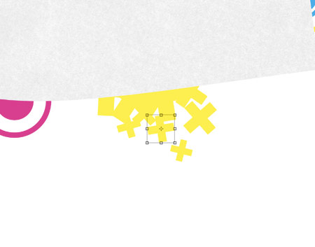
Add some interest by pasting in elements so that they interact with the orientation of the artwork, so for instance add elements that appear to be falling or dripping vertically down the page.
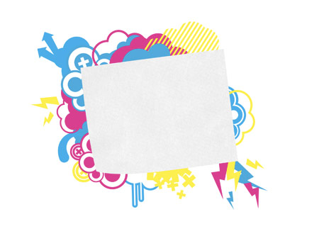
After a while the shapes will begin to fill out the background area and produce a layered effect as they span further outwards.
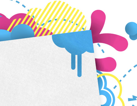
Using the same shape, but in various positions can help flesh out the illustration. Use the rotate and flip-horizontaly options to give variation to the same element.
Finish off the composition with some tiny details and check over the layout for any elements that interfere with each other.

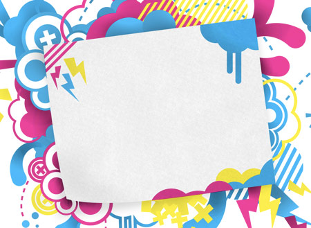
So far the vector elements add plenty of detail and dynamism to the illustration, but they do tend to look a little flat. Use the Burn Tool to draw in some subtle shadows. Set the tool to target Midtones, at a very low exposure (20%).
These little additions really start to bring the illustration to life and lift it from the screen.

Repeat the process, but this time with the Dodge tool to add some very subtle highlights to the elements.
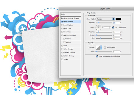
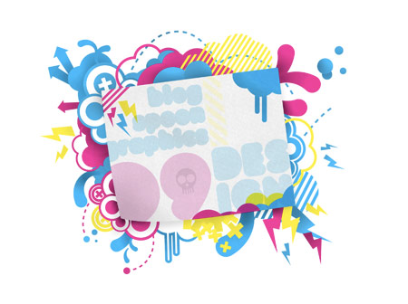
Select the main central paper area, and add a soft drop shadow. Use a large size, but low opacity to give the most realism.
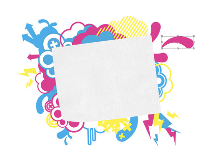
Paste in a couple more vector elements, this time above the paper area.
CMD-Click on the paper layer’s thumbnail to make a selection, CMD-SHIFT-I to inverse and delete out the excess from the vector shape.
Set the blending mode to Multiply to bring through the paper texture, and touch up with a brush of the Burn Tool.
The main collage portion of the illustration is now complete. Let’s move on to adding some content to the central page area.
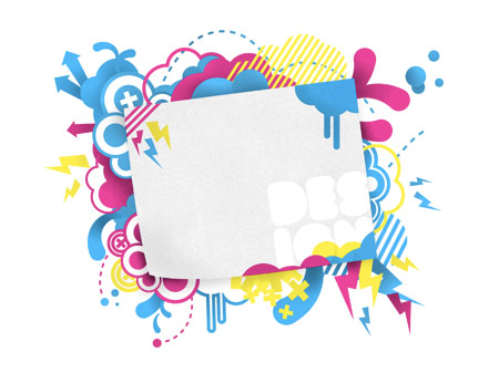
Add some type to the design, here I’ve used the word ‘design’, split over two lines and set in a heavy, rounded font.
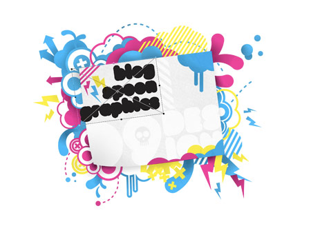
Continue adding various elements to the central design to fill out the space. Rotate the elements to match the orientation of the direction of the paper.
A few tweaks later and the design is taking shape. I made some decisions to continue the colour scheme into the main elements, but reduce the opacity to avoid them taking too much focus.
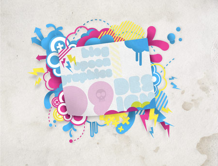
Paste in a high resolution texture into the background of the document. This one is from the highly useful Lost and Taken website.
To finish off the illustration, use a couple of high resolution spraypaint brushes to add some fine overspray in the Cyan, Magenta and Yellow colours.
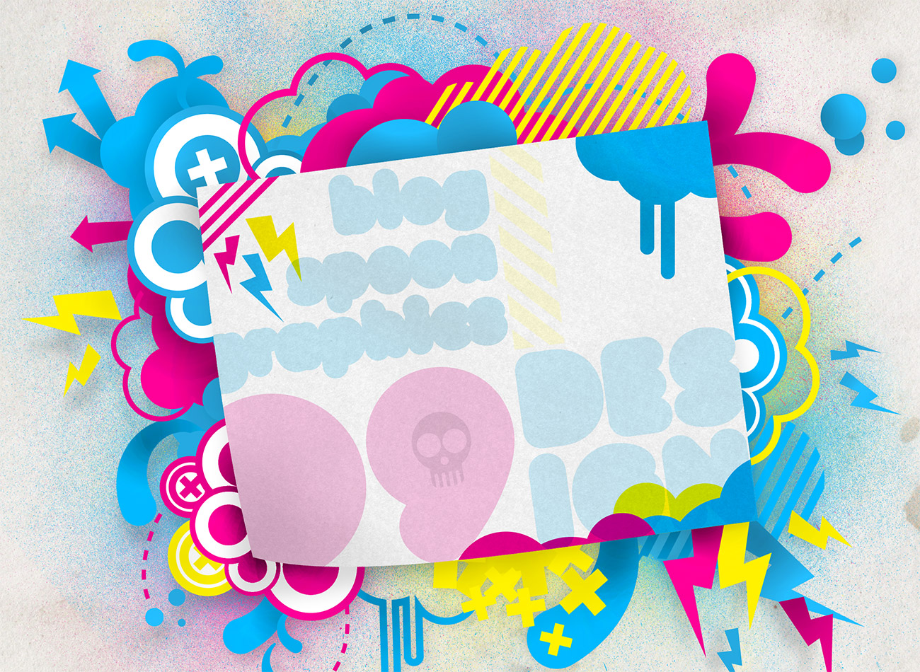
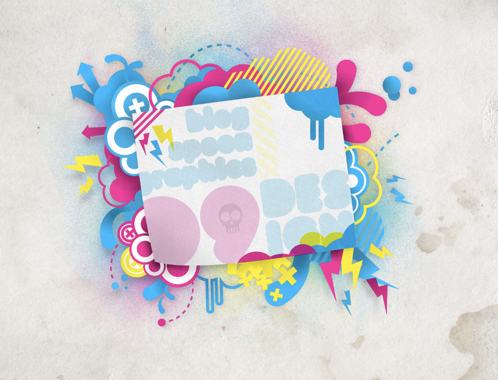
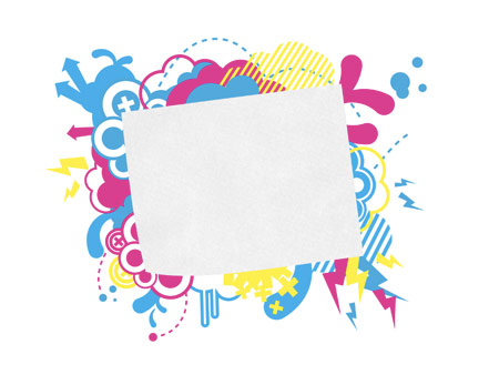
Take a look at the final illustration.

Sweet stuff!
great tutorial thanks so much
cool..makes me wana learn more bout photoshop ! but without an artistic mind, you still won’t get an artistic piece..lol
great tutorial! i love seeing the way you work! I really need to make an interesting vector-like illustration for my front page on my blog but haven’t got the time for it at the moment!
oh and thanks for the ‘Auto Selection Move Tool’ option tip, somehow I’ve missed that over the years!
good tut!!
Nice one… “neu-retro clean-grunge pop culture” is a term I think that may just catch on :D
nice tut m8..
Lovely tutorial!
Really really good tutorial, I’ve been looking for something like this a long time! Thanks!
very nice tut. lovely vectors:) thanks
Really good tutorial! Love this vector creation ..
Good job!
I totally love it.
Great job man :)
Perfecto!! :)
Thanks again, it looks great.
amazing tutorial…like how easy to make it
great share thank you
Great tut as always Chris!
I’ve never truly understood the grunge style, but your tutorial is pretty neat. Thanks for sharing.
I love you ‘-‘
Amazing stuff!
Really great tutorial, many thanks, so easy to follow. Got some ideas of designs, but, just didnt know how to implement them on the comp from paper.
Tracey
Great tutorial!
Featured here: http://www.presidiacreative.com/web-picks-19/
Chris, that is exactly the sort of tut I was looking for. I am looking at making an image like this for the header of a new iWeb theme and I need to brush up on my already fading Illustrator techniques.
I like the idea of creating ‘a little toolbox’ of things to collage together; nice tip.
Thanks very much.
Brilliant. This tutorial is exactly the look and style I was after for a design I’m currently working on. The depth you added to this comp with highlights and dark tones is perfect.
Great tutorial!
really great tutorial. Thanks for sharing!
Great work! =)
I love this blog!
I´m from Germany. But all your tuts are so detailed und simple.
I have never problems to understand anything.
Thanks for that!
Very cool – I like it!
Another awesome tut, thanks a lot Chris!
nice stuff, thanks for the creative tut..
I love designs in CMYK colours, and this one looks great for summer.
I imagine we will be seeing more 3D effects across the web in ’09
nice !! good stuff thx
Sweet tutorial, you’re definitely bringing the old-school back in a good way!
i always wanted to design and draw retro circles and stuff :-D thanks for this awesome tutorial
That is simply amazing! Yeah… simple when you see it step by step ;)
nice tuts :)
What a nice prety tutorial…
Wow a pretty artisitc and cool design! This is so awesome! i wish i can make one like this!
Very nice :)
Cool image, I really like the way it starts to look as soon as you start adding the shadows in. Another great tutorial Chris!
this really helps me alot! super thanks for that!
great tutorial!
Thanks for the inspiration!
Amazing! Very cool!
Wow, thanks for sharing how you did all that! I’ve always wondered how you came up with your blog header. I learned a lot from this tutorial; I never knew about the Illustrator blend tool before this. That will come in handy SO MUCH! Thanks again, you’re incredible!
what is that cool rounded font i really like it, please tell me
This stuff is great, too bad its played out. :(
I think that’s grat. I love the Grunge Style :-)
please someone tell me how to align the circles (the picture above “Group the individual group of circles and duplicate multiple times. Scale and position each group to form a stack of shapes.”) on top of each other? by just copying (..+c or ..+f) doesn’t help, the lines are all mixed up, not stacked on top of each other.
nice tut btw.
That was a great tutorial. Thank you!
nvm, got it :)
waaa..
it’s cOoL.!!
Awesome job! Looks amazing :D
great tutorial!
I’m a big fan of this style
really awesome. thank you very much!
Muy bueno el tutorial, en mi pais (Argentina) se usa mucho este tipo de diseños para publicidades de TV.
Saludos!
very good tutorial, thanks :)
Great tutorial
Ahhhhh takes me back to the 80s…which I like!
Very usefull thanks!
I will read more of your articels.
An exceptional tutorial. Thank you.
hey .. this is just awesome…. great… i love it..
nice.. i liked it..
post me more tutorial like this i will love to see those
Cool tut!… I like it a lot!: ) and I learned something new…thanks.