
This post was originally published in 2009
The tips and techniques explained may be outdated.
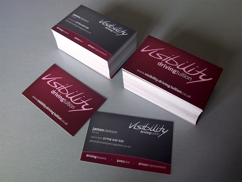
I recently worked on a business card design project and thought it would be a great opportunity to use the work as a base for a walkthrough of the design process.
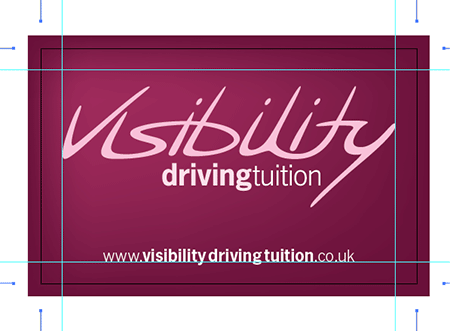
The project was for James Clarkson; a driving instructor working out of Tadcaster near York with his business, Visibility Driving Tuition. I really enjoy working with James, and with a high level of creative freedom on his projects the design process is really fun! Let’s look back at my process for creating the final concept of his business card, resulting in the finished printed product.

This business card project follows on from the initial logo design that was created a couple of months back. With the business cards requiring this branding, the vector logo files were opened up in Adobe Illustrator.
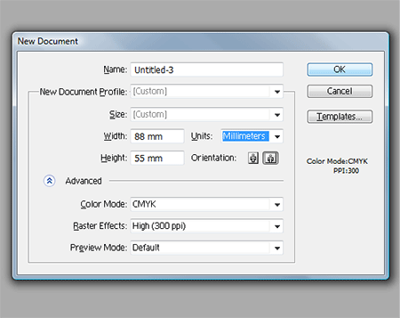
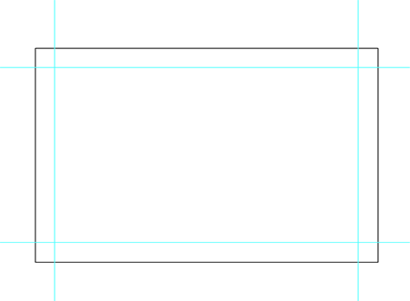
A new Illustrator document was created at the size of 88mm by 55mm, the standard size of business cards at the print firm I use. The color mode is set to CMYK for print purposes and raster effects at 300ppi (although no effects are used in this project it's worth remembering the setting).
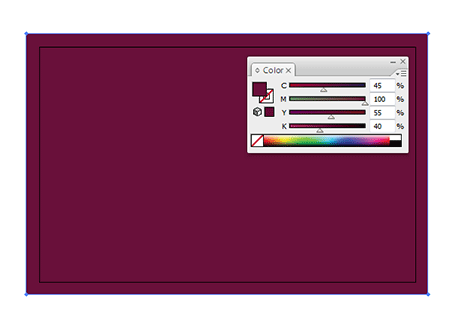
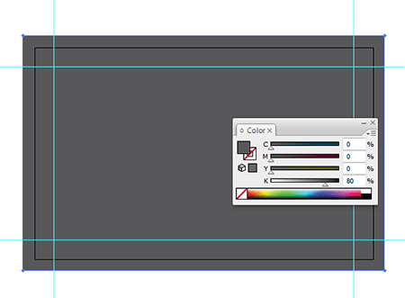
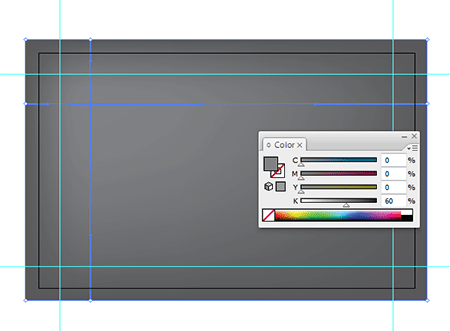
Being a print project the document required bleed at 3mm on each side of the document, therefore a rectangle of 94mm by 61mm was drawn and centred on the artboard. This was then filled with 45C, 100M, 55Y and 40K to continue forward the Visibility Driving Tuition brand colours.
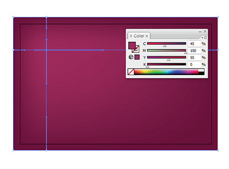
To add a little visual interest and depth to the card a slight gradient effect was added using the Gradient Mesh Tool. The highlight was given the same colour swatch but minus the black (K) ink, this means there is a solid coat of cyan, magenta and yellow but the gradient of black giving the overall change in tone.
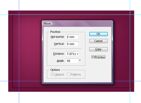
Before placing any text or content on the card, a set of guides were placed. A guide was positioned on each side of the artboard, then using the Move command they were positioned 5mm inwards.
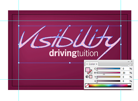
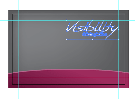
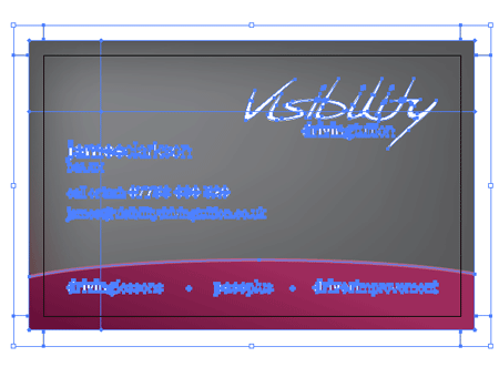
The logo was placed on the front of the card, then scaled down to fit within the content area. Being sat on a dark background the logo needed a light colouring, pure white was too brash and contrasting so this was softened with 30% magenta.
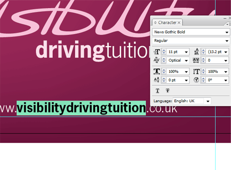
The web address of the Visibility Driving Tuition website was then set in News Gothic, the font chosen as part of the Visibility branding. Using a mixture of light and bold variations the important section of the address was made to stand out.

Being an address of three parts a small amount of spacing was added between each word, this helps differentiate the three making it easier to read with a passing glance.
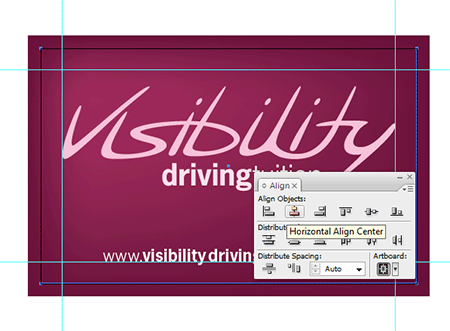
An 88x55mm rectangle was drawn and positioned centrally on the artboard, this was then used as a base for the crop marks using the Filter > Create > Crop Marks command.
With the front of the business card complete the file was saved.
The document was then stripped back to the basic structure, and a copy saved as the rear of the card on which the main details would be held.
Using a similar process, a grey rectangle was drawn (including bleed) using a fill of 80% black.
Using the Gradient Mesh tool, a single point at a lighter shade of 60% black was added to the top left corner. This again helps add a little depth and interest to the design. With the rear containing fine text, the single black ink ensured the printed reproduction was extremely crisp.
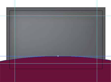
An area at the base of the card was to be sectioned to include the three main services, this was drawn using a large circle to produce a subtle curved edge.
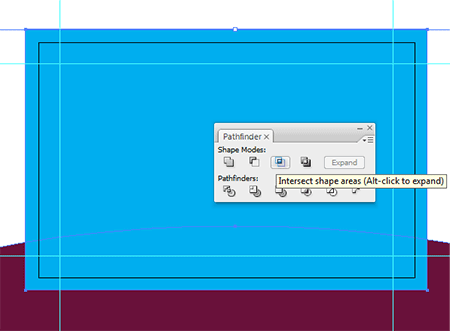
Using a temporary rectangle at the size of the document the large circle was trimmed to size using the Pathfinder tool.
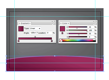
The colour scheme used on the front of the card was continued in this bottom area, adding a slight gradient across the width of the card and a thin stroke across the top edge.
The logo was placed onto the document and positioned within the margins in the top right corner.
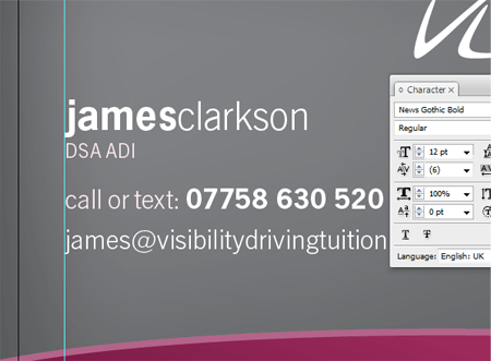
The name, job title and contact details were then laid out in the chosen font. For the name in particular, the design style of the logo was continued through by setting the text in lowercase with a mixture of bold and light weights. After some feedback an alternate version was also created for comparison with normal capitalisation and spacing, but it was decided that the little tweaks added that little extra to the design and were carried forward.
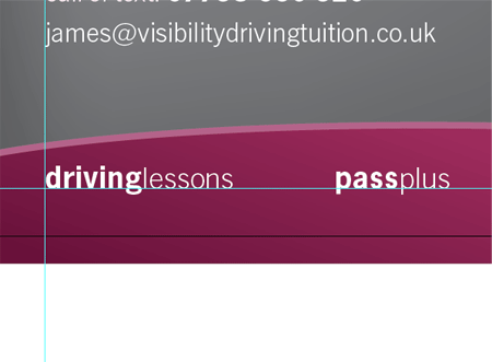
The three main services of driving lessons, pass plus and driver improvement were added to the lower section using this same type style, aligning each one to the left, right and centre.
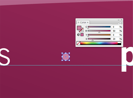
To separate each item, a small circular point was drawn, aligned with the text and filled with the colour swatch used on the stroke for consistency.
With the crop marks set in place the rear of the card was then complete. The design was soon approved and ready for printing. All text was converted to outlines to avoid font troubles.
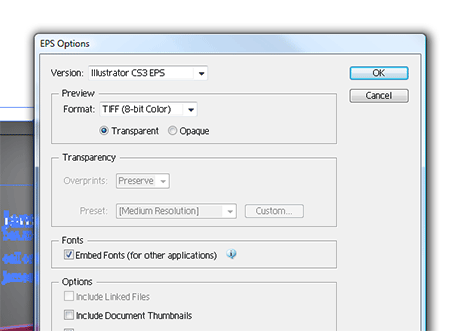
Each file was then saved as an EPS.
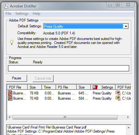
The two EPS files were then converted to PDF files using Adobe Distiller's Press Quality setting.
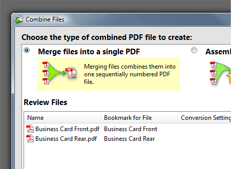
To save sending two separate files, the two PDFs were then combined into one file using Adobe Acrobat.

With the two files combined into one high resolution print file the business card artwork was ready to be sent to print.
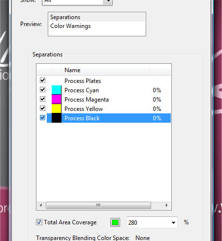
One final check was made using the Output Preview option within Adobe Acrobat by heading to Advanced > Print Production > Output Preview. Each plate can be viewed individually to check for stray colours and the reproduction of gradients. The Total Area Coverage also highlighted that there were no areas that risked over inking, with the exception of the crop marks that were set in registration black.
The files were packaged up and emailed to the printer, the order for 250 double sided cards with a matt lamination on both sides was placed.
In just a few days the cards arrived by post, all the colours looked fine, the text was nice and crisp and the gradients had been reproduced as planned, adding a nice soft variation of tone across each side of the card.

Good looking business cards and nice walkthrough! Thanks!
Using Distiller was a pleasant surprise. Gonna have to try that!
nice cards!
Can I ask what the reason was for you to first save it as eps first and then create a pdf opposed to Save As to a PDF right from illustrator?
As I recall, saving as a PDF directly from Illustrator preserves features such as gradients and transparency which bumps up the file size and could cause problems. Distilling an EPS will flatten any transparency or effects into a much safer file.
Why did you do it in Illustrator?? InDesign is the tool for layouting …
I briefly touched on InDesign in the last business card tutorial, I personally used Illustrator out of ease, especially with the gradient mesh and use of various vector shapes.
These would need creating separately and imported into InDesign.
I tend to use InDesign for multi-page designs where the layout features really come in handy, for smaller jobs Illustrator works well.
Totally agree. InDesign is great for multipage layout but for poster/biz cards/one page designs I always go for illustrator for convinience and rapidity of execution. (This last one is debatable depending on you “best” program.)
Illustrator all the way!
Great description.
How long does the process for designing the cards take (all inclusive)?
Stefan
Stefan, That all depends on the designer and how well they know illustrator. The first card I ever designed took me two hourse, but i had never used illustrator.
Now I can do the comp in about 30 mins to an hour, get approval, then prep for print, which takes maybe 30 mins depending on the design.
thanx great work and good finish
thanks a lot. this is perfect for me, because im doing a logo plus buisness card at the moment and the way you did seems to be a good one… ill try to follow that walktrough/tutorial
greetings from germany
Great Tutorial. Thanks for sharing. I am always trying to learn how to be a better designer and these are helpful. Thanks
Once again a great, high quality article that I’ve expected :) . Well done Chris, keep up the good work: This is a super start for 2009!
Great post, Thanks.
I recently had busniess cards made so seeing this process showed me some things that would have made it a quicker process. Thanks for the post.
Sweet… Im gna use this for my next business cards. Thanks!
thanks for the knowledge…saludos!
Great tutorial Chris.
It’s great to see how you pproch things compared to myself and others. I was just wondering which printers you used? I tend to use RCS (based in Retford), but I’m always looking into other printing services for reference.
I hope you don’t mind me dropping a link to an article I wrote for a driving instructor I did some work for, including a Business card design here:
http://www.andrewkelsall.com/logo-designs-and-marketing-for-gedt/
Very inspiring!
I’ve been thinking about getting some business cards for myself, and this will be enormously helpful. Thanks a lot
Great tutorial. Just a quick point with printing grey. Referring back to your tutorial on black printing techniques, is there anything similar we should consider when printing grey? I’ve printed a few grey backgrounds in my time just using percentages of K but with hugely varying results – for instance printing 80%K on a glossy 100GSM stock came back almost black but on a roller banner (vinyl) it had a very distinct reddish hue. Any tips for mixing CMY into the K to get a true, flat grey?
Cheers man, great work.
PS Blade or Owl? ;)
Great walkthrough, always interesting to see how other people go their design process. A agree on using Distiller. It’s a much safer bet than saving straight to PDF from Illustrator, even if Illustrator has got a lot better at this over the last few versions.
You could probably lay the business card out in InDesign but what’s the point? Illustrator is just as capable, and there’s no right or wrong way of doing it (unless you layout in Photoshop). Stick to you strengths that’s what I say.
thank you very much.
This is really awosome and very helpfull to design B-Card from scratch.
Thanks.
concept makes perfect…
thanks…
Very good!! thanks~
oh, thanks really, exporting part for print design was a little bit unclear for me and results always didn’t came out as I wanted, so huge thanks :)
Nice card design…what what the process for the logo? Is that just one font, or did you play around with that as well?
Seriously good job, colour selection works well
Great tutorial and perfect concept.Thanks for sharing..
This is a great step-by-step tutorial!!
Thanks for this tutorial, I really enjoy seeing other designer’s methods for creation. Good work!
I thought I noticed a gradient on there. Looks beautiful. But doesn’t it cost extra to have so many colors (gradient)?
nice walkthrough! thanks for sharing!
Excellent designs man. I was so amazed
This was my first time visiting your site, and I have to say — this is one of the most fulfilling tutorials I’ve ever read. I am reasonably experienced in graphic design (esp. Illustrator), but I probably learned 7 or 8 new things by reading this.
Kudos to you for a well-written tutorial, and especially for the contextual explanations that are too often overlooked.
-J
Hey,
What company do you use to print the business cards?
I’m currently using Illustrator CS4 – does anyone know how to add the crops marks now that the filter function no longer exists (Filter > Create > Crop Marks)?
Hey Liz,
In CS4 Crop Marks now became an ‘Effect’ (thus lives in the Effect menu). This means that it’s ‘live’ (/dynamic) now. So you can draw a rectangle, then go to Effect/Crop Marks and the crop marks are applied.. but if you resize your rectangle, the crop marks move too! :D
Cool but I must say that myself almost never use them – as I provide my designs in PDF to the printservice I tick the Crop Marks (and bleed if applicable) option in the Save As PDF Illustrator dialog.
Hope it was helpful, take care,
Mike
great!
just when i wanted to get a visiting card printed and didn’t know where to start at
nice post.
branding is one of my faves.
especially when you are given creative freedom.
thanks for the tut
http://calvin-t.blogspot.com/
Cool post!! Love the step by step!