Logo design is often seen as a quick and easy job; you create a small graphic, stick it next to some text and the job is done! In reality there’s a lot more to it, which makes the whole process of creating a logo or identity a challenging task. Let’s take a look at some of the general rules of logo design, see what guidelines we should stick to in order to build high quality logos, and see how they can all be put into practice to create a logo design that works in the real world.
It’s easy listing out a bunch of logo design rules, but to make this post a little more useful and insightful I decided to show I would implement each pointer into a design of my own. To do so I created a logo for a fictional web hosting company named Media Stack, and dealt with the project as if it was for real (just without the client communication). I’ll not go into how the design was made as a step by step tutorial, but instead I’ll try and give some behind the scenes insight into my thoughts and ideas by showing how I have personally translated the advice from each rule or guideline into the final logo design.
Ask questions to put together a good design brief
When you take on a new logo design project for a client, one of the first steps will be gathering together all the information and knowledge you need about the client’s company, such as what they do, who their target audience is, what their aims are and how they want to be perceived through their branding. Many designers use an online form to put forward a bunch of questions, while others might ask over a telephone call or by email. Whichever method you use, try to gather as much information as possible. The more information you have, the easier it will be to tailor a design specifically to your client’s needs, and more importantly be able to accurately represent the company in logo format.
![]()
Being a fictional project all the information for Media Stack is made up for the sake of the post, but I’ve aimed to make it a typical project for a small-medium sized business that’s emerging onto the scene. The sample design brief quickly outlines who Media Stack is, what they do and how they want to be seen by their customers. All this information can then be used to generate a unique logo that represents the company.
Every design begins with a sketch
Sketching is a great way to loosen up and quickly flesh out multiple ideas onto paper as they pass through your brain. No doubt you’ll have developed an initial idea from reading the design brief, now is your chance to note it down along with other keywords, doodles, diagrams and brainstorms.
![]()
I began jotting down ideas for Media Stack by mind mapping various keywords that related to web hosting, and the idea of a stack of servers. The sketches that followed quickly fleshed out some ideas of how a stack of servers could be represented in visual format. The general shape of a server is a thin rectangle, so this could be developed into the design. Other ideas were to use the initials M and S, or maybe some kind of network icon.
Develop a concept
The whole idea of a logo is to create a concept that portrays the company and its values in some kind of graphical mark. The concept you come up with can be as literal or as abstract as you like. Logos don’t always have to portray exactly what the company does, instead it might focus on a particular value or message. This is where all that initial research about your client’s business really comes into play, as you can develop something that’s unique and relative to their company.
![]()
The main idea I developed from my sketching for the Media Stack logo was to represent the stack of servers as a range of boxes, but rather than draw a range of boring old boxes, I wanted to inject a little visual interest and make the idea a little more abstract. Making the boxes three dimensional and hollow in the centre allowed the logo moved away from flat boxes, and helped develop a more unusual visual mark. You can look at the logo in two ways, firstly as a symmetrical symbol, but at a closer look you can see the illusion of three dimensions and the three layers being stacked on top of the other. The symbol itself also forms a kind of upwards facing arrow, which itself could be translated into growth and forward motion, which always give extra brownie points when it comes to representing a business!
Create the logo in vector format
Once you’ve chosen your design concept, you’ll be ready to begin crafting the digital logo file. Building a logo in vector format is one of the most important rules designers should follow. Vector graphics allow a design to be infinitely scaled to any size without losing any quality, whereas raster images that are made up of pixels will distort and become blurred when the size is altered. A vector logo file can be used for any purpose, whether it’s for tiny use on a receipt, or as a huge vinyl banner on the side of a building. Adobe Illustrator is the industry standard vector editing application, with Ai, EPS and PDF files being commonly accepted vector file types. Of course, your client probably won’t have the software to use this type of file, so you might want to render various sizes JPEG or PNG images for every day use, and supply the vector file for professional use.
![]()
The Media Stack logo was built in Adobe Illustrator, which is my application of preference for any vector work. The design was created out of a simple rectangle, which was then manipulated with the Direct Selection Tool to give the slanted appearance. Duplicating and reflecting this shape then allowed me to build up the symbol graphic. Each object was carefully positioned, with the document zoomed to the max and set in outline mode (CMD-Y).
Ensure your logo is balanced
Just like any type of Graphic Design, you should aim to balance your design with a suitable composition or structure. Logos that have two or more elements should be laid out in harmony. The best way to do this is use simple mathematics or to simply line things up.
![]()
I could have just randomly scaled and placed the Media Stack graphic next to the text, but to ensure the logo was balanced I drew a range of guides that outlined the edges or corners of each major part of the design. This gave me a grid that I could align the text to, which helped make sure the lines of the symbol flowed nicely into the lines of the typography. The height of the text is one third the height of the symbol, and the distance between the logo and symbol is equal to the width between the two inner points of the logo’s inner negative space.
Should effects be used on your logo?
Some people enjoy logos with transparency effects and gradients, while others prefer the back-to-basics approach without the bells, whistles and shiny bits. I personally think a logo can often benefit from being tarted up with effects if the nature of how the logo is to be used allows for it. For instance if the design is for primary use on screen, a gradient here and there can really help add depth to the design and give it that extra level of prominence. Even if the logo is being used on litho-printed documents, today’s printers are more than capable of recreating all the effects we can produce on screen in ink. It’s worth noting that your logo should definitely work in a flat colour and mono formats to maintain its versatility, so ensure your logo also works without the effects.
![]()
I decided to give the Media Stack logo an additional gradient to emphasise the 3D effect, which makes the message of a stack of objects slightly more recognisable. This full colour logo is the primary version, and is the one that will be used on-screen and on any full colour literature, but there’s also a flat colour version that doesn’t contain gradients, which is perfect for small scales, or for a limited colour print.
A great logo works in a single colour
A sign of a great logo is its versatility. Ideally your logo design can be adapted for use in any situation, and one of those situations will be the use of the logo in just a single colour. If your design relies heavily on colour or effects to generate its appearance, it limits the use of the logo in the real world. Think about how the design would work as a sticker which would need cutting out of vinyl, or how it would be etched onto a product. The beauty of a mono logo is that it can also be reversed out in order for it to work on any background colour or even a photograph.
![]()
As well as full colour and flat colour logo variations, I also developed a mono version of the Media Stack logo that is made up of just one colour. The mono version makes use of a couple of additional lines to maintain the shapes that are usually created by the changes in colour, so it maintains its visual appearance of being three separate elements.
Use colour psychology and theory in your design
Colour is one of the main ingredients when it comes to designing logos and brands. People can immediately develop a certain perception from a design simply from its colour, so it’s important to make wise choices for your designs. When it comes to choosing the colours for your logo design, think about what colours will relate to the message and value that you’re trying to put across in the design; some colours will help reinforce that message. Certain mixes of colours work better than others, this is when knowledge of colour theory comes into play. Some mixes of colours will appear bright and brash, others more muted and dignified, so some colour palettes will fit your design perfectly, while others could completely ruin its perception.
![]()
I’ve chosen the colour blue for the Media Stack logo. As well as simply being a pretty awesome colour, the colour blue is also documented as being seen as reliable and dedicated, which is probably why it’s one of the most popular colours for businesses. Unless the company you’re designing for wanted a complete brand overhaul, the colour might something that’s left intact from previous designs, as it’s an important element of brand recognition. Just imagine if Coca Cola changed their cans to blue…
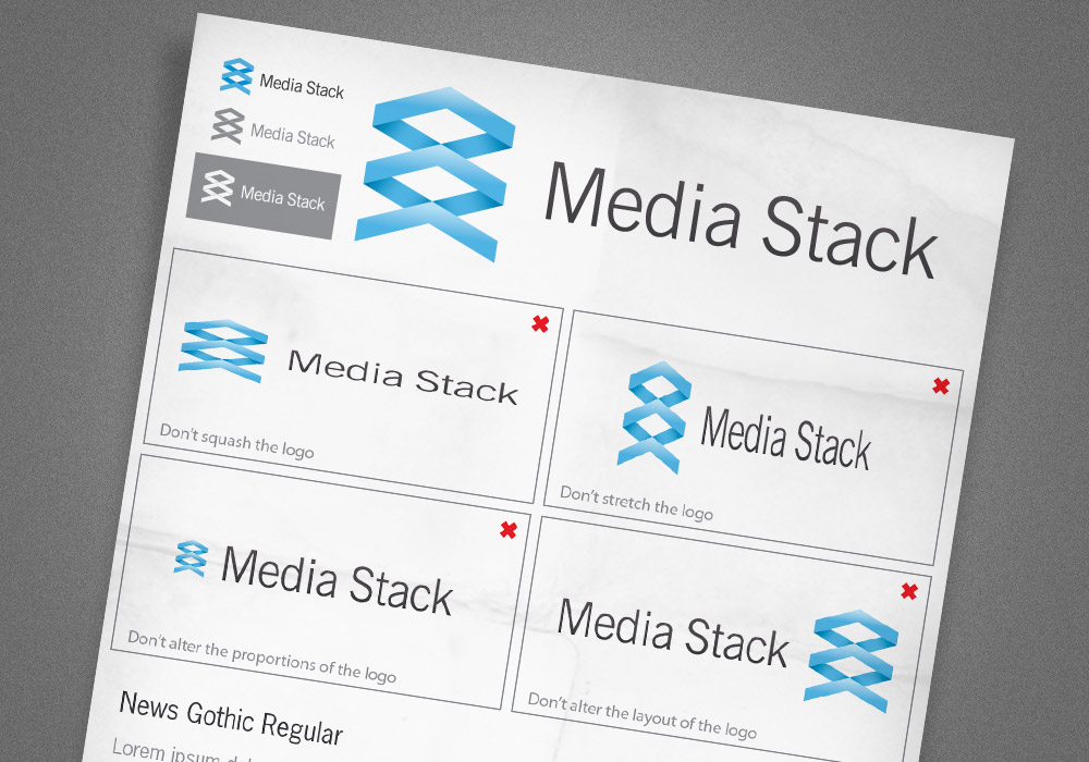
Do you need to produce brand guidelines?
A brand guidelines document is like an instruction manual for your freshly baked logo, it tells the clients how it should be used and what best practices should be considered. For instance, the document might include details on what minimum dimensions the logo works at before becoming illegible, which version of the logo should be used on dark backgrounds and when it’s best to use the mono version. It might also include a section stating that the logo shouldn’t be squashed, stretched or the colours altered. The document might also contain details on the colour swatches used, in Hex, RGB, CMYK and Pantone formats, and what fonts were used in the design.
![]()
Handy information that would help spread the Media Stack brand across all other company documents would be an overview of the blue and grey colour swatches used, as well as the identification of the News Gothic typeface that the logo is set in. It would also be useful to protect the design by showing how it should and shouldn’t be used. These examples might seem obvious to us designers, but we all know what can happen to our babies when clients get their hands on them!

Nice article. You touched most points which are good to tune up a logo design process. So A+!
P.S. + is for “ensure your logo also works without the effects”
Great summary of a proper logo design process.
I think the actually time spent researching the client and its background is often cut too short, many designer want to jump right into Illustrator and co – it’s great that you point out the right way.
Great article. I love it when you give somebody a logo and then they complete warp it with screwed up dimensions… and keep it that way.
Very well explained.
That’s a very well written article – well done Chris, loved the read and the inspiration.
Keep up the great work!
Great post Chris. Very well written, put together & informative. Bookmarked!
Keep these bad boys coming!
cool good….thanks…what all things will you ask to your clients before designing a logo? can u share?
i mean more from above listed any questionnaire?
Great tips! I especially like the advice given regarding the use of the logo in the future. I need to provide more details I think it’s too easy to think that the client knows the basics when they may not.
Rakesh, my recent blog article contains some questions you might want to ask your client. I suggest using those, and the ones added on this site as guides then creating your own list that suits you and your customer base.
Hope that helps!
Here’s the link.
http://victoriaanndesign.net/2010/02/16-questions-you-can%E2%80%99t-afford-not-to-ask-your-graphic-design-clients/
@Vicki thanks for the addition. Great
Quick, easy, fantastic.
Well written Chris. I’ll be keeping this one for future use! Keep up the good work!
Hi Chris, great article. Thanks for that ;-)
Can you tell me what kind of pencil do you use for your sketches?
Well that just beat my article I posted the other day :(
http://www.chopeh.com/blog/logo-design-start-to-finish/
excellent post – We were having the single colour debate only recently!
Excellent tutorial Chris, this really helps out as im still seeing people not following these sorts of guidelines in Logo Design.
This is a great article. Simple and informative. I think the art of creating a great logo has been lost over the last few years. People expect it to be such a quick turnaround project. Well done. Keep up the great work.
great post….!!!
Great job man!! I like your method… Thanks!
Hey Chris- I enjoy reading articles like this one. Do you any additional input on the topic of Research. What questions do you think is key to ask a client when starting a project for them? and besides asking them questions what additional research does one also have to do?
Never thought about producing brand guidelines which I think is a great idea.
Thanks and as always keep up the great work!!
Thanks so much Chris for sharing your experience with us,
Just i have note, I think the typeface is not suitable with the kind of logo. Just suggestion
Thanks again,
I am currently developing a logo for a copywriting project I intend to launch soon and this tutorial made me think of a couple of aspects that hadn’t occurred to me yet.
Additionally, good job with the writing. Very clear and down-to-earth.
it was interesting to learn your process for designing logos. Although this one reminds me too much of the dropbox logo
I agree, and did stumble upon this too and it jogged the memory of this post.
http://www.bonnersmusic.co.uk/
Great job, clear and concise!
Awesome article! thanks for sharing!
Really well written and explained.
Definitely one to refer to when the time arises!
Well done… :)
Great article Chris, really like the logo must work in mono colour test – keeps everything real and stops overkill of gradients, shadows and effects.
Great artice! I think logos are one of the hardest things a designer can create. To capture the essence of a company requires real skill and is by no means a quick job.
I’ve always struggled with logo design. Brilliant, well-written and inspirational post. Gonna go try my hand at some logo designs now! :P
Great steps…I especially like that you started with a brief and sketch first instead of just diving in to the computer. Thanks for the article. Great stuff!
Superb post Chris!
This is a very nice, in-depth article. I quite enjoyed it. I really liked the point about gradients and other extra bells and whistles–I’m glad you pointed out that a good logo will work even without them, but they are nice every noe and again.
I also agree with the one about color. I have worked with some designers who think that when you show a client a logo for the first time, it should be in black and white. I disagree. Color is emotion. If you don’t have emotion in your logo, what DO you have? A simple symbol, i think.
Thanks, Chris. Great resource here.
Fantastic article Chris and lovely logo!
great stuff! I should definetely work with more guidelines and raster again. thanks!
Nice article! Can check out some of my logos here if you’re interested:
http://www.simonowendesign.co.uk/logos/
Excellent article, and nice and simple way to explain it!!!
good inspiration…
Great post!
This may be somewhat off-topic, but I’ve always wondered about brand guidelines – is the client contractually obligated to follow them or is it more of a favor that the designer is asking of the client?
I’ve wondered about this as well. To me, it seems it’s more of a favor, as you put it. Clients probably don’t have to follow the brand guidelines, but that would pretty much defeat the purpose of hiring a designer to design a logo that properly displays who you are as a business.
If they don’t follow the guidelines, they’re just hurting themselves.
Nice article! A quick overview to refresh my memory.
I also agree with your point on logos with subtle gradients. If the medium being used to display it allows it, such as screens, then why not. Some logos take it way to far though, to the point where it’s not even a logo anymore.
Thanks again for sharing.
Great article! Definately worth a 10+. And a great tip about the guidelines. I should use them more in Illustrator.
A really fantastic inspirational insight into your logo design process. Its been bookmarked!
Great article!!! Very informative…
Great article Chris!
My advice is to do as much as can away from the PC – Illustrator and Photoshop are so easy to get distracted with.
Thanks for this…Great resource!
Great post. I think a lot of people skip the design brief part of it, but it’s one of the most important aspects of understanding WHO you’re creating your logo for.
One of the best articles I’ve read about branding in a /long/ time. Thanks!
Really inspiring article, Chris. I especially found your client questionnaire helpful at the beginning.
Jack
Wow – some great tips which will come in handy, just landed a big logo design job for a county educational partnership so this post shall help.
Thanks once again Chris!
Well thought out and written, and a nice logo too!
I will admit that I find myself skipping the sketching step quite a bit. Most of the time ideas transpire so clear enough in my mind that it just becomes a matter of grabbing the finishing tool. Not to say that sketching is not required or important, in fact it should be common practice.
Peace!
Very very nice! You did a good job of explaining your design theory, you made some good points!
Klasse Artikel
Deluxe, congratulations Chris.
Sometimes a create a good logo is easy and fast, but create a good brand takes a lot.
Great article Chris :)
Great article, i particularly like the simple one page brand guidelines!
Very nice post Chris!
Great as always, nice read.
Great article Chris :) thx
Great article.. I am going to use this as reference to improve my creative process when I am designing for a logo.
wow its very detail logo Guide. I will for sure follow some ideas in my next project thanks for such great article :)
Really helpful thanks! I’m a web designer and I’ll be creating a logo for my company which is quite the challenge.
Straight to the point and absolutely helpful. Great article. Looking forward to more.
Great guidelines, thanks!
Especially your comment on balance – I think that’s one thing people forget sometimes.
Hi Dude, coca-cola changed their cans to blue on Parintins Fest here in Brazil to challenge Pepsi. Search on web Parintins Fest Coca-cola blue. You’ll find it. It’s just different and beautiful.
Just a quick note to say thanks – not only for this post but for all the others! – Keep up the great work.
Very nice read, some useful tips, tnx!!!
As a logo designer, I enjoyed seeing your process!
Great article Chris, very useful. Would love to see one about how you go about choosing a font – this is my biggest nightmare right now!
Excellent article! I enjoyed following your workflow/process. I’ve been reading more and more about other designers processes and workflows. It’s fascinating how so many of us have similar approaches, but the little details are what set us all apart.
I have been reading your blog for a long, long time. I think I might have to subscribe to the premium content, to be supportive to you, and to hopefully gain something out of it for myself.
great article. i’ve totally loved it.
Great article.Very useful tips.Thanks for sharing
Hey dude, this is a great article. I particularly like the idea of giving the client the guidelines so they dont screw it up!
– Shaun :)
Great as always, nice read.
Thanks a lot for sharing a very valuable information.
You make branding so easy with this tut. Unfortunatly, it isn’t that easy in the real life… At least for me ;-)
These article is great!!!! Thanks for all information.
Great article as always! This article will be quite useful if I ever need help.
I always enjoy creating logos, unfortunately sometimes what a client wants can ruin all this creativity. But as in everything, communication is a key factor.
Great article Chris. I often find that coming up with the initial concept for the logo is the most time consuming and, like you said, having enough company info to help you get there is all important.
Good work explaining your process
Nice article. I spend hours researching ideas and colors, and am always looking for tips to hone my process.
nice post =)
interesting, useful.. I like
It’s good when you can draw your logo into sand with your big toe you you still recognize it as your logo.
Great article, very useful for a startup like me
Hey Chris! You are good as ever. :)
Your ‘behind the scene’ tips with your personal logo designing job made this post exclusive. great work! keep sharing..
wicked post, you covered some really good points!!
This is a really great article with a surprising amount of depth to it. You have covered the essential points and more. Was an enjoyable read. Thank you for sharing.
I am happy to see that you start the process with some good old fashioned sketching. I’m startled at the number of younger designers these days who never seem to take pencil in hand. I sometimes find my hand can intuitively and quickly trace out design that will become the major framework for which an entire website, logo or advertising campaign will be based.
Thanks for the thoughtful article. Love your blog design too, by the way.
Nice article. Pity the media stack logo doesn’t look like a stack.
Nice post Chris, although I tend to outsource my logo work, I do appreciate the process.
Wow! This is really great article Chris. Thank you!
Great helpful tips here thanks for posting!
This is by far one of my favorite tutorial about logo design and guidelines. Kudos and thank you very much for a very great tool Chris!
hey this is a very well written and well conceptualised post. i enjoyed reading it. i do my own designing and printing work at http://www.psprint.com/stickers-labels and work on logos for my clients too, and hence agree with what you say.
I would like to get a new logo, are you interested for the same?
regards,
Ajay Rana
+91.9872074785
While the article is a great process to follow I find it funny that the first thing I see at the top of the site is an add to design ‘professional’ sites for free. Kinda seems like a mixed message.
Logo design is not a piece of cake, thanks for the article
What a great tutorial. Very usefull.
Tnx
Excellent Guidelines I must say.
Thanks a lot.
Nicely executed, thanks Chris!
I really enjoy your tips, very helpful and all in one place! Thanks!
This Is One Of The Most Awesome Design I Have Ever Seen…..
Thanks for this. Although it seems obvious to have a brief, the number of times i have started designing without it and wasting a lot of time. This has really streamlined things for me know when designing logos! Thanks
Very helpful, thanks Chris!
The thing is.. ur teaching basics and must stuff, great as usual.
Thanks for sharing this! Nice collection, good inspiration.
awesome article. im new to the design thing, teaching myself by reading & practicing in CS$ extended. so far, this is the best written article ive read. lot of others are missing steps, poorly explained or assume you know tons of stuff already. thanks for keeping this understandable even for a novice. bookmarked & about to become a member. i love you
Very very nice! You did a good job of explaining your design theory, you made some good points!
Very good article!
Thanks for the tips!
Jedi master at work. Thanks for the good posts. It’s always good to know that us designers have similar working habits.